Propensity Modelling - Using h2o and DALEX to Estimate Likelihood to Purchase a Financial Product - Abridged Version
In this day and age, a business that leverages data to understand the drivers of customers’ behaviour has a true competitive advantage. Organisations can dramatically improve their performance in the market by analysing customer level data in an effective way and focus their efforts towards those that are more likely to engage.
One trialled and tested approach to tease this type of insight out of data is Propensity Modelling, which combines information such as a customers’ demographics (age, race, religion, gender, family size, ethnicity, income, education level), psycho-graphic (social class, lifestyle and personality characteristics), engagement (emails opened, emails clicked, searches on mobile app, webpage dwell time, etc.), user experience (customer service phone and email wait times, number of refunds, average shipping times), and user behaviour (purchase value on different time-scales, number of days since most recent purchase, time between offer and conversion, etc.) to estimate the likelihood of a certain customer profile to performing a certain type of behaviour (e.g. the purchase of a product).
Once you understand the probability of a certain customer to interact with a brand, buy a product or sign up for a service, you can use this information to create scenarios, be it minimising marketing expenditure, maximising acquisition targets, and optimise email send frequency or depth of discount.
Project Structure
In this project I’m analysing the results of a bank direct marketing campaign to sell term a deposit its existing clients in order to identify what type of characteristics make a customer more likely to respond. The marketing campaigns were based on phone calls and more than one contact to the same person was required at times.
First, I am going to carry out an extensive data exploration and use the results and insights to prepare the data for analysis.
Then, I’m estimating a number of models and assess their performance and fit to the data using a model-agnostic methodology that enables to compare traditional “glass-box” models and “black-box” models.
Last, I’ll fit one final model that combines findings from the exploratory analysis and insight from models’ selection and use it to run a revenue optimisation.
The data
library(tidyverse)
library(data.table)
library(skimr)
library(correlationfunnel)
library(GGally)
library(ggmosaic)
library(knitr)
library(h2o)
library(DALEX)
library(knitr)
library(tictoc)
The Data is the Portuguese Bank Marketing set from the UCI Machine Learning Repository and describes the direct marketing campaigns carried out by a Portuguese banking institution aimed at selling term deposits/certificate of deposits to their customers. The marketing campaigns were based on phone calls to potential buyers from May 2008 to November 2010.
The data I’m using bank-direct-marketing.csv is a modified version of bank-additional-full.csv and contains 41,188 examples with 21 different variables (10 continuous, 10 categorical plus the target variable). In particular, the target subscribed is a binary response variable indicating whether the client subscribed (‘Yes’ or numeric value 1) to a term deposit or not (‘No’ or numeric value 0), which make this a binary classification problem.
The data required some manipulation to get into a usable format, details of which can be found on my webpage: Propensity Modelling - Data Preparation and Exploratory Data Analysis. Here I simply load up the pre-cleansed data I am hosting on my GitHub repo for this project
data_clean <-
readRDS(file = "https://raw.githubusercontent.com/DiegoUsaiUK/Propensity_Modelling/master/01_data/data_clean.rds")
Exploratory Data Analysis
Although an integral part of any Data Science project and crucial to the full success of the analysis, Exploratory Data Analysis (EDA) can be an incredibly labour intensive and time consuming process. Recent years have seen a proliferation of approaches and libraries aimed at speeding up the process and in this project I’m going to sample one of the “new kids on the block” ( the correlationfunnel ) and combine its results with a more traditional EDA.
correlationfunnel
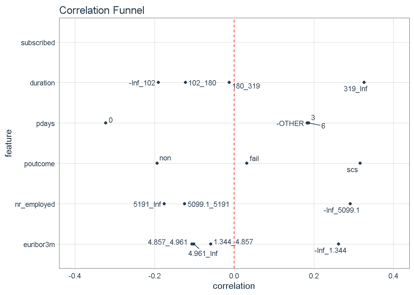
With 3 simple steps correlationfunnel can produce a graph that arranges predictors top to bottom in descending order of absolute correlation with the target variable. Features at the top of the funnel are expected to have have stronger predictive power in a model.
This approach offers a quick way to identify a hierarchy of expected predictive power for all variables and gives an early indication of which predictors should feature strongly/weakly in any model.
data_clean %>%
# turn numeric and categorical features into binary data
binarize(n_bins = 4, # bin number for converting to discrete features
thresh_infreq = 0.01 # thresh. for assign categ. features into "Other"
) %>%
# correlate target variable to features
correlate(target = subscribed__1) %>%
# correlation funnel visualisation
plot_correlation_funnel()
Zooming in on the top 5 features we can see that certain characteristics have a greater correlation with the target variable (subscribing to the term deposit product) when:
- The
durationof the last phone contact with the client is 319 seconds or longer - The number of
daysthat passed by after the client was last contacted is greater than 6 - The outcome of the
previousmarketing campaign wassuccess - The number of employed is 5,099 thousands or higher
- The value of the euribor 3 month rate is 1.344 or higher
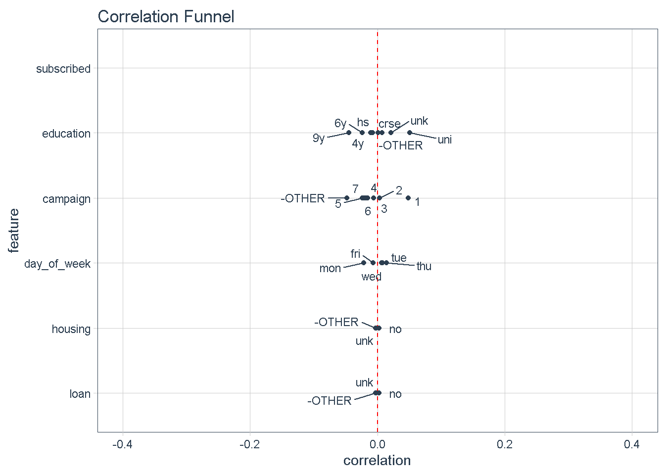
Conversely, variables at the bottom of the funnel, such as day_of_week, housing, and loan. show very little variation compared to the target variable (i.e.: they are very close to the zero correlation point to the response). For that reason, I’m not expecting these features to impact the response.
Features exploration
Guided by the results of this visual correlation analysis, I will continue to explore the relationship between the target and each of the predictors in the next section. For this I am going to enlist the help of the brilliant GGally library to visualise a modified version of the correlation matrix with Ggpairs, and plot mosaic charts with the ggmosaic package, a great way to examine the relationship among two or more categorical variables.
Target Variable
First things first, the target variable: subscribed shows a strong class imbalance, with nearly 89% in the No category to 11% in the Yes category.
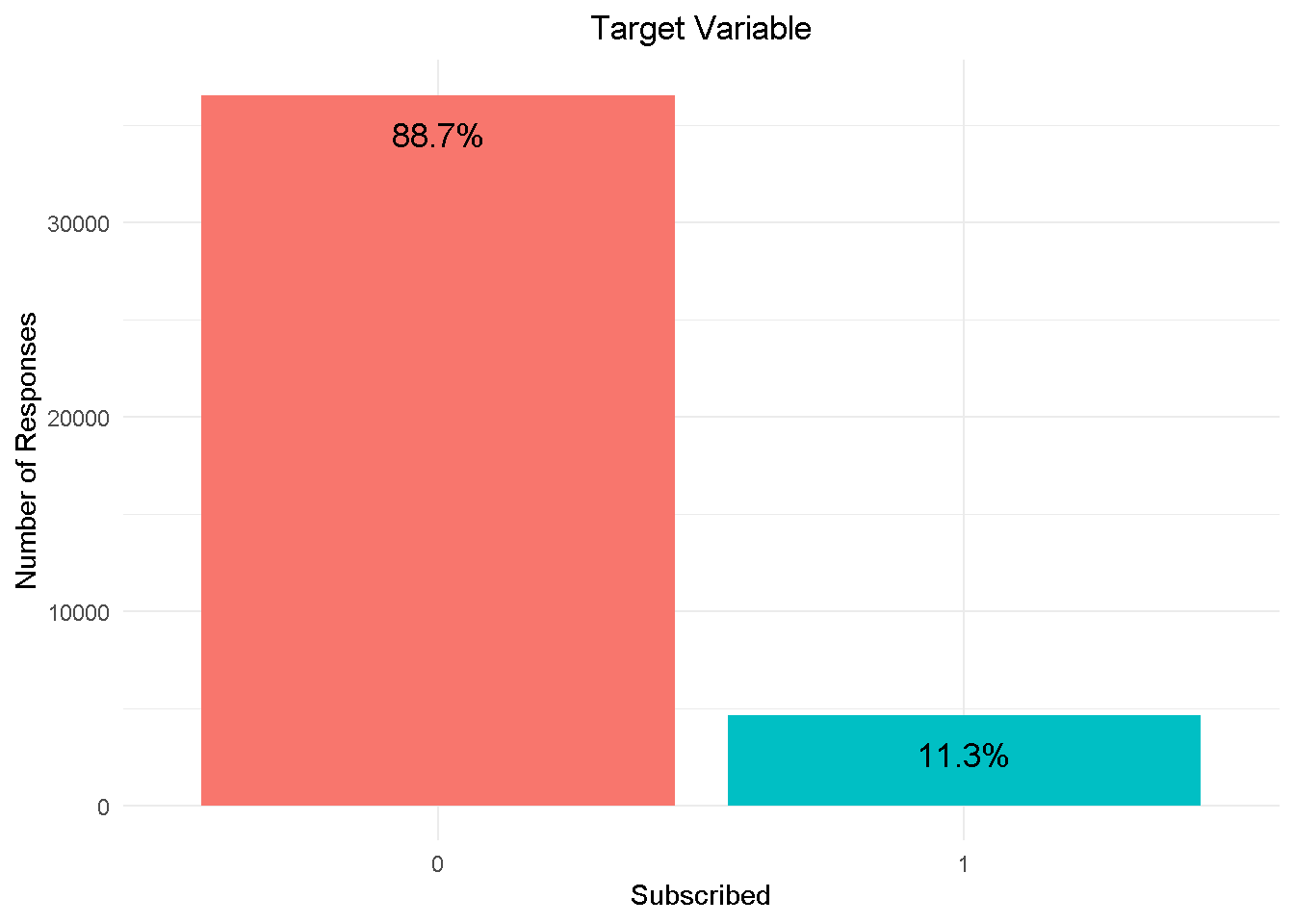
I am going to address class imbalance during the modelling phase by enabling re-sampling, in h2o. This will rebalance the dataset by “shrinking” the prevalent class (“No” or 0) and ensure that the model adequately detects what variables are driving the ‘yes’ and ‘no’ responses.
Predictors
Let’s continue with some of the numerical features:
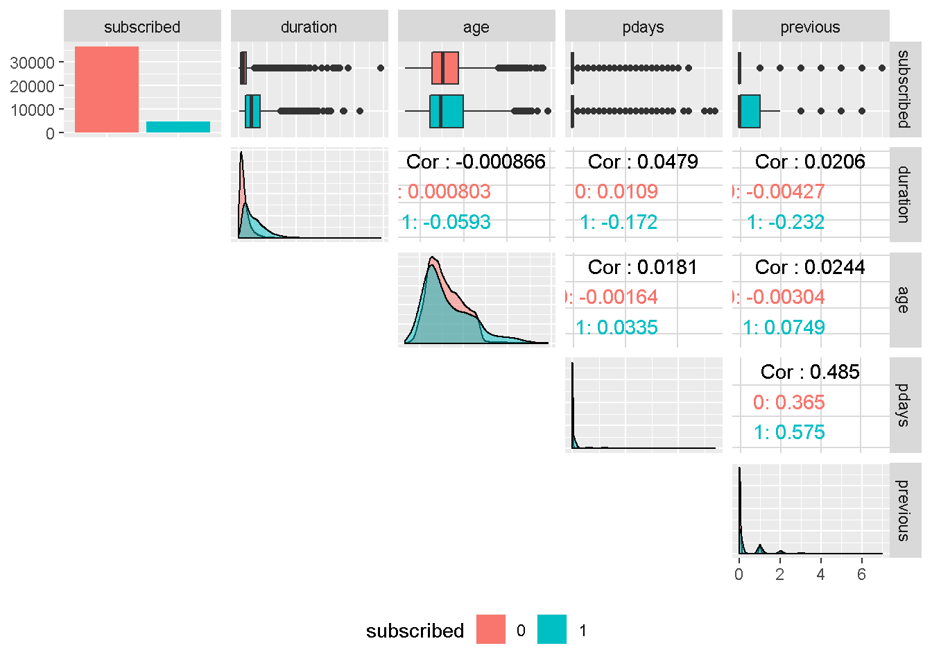
Although the correlation funnel analysis revealed that duration has the strongest expected predictive power, it is unknown before a call (it’s obviously known afterwards) and offers very little actionable insight or predictive value. Therefore, it should be discarded from any realistic predictive model and will not be used in this analysis.
age ’s density plots have very similar variance compared to the target variable and are centred around the same area. For these reasons, it should not have a great impact on subscribed.
Despite continuous in nature, pdays and previous are in fact categorical features and are also all strongly right skewed. For these reasons, they will need to be discretised into groups. Both variables are also moderately correlated, suggesting that they may capture the same behaviour.
Next, I visualise the bank client data with the mosaic charts:
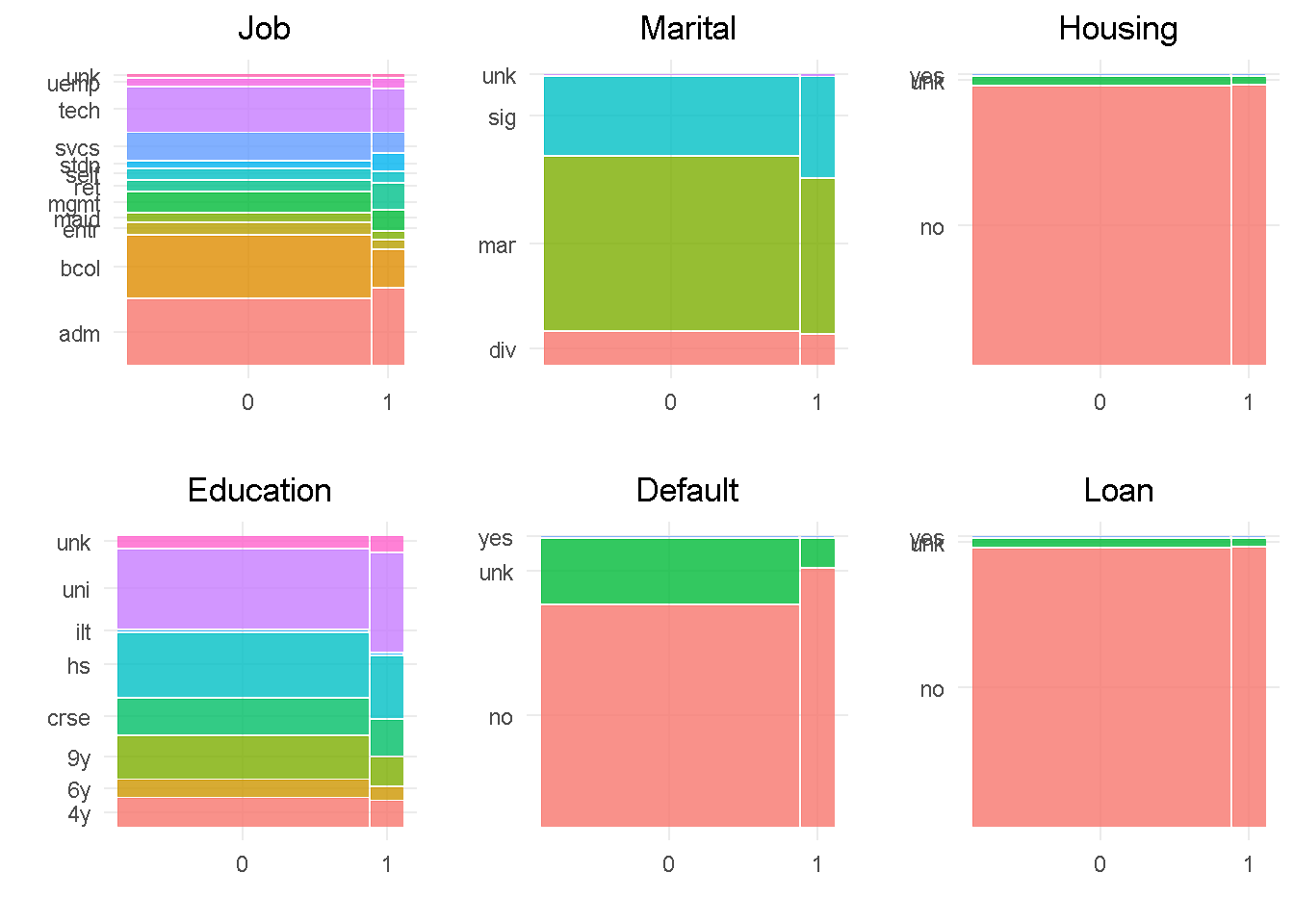
In line with the correlationfunnel findings, job, education, marital and default all show a good level of variation compared to the target variable, indicating that they would impact the response. In contrast, housing and loan sat at the very bottom of the funnel and are expected to have little influence on the target, given the small variation when split by “subscribed” response.
default has only 3 observations in the ‘yes’ level, which will be rolled into the least frequent level as they’re not enough to make a proper inference. Level ‘unknown’ of the housing and loan variables have a small number of observations and will be rolled into the second smallest category. Lastly, job and education would also benefit from grouping up of least common levels.
Moving on to the other campaign attributes:
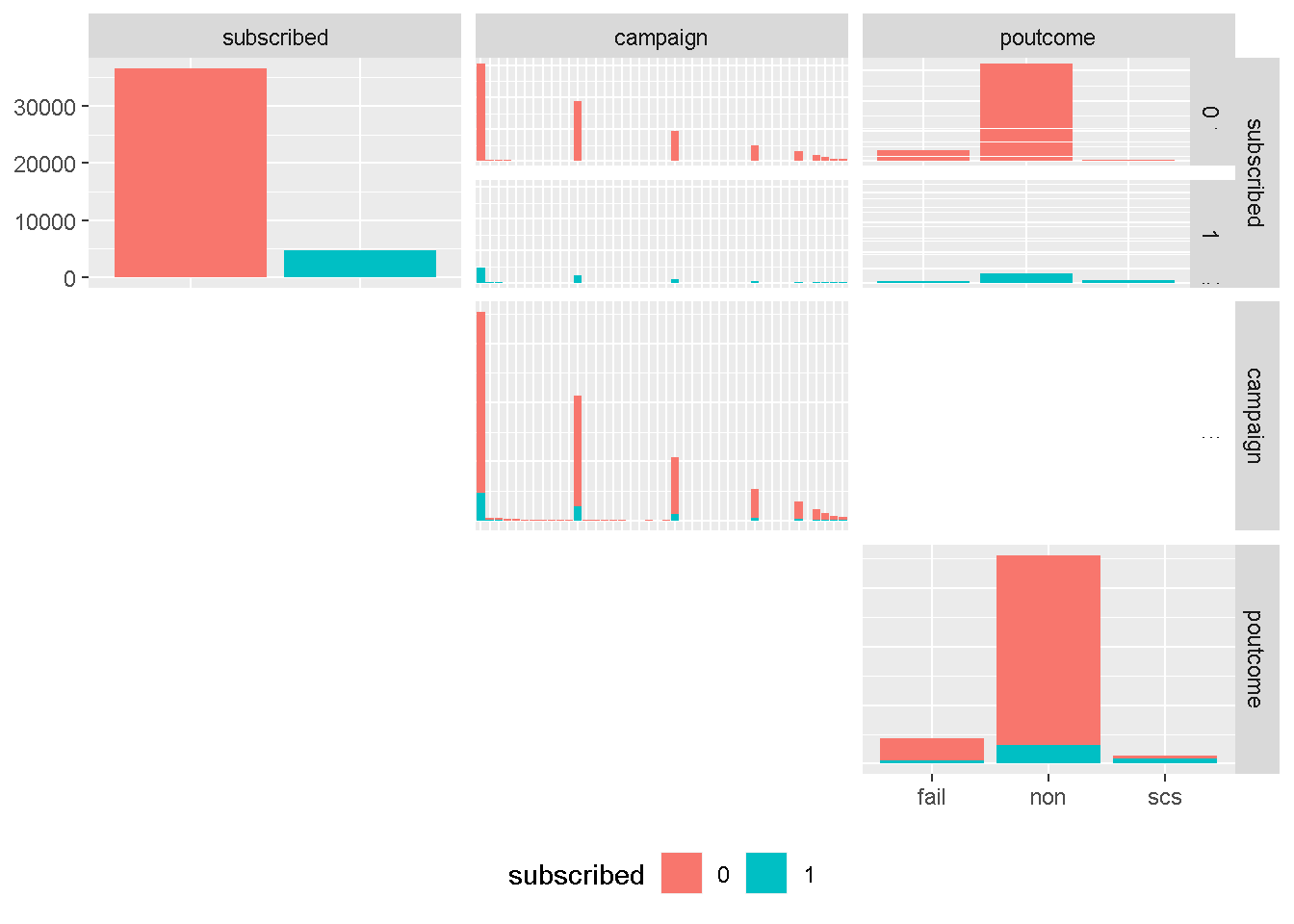
Although continuous in principal, campaign is more categorical in nature and strongly right skewed, and will need to be discretised into groups. However, we have learned from the earlier correlation analysis that is not expected be a strong drivers of variation in any model.
On the other hand, poutcome is one of the attributes expected to be have a strong predictive power. The uneven distribution of levels would suggest to roll the least common occurring level (success or scs) into another category. However, contacting a client who previously purchased a term deposit is one of the catacteristics with highest predictive power and needs to be left ungrouped.
Then, I’m looking at last contact information:
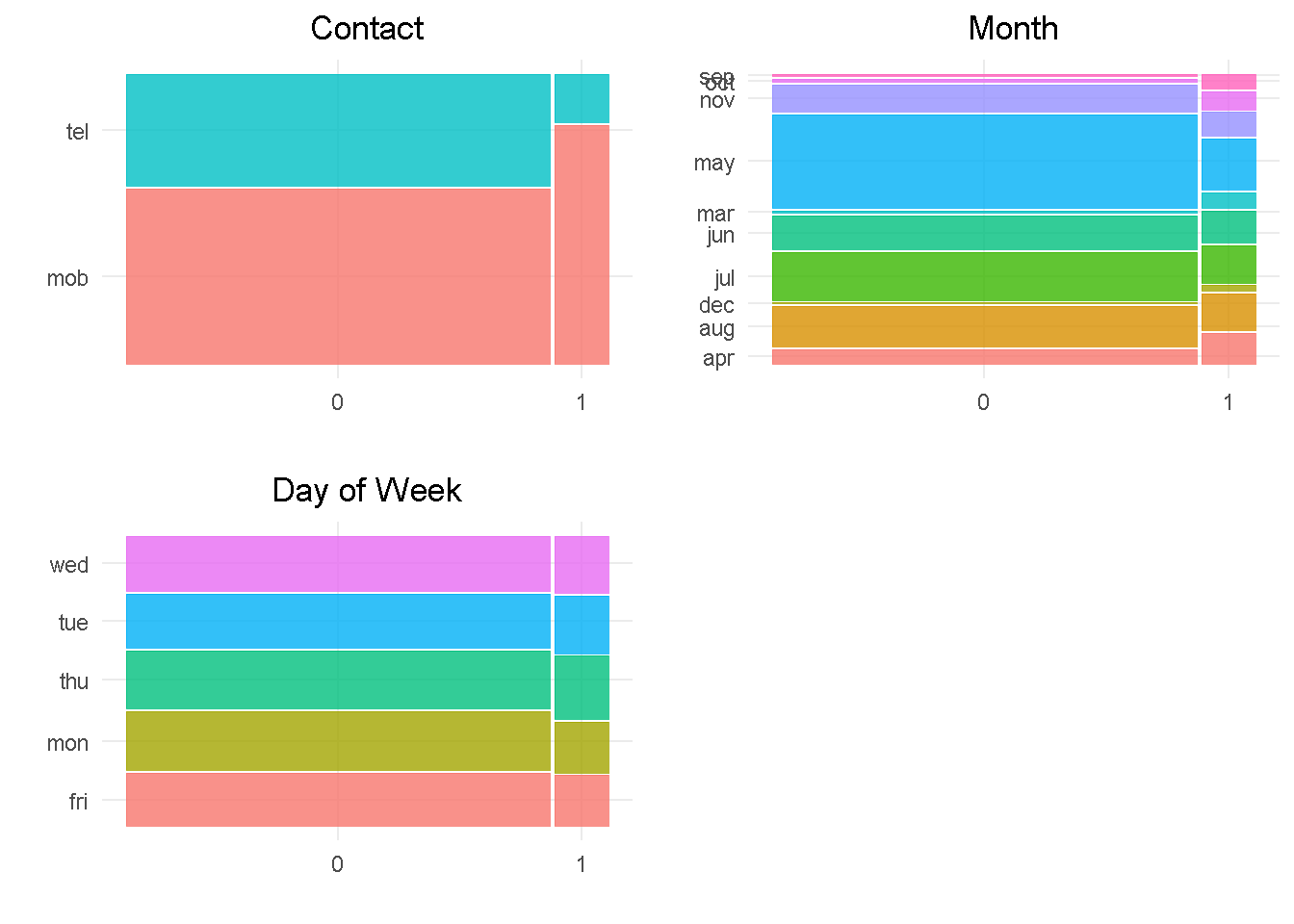
contact and month should impact the response variable as they both have a good level of variation compared to the target. month would also benefit from grouping up of least common levels.
In contrast, day_of_week does not appear to impact the response as there is not enough variation between the levels.
Last but not least, the social and economic attributes:
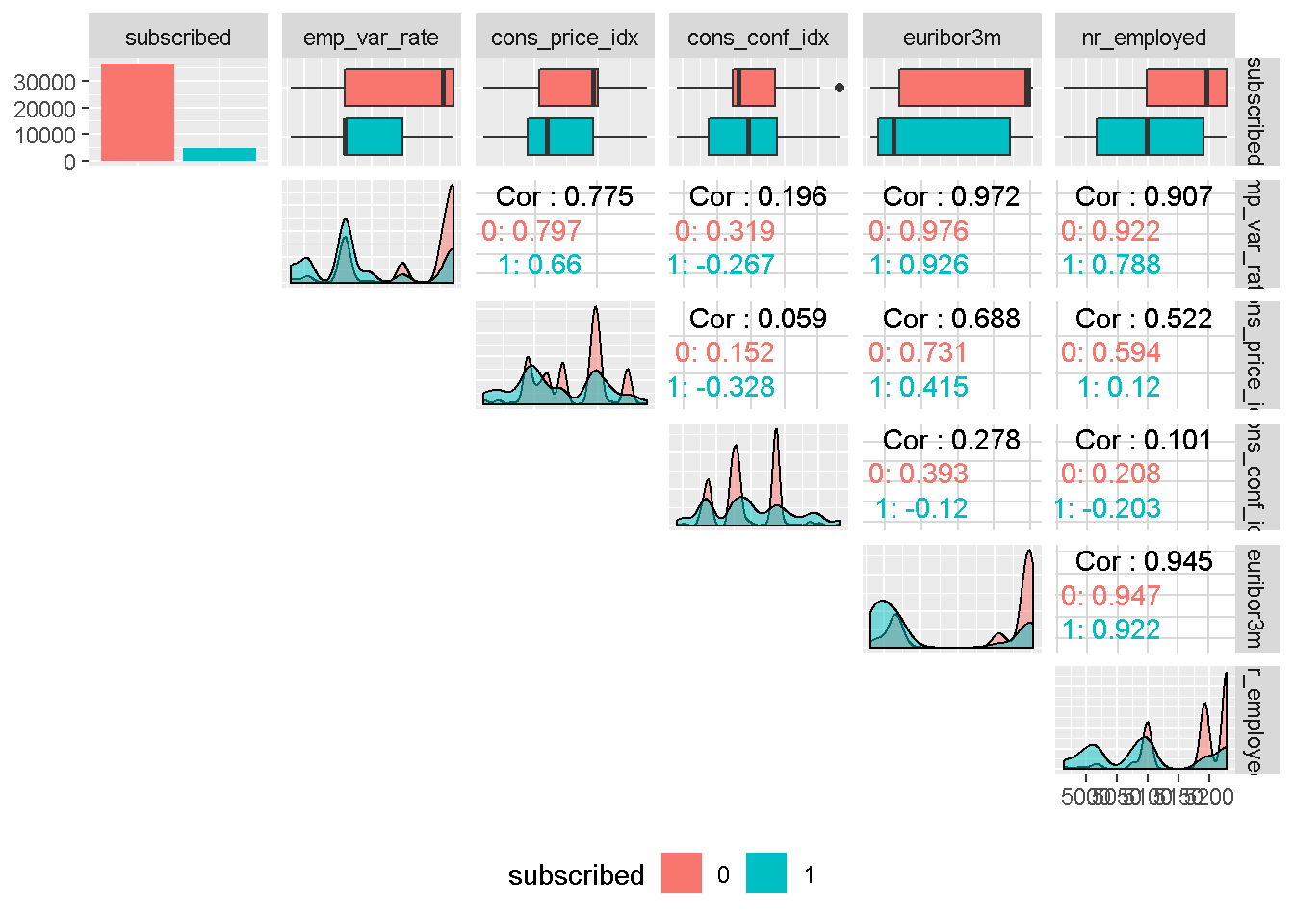
All social and economic attributes show a good level of variation compared to the target variable, which suggests that they should all impact the response. They all display a high degree of multi-modality and do not have an even spread through the density plot, and will need to be binned.
It is also worth noting that, with the exception of consumer confidence index , all other social and economic attributes are strongly correlated to each other, indicating that only one could be included in the model as they are all “picking up” similar economic trend.
Summary of Exploratory Data Analysis & Preparation
Correlation analysis with correlationfunnel helped identify a hierarchy of expected predictive power for all variables
duration (eqpt_rent) has strongest correlation with target variable whereas some of the bank client data like housing and loan shows the weakest correlation
However, duration will NOT be used in the analysis as it is unknown before a call. As such it offers very little actionable insight or predictive value and should be discarded from any realistic predictive model
The target variable subscribed shows strong class imbalance, with nearly 89% of No churn, which will need to be addresses before the modelling analysis can begin
Most predictors would benefit from grouping up of least common levels
Further feature exploration revealed the most social and economic context attributes are strongly correlated to each other, suggesting that only a selection of them could be considered in a final model
Final Data Processing and Transformation
Following up on the findings from the Exploratory Data Analysis, I’ve discretised categorical and continuous predictors by combining least common levels into “other” category, set all variables but age as unordered factors ( h2o does not support ordered categorical variables) and shorted level names of some categorical variables to ease visualisations. You can find all the details and the full code on my webpage: Propensity Modelling - Data Preparation and Exploratory Data Analysis.
Here I simply load up the final dataset hosted on my GitHub repo:
data_final <-
readRDS(file = "https://raw.githubusercontent.com/DiegoUsaiUK/Propensity_Modelling/master/01_data/data_final.rds")
Modelling strategy
In order to stick to a reasonable project running time, I’ve opted for h2o as my modelling platform as it offers a number of advantages:
it’s very easy to use and you can estimate several Machine Learning models in no time
it does not require to pre-treat character/factor variables by “binarising” them (this is done “internally”), which further reduces data formatting time
it has a functionality that takes care of the class imbalance highlighted in the Data Exploration phase - I simply set
balance_classes= TRUE in the model specification, more on this later oncross-validation can be enabled without the need for a separate
validation frameto be “carved out” of the training sethyper-parameters fine tuning (a.k.a. grid search) can be implemented alogside a number of strategies that ensure running time is capped without compromising on performance
Building models with h2o
I’m starting by creating a randomised training and validation set with rsample and save them as train_tbl and test_tbl.
set.seed(seed = 1975)
train_test_split <-
rsample::initial_split(
data = data_final,
prop = 0.80
)
train_tbl <- train_test_split %>% rsample::training()
test_tbl <- train_test_split %>% rsample::testing()
Then, I start an h2o cluster. I specify the size of the memory cluster to “16G” to help speed things up a bit and turn off the progress bar.
# initialize h2o session and switch off progress bar
h2o.no_progress()
h2o.init(max_mem_size = "16G")
##
## H2O is not running yet, starting it now...
##
## Note: In case of errors look at the following log files:
## C:\Users\LENOVO\AppData\Local\Temp\RtmpoJnEwn/h2o_LENOVO_started_from_r.out
## C:\Users\LENOVO\AppData\Local\Temp\RtmpoJnEwn/h2o_LENOVO_started_from_r.err
##
##
## Starting H2O JVM and connecting: ... Connection successful!
##
## R is connected to the H2O cluster:
## H2O cluster uptime: 7 seconds 431 milliseconds
## H2O cluster timezone: Europe/Berlin
## H2O data parsing timezone: UTC
## H2O cluster version: 3.28.0.4
## H2O cluster version age: 2 months and 4 days
## H2O cluster name: H2O_started_from_R_LENOVO_frm928
## H2O cluster total nodes: 1
## H2O cluster total memory: 14.22 GB
## H2O cluster total cores: 4
## H2O cluster allowed cores: 4
## H2O cluster healthy: TRUE
## H2O Connection ip: localhost
## H2O Connection port: 54321
## H2O Connection proxy: NA
## H2O Internal Security: FALSE
## H2O API Extensions: Amazon S3, Algos, AutoML, Core V3, TargetEncoder, Core V4
## R Version: R version 3.6.3 (2020-02-29)
Next, I sort out response and predictor variables sets. For a classification to be performed, I need to ensure that the response variable is a factor (otherwise h2o will carry out a regression). This was sorted out during the data clensing and formatting phase.
# response variable
y <- "subscribed"
# predictors set: remove response variable
x <- setdiff(names(train_tbl %>% as.h2o()), y)
Fitting the models
For this project I’m estimating a Generalised Linear Model (a.k.a. Elastic Net), a Random Forest (which h2o refers to at Distributed Random Forest) and a Gradient Boosting Machine (or GBM).
To implement a grid search for the tree-based models (DRF and GBM), I need to set up a random grid to search for optimal hyper-parameters for the h2o.grid() function . To do so, I start with defining the search parameters to be passed to the hyper_paramsargument:
sample_rateis used to set the row sampling rate for each treecol_sample_rate_per_treedefines the column sampling for each treemax_depthspecifies the maximum tree depthmin_rowsto fix the minimum number of observations per leafmtries(DRF only) indicates the columns to randomly select on each node of the treelearn_rate(GBM only) specifies the rate at which the model learns when building a model# DRF hyperparameters hyper_params_drf <- list( mtries = seq(2, 5, by = 1), sample_rate = c(0.65, 0.8, 0.95), col_sample_rate_per_tree = c(0.5, 0.9, 1.0), max_depth = seq(1, 30, by = 3), min_rows = c(1, 2, 5, 10) ) # GBM hyperparameters hyper_params_gbm <- list( learn_rate = c(0.01, 0.1), sample_rate = c(0.65, 0.8, 0.95), col_sample_rate_per_tree = c(0.5, 0.9, 1.0), max_depth = seq(1, 30, by = 3), min_rows = c(1, 2, 5, 10) )
I also set up a second list for the search_criteria argument, which helps to manage the models’ estimation running time:
The
strategyargument is set to RandomDiscrete for the search to randomly select a combination from the grid search parametersSetting
stopping_metricto AUC as the error metric for early stopping - the models will stop building new trees when the metric ceases to improveWith
stopping_roundsI’m specifying the number of training rounds before early stopping is consideredI’m using
stopping_toleranceto set minimal improvement needed for the training process to continuemax_runtime_secsrestricts the search time to one hour per modelsearch_criteria_all <- list( strategy = "RandomDiscrete", stopping_metric = "AUC", stopping_rounds = 10, stopping_tolerance = 0.0001, max_runtime_secs = 60 * 60 )
At last, I can set up the models’ formulations. Note that all models have 2 parameters in common:
the
nfoldsparameter, which enables cross-validation to be carried out without the need for a validation_frame - if set to 5 for instance, it will perform a 5-fold cross-validationthe
balance_classesparameter is set to TRUE to account for the imbalance in the target variable highlighted during the exploratory analysis. When enabled, h2o will either under-sample the majority class or oversample the minority class.# elastic net model glm_model <- h2o.glm( x = x, y = y, training_frame = train_tbl %>% as.h2o(), balance_classes = TRUE, nfolds = 10, family = "binomial", seed = 1975 ) # random forest model drf_model_grid <- h2o.grid( algorithm = "randomForest", x = x, y = y, training_frame = train_tbl %>% as.h2o(), balance_classes = TRUE, nfolds = 10, ntrees = 1000, grid_id = "drf_grid", hyper_params = hyper_params_drf, search_criteria = search_criteria_all, seed = 1975 ) # gradient boosting machine model gbm_model_grid <- h2o.grid( algorithm = "gbm", x = x, y = y, training_frame = train_tbl %>% as.h2o(), balance_classes = TRUE, nfolds = 10, ntrees = 1000, grid_id = "gbm_grid", hyper_params = hyper_params_gbm, search_criteria = search_criteria_all, seed = 1975 )
I sort the tree-based model by AUC score and retrieve the lead models from the grid
# Get the DRM grid results, sorted by AUC
drf_grid_perf <-
h2o.getGrid(grid_id = "drf_grid",
sort_by = "AUC",
decreasing = TRUE)
# Fetch the top DRF model, chosen by validation AUC
drf_model <-
h2o.getModel(drf_grid_perf@model_ids[[1]])
# Get the GBM grid results, sorted by AUC
gbm_grid_perf <-
h2o.getGrid(grid_id = "gbm_grid",
sort_by = "AUC",
decreasing = TRUE)
# Fetch the top GBM model, chosen by validation AUC
gbm_model <-
h2o.getModel(gbm_grid_perf@model_ids[[1]])
Performance assessment
There are many libraries (like IML, PDP, VIP, and DALEX to name but the more popular) that help with Machine Learning Interpretability, feature explanation and general performance assessment and they all have gained in popularity in recent years.
There are a number of methodologies to interpret machine learning results (i.e. local interpretable model-agnostic explanations, partial dependence plots, permutation-based variable importance) but in this project I examine the DALEX package, which focuses on Model-Agnostic Interpretability and provides a convenient way to comparing performance across multiple models with different structures.
One of the key advantages of the model-agnostic approach used by DALEX is that you can compare contributions of traditional “glass-box” models to black-box models on the same scale. However, being permutation-based, one of its main drawbacks is that it does not scale well with large number of predictor variables and larger datasets.
The DALEX procedure
Currently DALEX does not support some of the more recent ML packages like h2o or xgboost. To make it compatible with such objects, I’ve followed the procedure illustrated by Bradley Boehmke in his brilliant study Model Interpretability with DALEX, from which I’ve drawn lots of inspiration and borrowed some code.
First, the dataset needs to be in a specific format:
# convert feature variables to a data frame - tibble is also a data frame
x_valid <- test_tbl %>% select(-subscribed) %>% as_tibble()
# change response variable to a numeric binary vector
y_valid <- as.vector(as.numeric(as.character(test_tbl$subscribed)))
Then, I create a predict function returning a vector of numeric values, which extracts the probability of the response for binary classification problems.
# create custom predict function
pred <- function(model, newdata) {
results <- as.data.frame(h2o.predict(model, newdata %>% as.h2o()))
return(results[[3L]])
}
Now I can convert my machine learning models into DALEK “explainers” with the explain() function, which works as a “container” for the parameters.
# generalised linear model explainer
explainer_glm <- explain(
model = glm_model,
type = "classification",
data = x_valid,
y = y_valid,
predict_function = pred,
label = "h2o_glm"
)
# random forest model explainer
explainer_drf <- explain(
model = drf_model,
type = "classification",
data = x_valid,
y = y_valid,
predict_function = pred,
label = "h2o_drf"
)
# gradient boosting machine explainer
explainer_gbm <- explain(
model = gbm_model,
type = "classification",
data = x_valid,
y = y_valid,
predict_function = pred,
label = "h2o_gbm"
)
Assessing the models
At last, I’m ready to pass the explainer objects to several DALEX functions that will help assess and compare the performance of the different models. Given that performance measures may reflect a different aspect of the predictive performance of a model, it is important to evaluate and compare several metrics when appraising a model and with DALEX you can do just that!
To evaluate and compare my models’ performance, I’ve drawn inspiration from the framework used by Przemyslaw Biecek and Tomasz Burzykowski in their book, Explanatory Model Analysis, which is structured around key questions:
1 - Are the models well fitted?
2 - How do the models compare with one another?
3 - Which variables are important in the models?
4 - How does a single variable affect the average prediction?
1 - Are the models well fitted?
General Model Fit
To get an initial feel for how well my models fit the data, I can use the self-explanatory model_performance() function, which calculates selected model performance measures.
model_performance(explainer_glm)
## Measures for: classification
## recall : 0
## precision: NaN
## f1 : NaN
## accuracy : 0.8914653
## auc : 0.7500738
##
## Residuals:
## 0% 10% 20% 30% 40% 50%
## -0.48867133 -0.16735197 -0.09713539 -0.07193152 -0.06273300 -0.05418778
## 60% 70% 80% 90% 100%
## -0.04661088 -0.03971492 -0.03265955 0.63246516 0.98072521
model_performance(explainer_drf)
## Measures for: classification
## recall : 0.1700224
## precision: 0.76
## f1 : 0.2778793
## accuracy : 0.9040913
## auc : 0.7993824
##
## Residuals:
## 0% 10% 20% 30% 40% 50%
## -0.87841486 -0.13473277 -0.07933048 -0.06305297 -0.05556507 -0.04869549
## 60% 70% 80% 90% 100%
## -0.04172427 -0.03453394 -0.02891645 0.33089059 0.98046626
model_performance(explainer_gbm)
## Measures for: classification
## recall : 0.2192394
## precision: 0.7340824
## f1 : 0.33764
## accuracy : 0.9066408
## auc : 0.7988382
##
## Residuals:
## 0% 10% 20% 30% 40% 50%
## -0.83600975 -0.14609749 -0.08115376 -0.06542395 -0.05572322 -0.04789869
## 60% 70% 80% 90% 100%
## -0.04068165 -0.03371074 -0.02750033 0.29004942 0.98274727
Based on the metrics available for all models ( accuracy and AUC), I can see that random forest and gradient boosting are performing roughly in par with one another, with elastic net far behind. AUC ranges between .75-.80 whereas accuracy has a slightly narrower range of .89-.90
Residual diagnostics
As shown in the previous paragraph, model_performance() also produces residual quantiles that can be plotted to compare absolute residual values across models.
# compute and assign residuals to an object
resids_glm <- model_performance(explainer_glm)
resids_drf <- model_performance(explainer_drf)
resids_gbm <- model_performance(explainer_gbm)
# compare residuals plots
p1 <- plot(resids_glm, resids_drf, resids_gbm) +
theme_minimal() +
theme(legend.position = 'bottom',
plot.title = element_text(hjust = 0.5)) +
labs(y = '')
p2 <- plot(resids_glm, resids_drf, resids_gbm, geom = "boxplot") +
theme_minimal() +
theme(legend.position = 'bottom',
plot.title = element_text(hjust = 0.5))
gridExtra::grid.arrange(p2, p1, nrow = 1)
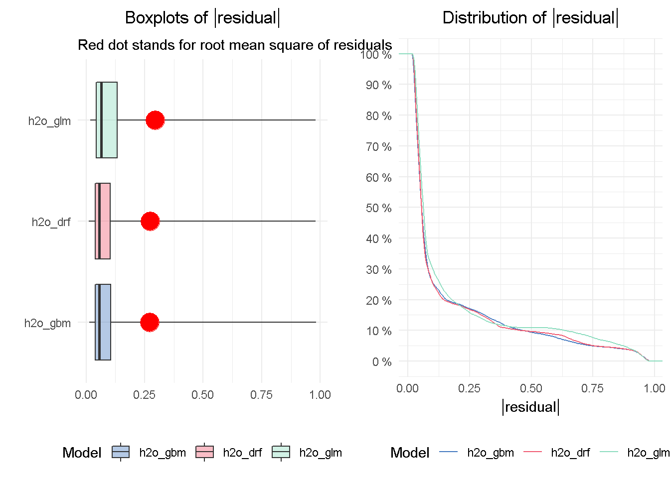
The DRF and GBM models appear to perform on a par with one another, given the median absolute residuals. Looking at the residuals distribution on the right-hand side, you can see that the median residuals are the lowest for these two models, with the GLM seeing a higher number of tail residuals. This is also mirrored by the boxplots on the left-hand side, where the tree-based models both achieve the lowest median absolute residual value.
2 - How do the models compare with one another?
ROC and AUC
The Receiver Operating Characteristic (ROC) curve is a graphical method that allows to visualise a classification model performance against a random guess, which is represented by the striped line on the graph. The curve plots the true positive rate (TPR) on the y-axis against the false positive rate (FPR) on the x-axis.
eva_glm <- DALEX::model_performance(explainer_glm)
eva_dfr <- DALEX::model_performance(explainer_drf)
eva_gbm <- DALEX::model_performance(explainer_gbm)
plot(eva_glm, eva_dfr, eva_gbm, geom = "roc") +
ggtitle("ROC Curves - All Models",
"AUC_glm = 0.750 AUC_drf = 0.799 AUC_gbm = 0.798") +
theme_minimal() +
theme(plot.title = element_text(hjust = 0.5))
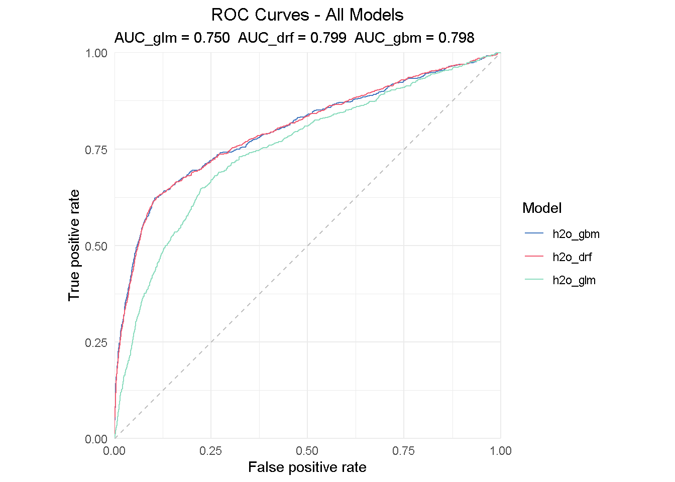
The insight from a ROC curve is two-fold:
Direct read: All models are performing much better than a random guess
Compared read: the AUC (Area Under the Curve) summarises the ROC curve and can be used to directly compare models performance - the perfect classifier would have AUC = 1.
All models performs much better that random guessing and achieves a AUC of .75-.80, with the DRF achieving the highest score of 0.799.
3 - Which variables are important in the models?
Variable importance plots
Each ML algorithm has its own way to assess the importance of each variable: linear models for instance refer to their coefficients, whereas tree-based models look at impurity, which makes it difficult to compare variable importance across models.
DALEX calculates variable importance measures via permutation, which is model agnostics and allows for direct comparison between models of different structure. However, when variable importance scores are based on permutations, we should remember that calculations slow down when the number of features increases.
Once again, I’m passing the “explainer” for each single model to the feature_importance() function and setting n_sample to 8000 to use practically all available observations. Although not exorbitant, the total execution time was nearly 30 minute but this is based on a relatively small dataset and number of variables. Don’t forget that computation speed can be increased by reducing n_sample, which is especially important for larger datasets.
# measure execution time
tictoc::tic()
# compute permutation-based variable importance
vip_glm <- feature_importance(explainer_glm, n_sample = 8000,
loss_function = loss_root_mean_square)
vip_drf <- feature_importance(explainer_drf, n_sample = 8000,
loss_function = loss_root_mean_square)
vip_gbm <- feature_importance(explainer_gbm, n_sample = 8000,
loss_function = loss_root_mean_square)
# show total execution time
tictoc::toc()
## 1663.78 sec elapsed
Now I only have to pass the vip objects to a plotting function: as suggested by the auto-generated x-axis label ( Drop-out loss), the main intuition behind how variable importance is calculated lies in how much the model fit would decrease if the contribution of a selected explanatory variable was removed. The larger the segment, the larger the loss when that variable is dropped from the model.
# plotting top 10 feature only for clarity of reading
plot(vip_glm, vip_drf, vip_gbm, max_vars = 10) +
ggtitle("Permutation variable importance",
"Average variable importance based on 8,000 permutations") +
theme_minimal() +
theme(plot.title = element_text(hjust = 0.5))
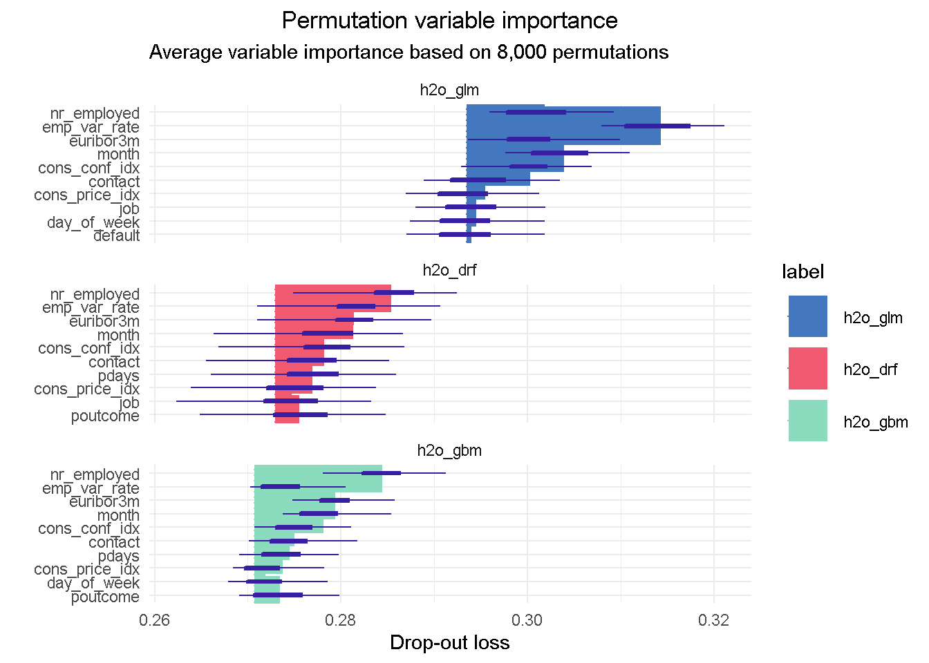
I like this plot as it brings together a wealth of information.
First of all you can notice that, although with slightly different relative weights, the top 5 features are common to each models, with nr_employed ( employed in the economy) being the single most important predictor in all of them. This consistency is reassuring as it tells us that all models are picking up the same structure and interactions in the data, and gives us assurance that these features have strong predictive power.
You can also notice the distinct starting point for the x-axis left edge, which reflects the difference in the RMSE loss between the three models: in this case the elastic net model has the highest RMSE, suggesting the higher number of tail residuals seen earlier in the residual diagnostics is probably penalising the RMSE score.
4 - How does a single variable affect the average prediction?
Partial Dependence profiles
After we have identified the relative predictive power of each variable, we may want to investigate how their relationship with the predicted response differ across all three models. Partial Dependence (PD) plots, sometimes also referred to as PD profiles, offer a great way to inspect how each model is responding to a particular predictor.
We can start with having a look at the single most important feature, nr_employed:
# compute PDP for a given variable
pdp_glm <- model_profile(explainer_glm, variable = "nr_employed", type = "partial")
pdp_drf <- model_profile(explainer_drf, variable = "nr_employed", type = "partial")
pdp_gbm <- model_profile(explainer_gbm, variable = "nr_employed", type = "partial")
plot(pdp_glm$agr_profiles, pdp_drf$agr_profiles, pdp_gbm$agr_profiles) +
ggtitle("Contrastive Partial Dependence Profiles", "") +
theme_minimal() +
theme(plot.title = element_text(hjust = 0.5))
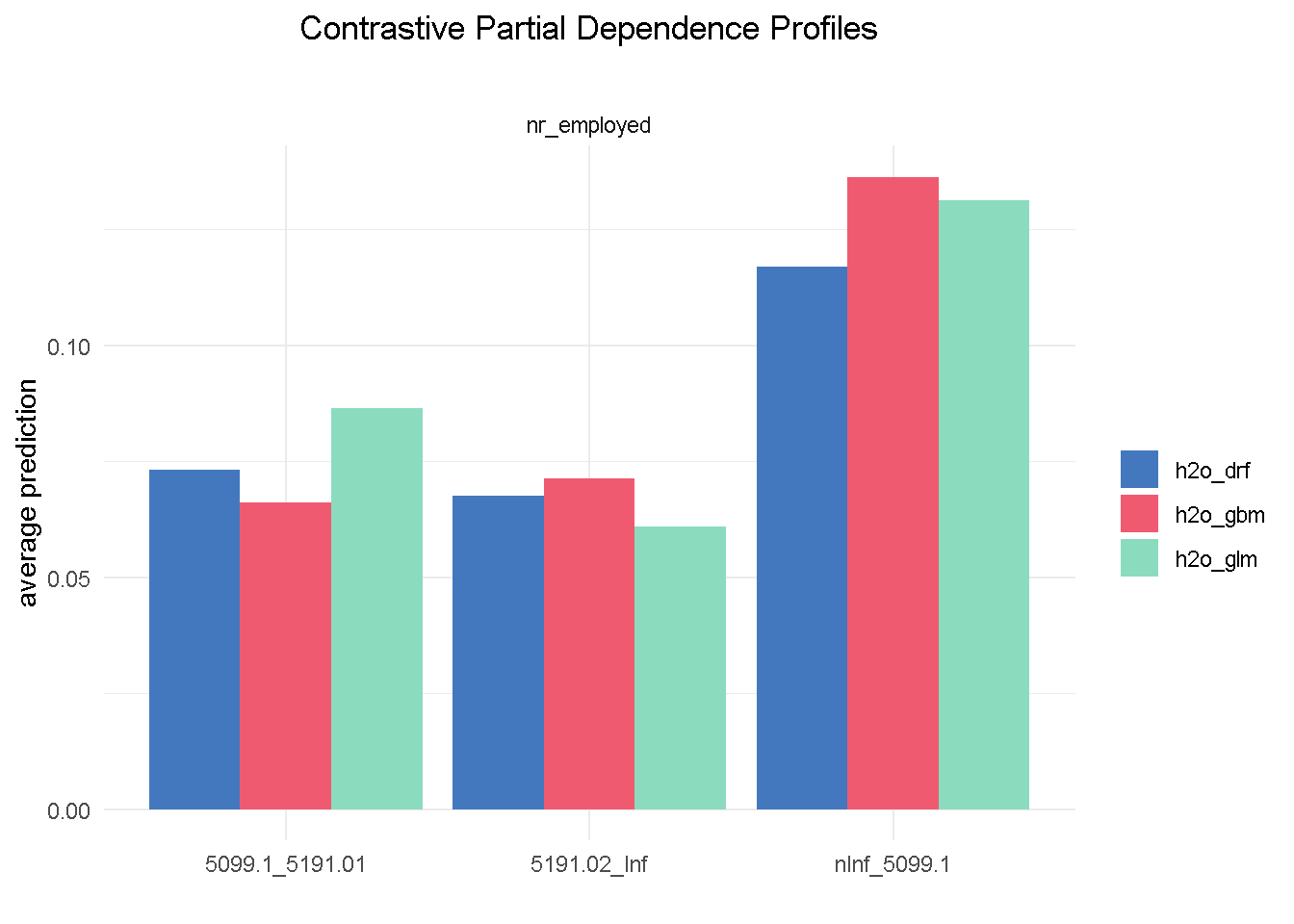
Although with different average prediction weights, all three models found that bank customers are more likely to sigh up to a term deposit when the level of employed in the economy is up to 5.099m (nInf_5099.1). Both elastic net and random forest have found the exact same hierarchy of predictive power among the 3 different levels of nr_employed (less pronounced for the random forest) that we observed in the correlationfunnel analysis, with GBM being the one slightly out of kilter.
Let’s now take a look at age, a predictor that, if you recall from the EDA, was NOT expected to have an impact on the target variable:
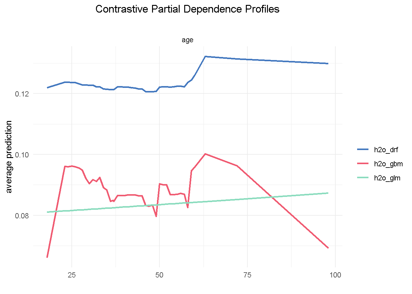
One thing we notice is that the range of variation in the average prediction (x-axis) is relatively shallow across the age spectrum (y-axis), confirming the finding from the exploratory analysis that this variable would have a low predictive power. Also, both GBM and random forest are using age in a non-linear way, whereas the elastic net model is unable to capture this non-linear dynamic.
Partial Dependence plots could also work as a diagnostic tool: looking at poutcome (outcome of the previous marketing campaign) reveals that GBM and random forest correctly picked up on a higher probability of signing up when the outcome of a previous campaign was success (scs).
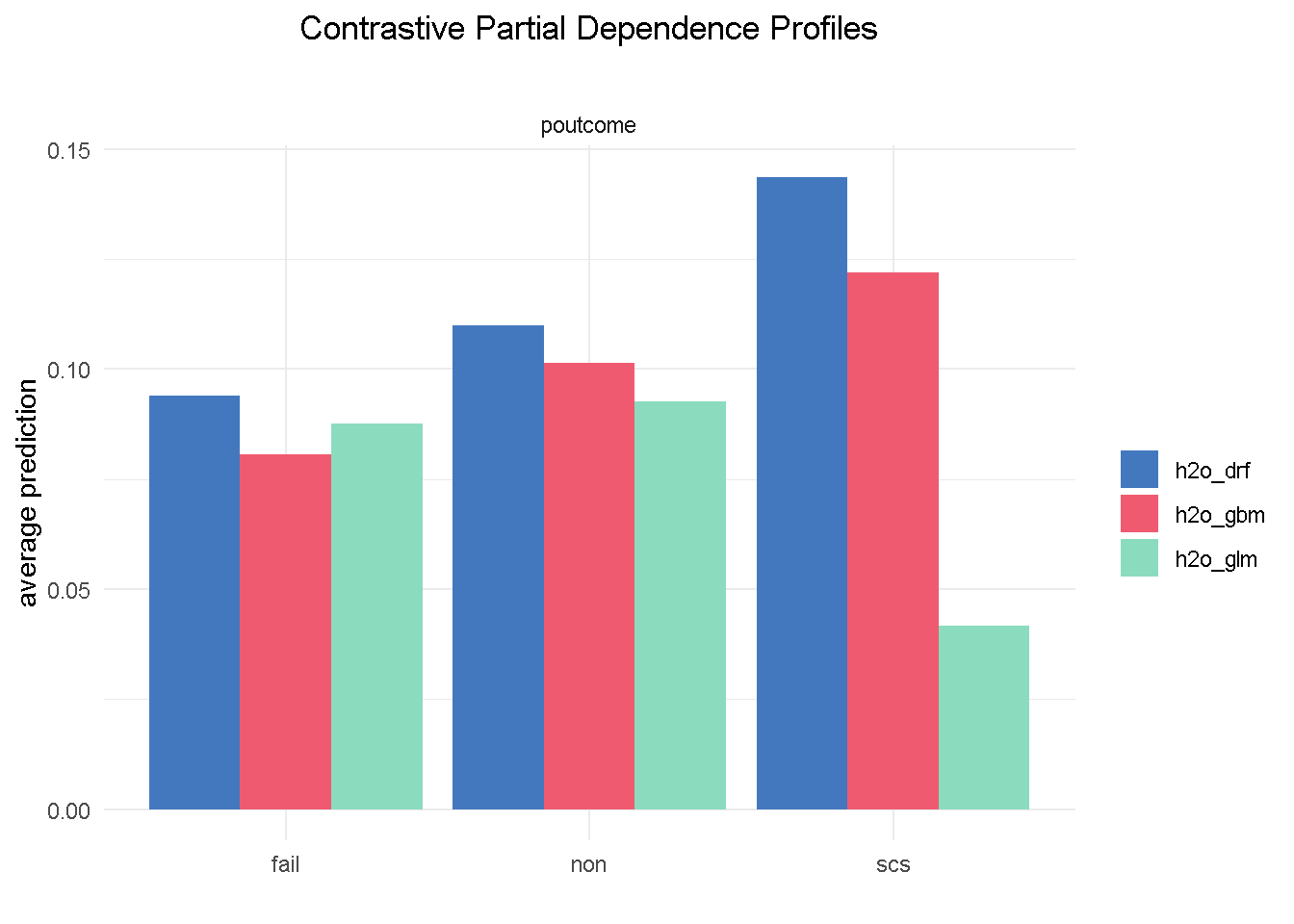
However, the elastic net model fails to do the same, which could represents a serious flaw as success in a previous campaign had a very strong positive correlation with the target variable.
I’m going to finish with the month feature as it offers a great example of one of those cases where you may want to override the model’s outcome with industry knowledge and some common sense. Specifically, the GBM model seems to suggest that March, October and December are periods associated with much better odds of success.
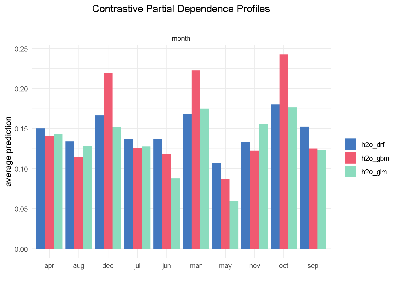
Based on my previous analysis experience of similar financial products, I would not advise a banking organisation to ramp up their direct marketing activity around the weeks in the run to Christmas as this is a period of the year where the consumers’ focus shifts away from this type of purchases.
Final model
All in all random forest is my final model of choice: it appears the more balanced of the three and does not display some of the “oddities” seen with variables like month and poutcome.
I can now further refine my model and reduce its complexity by combining findings from the Exploratory analysis, insight from models’ assessment and a number of industry-specific/common sense considerations.
In particular, my final model:
Excludes a number of features (
age,housing,loan,campaign,cons_price_idx) that have low predictive powerRemoves
previous, which shows little difference between its 2 levels in the PD plot - it’s also moderately correlated withpdays, suggesting that they may be capturing the same behaviourAlso drops
emp_var_ratebecause of its strong correlation withnr_employedand also because conceptually they are controlling for a very similar economic behaviour# response variable remains unaltered y <- "subscribed" # predictors set: remove response variable and 7 predictors x_final <- setdiff(names(train_tbl %>% select(-c(age, housing, loan, campaign, previous, cons_price_idx, emp_var_rate)) %>% as.h2o()), y)
For the final model, I’m using the same specification as to the original random forest
# random forest model
drf_final <-
h2o.grid(
algorithm = "randomForest",
x = x_final,
y = y,
training_frame = train_tbl %>% as.h2o(),
balance_classes = TRUE,
nfolds = 10,
ntrees = 1000,
grid_id = "drf_grid_final",
hyper_params = hyper_params_drf,
search_criteria = search_criteria_all,
seed = 1975
)
Once again, we sort the model by AUC score and retrieve the lead model
# Get the grid results, sorted by AUC
drf_grid_perf_final <-
h2o.getGrid(grid_id = "drf_grid_final",
sort_by = "AUC",
decreasing = TRUE)
# Fetch the top DRF model, chosen by validation AUC
drf_final <-
h2o.getModel(drf_grid_perf_final@model_ids[[1]])
Final model evaluation
For brevity, I am visualising the variable importance plot with the vip() function from the namesake package, which returns the ranked contribution of each variable.
vip::vip(drf_final, num_features = 12) +
ggtitle("Variable Importance", "") +
theme_minimal() +
theme(plot.title = element_text(hjust = 0.5))
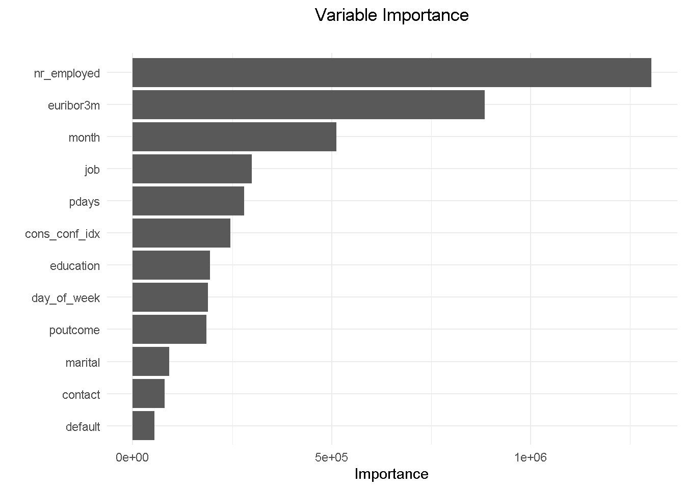
Removing emp_var_rate has allowed education to come into the top 10 features. Understandably, the variables hierarchy and relative predictive power has adjusted and changed slightly but it’s reassuring to see that the other 9 variables were in the previous model’s top 10.
Lastly, I’m comparing the model’s performance with the original random forest model.
drf_final %>% h2o.performance(newdata = test_tbl %>% as.h2o()) %>% h2o.auc()
## [1] 0.7926509
drf_model %>% h2o.performance(newdata = test_tbl %>% as.h2o()) %>% h2o.auc()
## [1] 0.7993973
The AUC has only changed by a fraction of a percent, telling me that the model has maintained its predictive power.
A important observation on Partial Dependence Plots
Being already familiar with odds ratios in the context of a logistic regression, I set out to understand whether the same intuition could be extended to black-box classification models. During my research one very interesting post on Cross Validated stood out for drawing a parallel between odds ratio from decision tree and random forest.
Basically, this tells us that Partial Dependence plots can be used in a similar way to odds ratios to define what characteristics of a customer profile influence his/her propensity to performing a certain type of behaviour.
For example, features like job, month and contact would provide context around who, when and how to target:
Looking at
jobwill tell us that a customer in an admin role is roughly 25% more likely to subscribe that a self employed.Getting in touch with a prospective customer in the
monthof October will more then double the chance of a positive outcome than in May.contactingyour customer on their mobile increases the chances of subscription by nearly a quarter compared to a telephone call.
NOTE THAT Partial Dependence Plots for all final model’s predictors can be found on my webpage: Propensity Modelling - Estimate Several Models and Compare Their Performance Using a Model-agnostic Methodology.
Armed with such insight, one can help shaping overall marketing and communication plans to focus on customers more likely to subscribe to a term deposit.
However, these are based on model-level explainers, which reflect an overall, aggregated view. If you’re interested to understand how a model yields a prediction for a single observation (i.e. what factors influence the likelihood to engage at single customer level), you can resort to the Local Interpretable Model-agnostic Explanations (LIME) method that exploits the concept of a “local model”. I will be exploring the LIME methodology in a future post.
Summary of model estimation and assessment
For the analysis part of this project I opted for h2o as my modelling platform. h2o is not only very easy to use but also has a number of built-in functionalities that help speeding up data preparation: it takes care of class imbalance with no need for pre-modelling resampling, automatically “binarises“ character/factor variables, and implements cross-validation without the need for a separate validation frame to be “carved out” of the training set.
After setting up a random grid to search for best hyper-parameters, I’ve estimated a number of models ( a logistic regression, a random forest and a gradient boosting machines) and used the DALEX library to assess and compare their performance through an array of metrics. This library employs a model-agnostic approach that enables to compare traditional “glass-box” models and “black-box” models on the same scale.
My final model of choice is the random forest, which I further refined by combining findings from the exploratory analysis, insight gathered from the models’ evaluation and a number of industry-specific/common sense considerations. This ensured a reduced model complexity without compromising on predictive power.
Optimising for expected profit
Now that I have my final model, the last piece of the puzzle is the final “So what?” question that puts all into perspective. The estimate for the probability of a customer to sign up for a term deposit can be used to create a number of optimised scenarios, ranging from minimising your marketing expenditure, maximising your overall acquisition targets, to driving a certain number of cross-sell opportunities.
Before I can do that, there are a couple of housekeeping tasks needed to “set up the work scene” and a couple of important concepts to introduce:
the threshold and the F1 score
precision and recall
The threshold and the F1 score
The question the model is trying to answer is “ Has this customer signed up for a term deposit following a direct marketing campaign? “ and the cut-off (a.k.a. the threshold) is the value that divides the predictions into Yes and No.
To illustrate the point, I first calculate some predictions by passing the test_tbl data set to the h2o.performance function.
perf_drf_final <- h2o.performance(drf_final, newdata = test_tbl %>% as.h2o())
perf_drf_final@metrics$max_criteria_and_metric_scores
## Maximum Metrics: Maximum metrics at their respective thresholds
## metric threshold value idx
## 1 max f1 0.189521 0.508408 216
## 2 max f2 0.108236 0.560213 263
## 3 max f0point5 0.342855 0.507884 143
## 4 max accuracy 0.483760 0.903848 87
## 5 max precision 0.770798 0.854167 22
## 6 max recall 0.006315 1.000000 399
## 7 max specificity 0.930294 0.999864 0
## 8 max absolute_mcc 0.189521 0.444547 216
## 9 max min_per_class_accuracy 0.071639 0.721231 300
## 10 max mean_per_class_accuracy 0.108236 0.755047 263
## 11 max tns 0.930294 7342.000000 0
## 12 max fns 0.930294 894.000000 0
## 13 max fps 0.006315 7343.000000 399
## 14 max tps 0.006315 894.000000 399
## 15 max tnr 0.930294 0.999864 0
## 16 max fnr 0.930294 1.000000 0
## 17 max fpr 0.006315 1.000000 399
## 18 max tpr 0.006315 1.000000 399
Like many other machine learning modelling platforms, h2o uses the threshold value associated with the maximum F1 score, which is nothing but a weighted average between precision and recall. In this case the threshold @ Max F1 is 0.190.
Now, I use the h2o.predict function to make predictions using the test set. The prediction output comes with three columns: the actual model predictions (predict), and the probabilities associated with that prediction (p0, and p1, corresponding to No and Yes respectively). As you can see, the p1 probability associated with the current cut-off is around 0.0646.
drf_predict <- h2o.predict(drf_final, newdata = test_tbl %>% as.h2o())
# I converte to a tibble for ease of use
as_tibble(drf_predict) %>%
arrange(p0) %>%
slice(3088:3093) %>%
kable()
| predict | p0 | p1 |
|---|---|---|
| 1 | 0.9352865 | 0.0647135 |
| 1 | 0.9352865 | 0.0647135 |
| 1 | 0.9352865 | 0.0647135 |
| 0 | 0.9354453 | 0.0645547 |
| 0 | 0.9354453 | 0.0645547 |
| 0 | 0.9354453 | 0.0645547 |
However, the F1 score is only one way to identify the cut-off. Depending on our goal, we could also decide to use a threshold that, for instance, maximises precision or recall. In a commercial setting, the pre-selected threshold @ Max F1 may not necessarily be the optimal choice: enter Precision and Recall!
Precision and Recall
Precision shows how sensitive models are to False Positives (i.e. predicting a customer is subscribing when he-she is actually NOT) whereas Recall looks at how sensitive models are to False Negatives (i.e. forecasting that a customer is NOT subscribing whilst he-she is in fact going to do so).
These metrics are very relevant in a business context because organisations are particularly interested in accurately predicting which customers are truly likely to subscribe (high precision) so that they can target them with advertising strategies and other incentives. At the same time they want to minimise efforts towards customers incorrectly classified as subscribing (high recall) who are instead unlikely to sign up.
However, as you can see from the chart below, when precision gets higher, recall gets lower and vice versa. This is often referred to as the Precision-Recall tradeoff.
To fully comprehend this dynamic and its implications, let’s start with taking a look at the cut-off zero and cut-off one points and then see what happens when you start moving the threshold between the two positions:
At threshold zero ( lowest precision, highest recall) the model classifies every customer as
subscribed = Yes. In such scenario, you would contact every single customers with direct marketing activity but waste precious resourses by also including those less likely to subcsribe. Clearly this is not an optimal strategy as you’d incur in a higher overall acquisition cost.Conversely, at threshold one ( highest precision, lowest recall) the model tells you that nobody is likely to subscribe so you should contact no one. This would save you tons of money in marketing cost but you’d be missing out on the additional revenue from those customers who would’ve subscribed, had they been notified about the term deposit through direct marketing. Once again, not an optimal strategy.
When moving to a higher threshold the model becomes more “choosy” on who it classifies as subscribed = Yes. As a consequence, you become more conservative on who to contact ( higher precision) and reduce your acquisition cost, but at the same time you increase your chance of not reaching prospective subscribes ( lower recall), missing out on potential revenue.
The key question here is where do you stop? Is there a “sweet spot” and if so, how do you find it? Well, that will depend entirely on the goal you want to achieve. In the next section I’ll be running a mini-optimisation with the goal to maximise profit.
Finding the optimal threshold
For this mini-optimisation I’m implementing a simple profit maximisation based on generic costs connected to acquiring a new customer and benefits derived from said acquisition. This can be evolved to include more complex scenarios but it would be outside the scope of this exercise.
To understand which cut-off value is optimal to use we need to simulate the cost-benefit associated with each threshold point. This is a concept derived from the Expected Value Framework as seen on Data Science for Business
To do so I need 2 things:
Expected Rates for each threshold - These can be retrieved from the confusion matrix
Cost/Benefit for each customer - I will need to simulate these based on assumptions
Expected rates can be conveniently retrieved for all cut-off points using h2o.metric.
# Get expected rates by cutoff
expected_rates <- h2o.metric(perf_drf_final) %>%
as.tibble() %>%
select(threshold, tpr, fpr, fnr, tnr)
The cost-benefit matrix is a business assessment of the cost and benefit for each of four potential outcomes. To create such matrix I will have to make a few assumptions about the expenses and advantages that an organisation should consider when carrying out an advertising-led procurement drive.
Let’s assume that the cost of selling a term deposits is of £30 per customer. This would include the likes of performing the direct marketing activity (training the call centre reps, setting time aside for active calls, etc.) and incentives such as offering a discounts on another financial product or on boarding onto membership schemes offering benefits and perks. A banking organisation will incur in this type of cost in two cases: when they correctly predict that a customer will subscribe ( true positive, TP), and when they incorrectly predict that a customer will subscribe ( false positive, FP).
Let’s also assume that the revenue of selling a term deposits to an existing customer is of £80 per customer. The organisation will guarantee this revenue stream when the model predicts that a customer will subscribe and they actually do ( true positive, TP).
Finally, there’s the true negative (TN) scenario where we correctly predict that a customer won’t subscribe. In this case we won’t spend any money but won’t earn any revenue.
Here’s a quick recap of the scenarios:
True Positive (TP) - predict will subscribe, and they actually do: COST: -£30; REV £80
False Positive (FP) - predict will subscribe, when they actually wouldn’t: COST: -£30; REV £0
True Negative (TN) - predict won’t subscribe, and they actually don’t: COST: £0; REV £0
False Negative (FN) - predict won’t subscribe, but they actually do: COST: £0; REV £0
I create a function to calculate the expected profit using the probability of a positive case (p1) and the cost/benefit associated with a true positive (cb_tp) and a false positive (cb_fp). No need to include the true negative or false negative here as they’re both zero.
I’m also including the expected_rates data frame created previously with the expected rates for each threshold (400 thresholds, ranging from 0 to 1).
# Function to calculate expected profit
expected_profit_func <- function(p1, cb_tp, cb_fp) {
tibble(
p1 = p1,
cb_tp = cb_tp,
cb_fp = cb_fp
) %>%
# add expected rates
mutate(expected_rates = list(expected_rates)) %>%
unnest() %>%
# calculate the expected profit
mutate(
expected_profit = p1 * (tpr * cb_tp) +
(1 - p1) * (fpr * cb_fp)
) %>%
select(threshold, expected_profit)
}
Multi-Customer Optimization
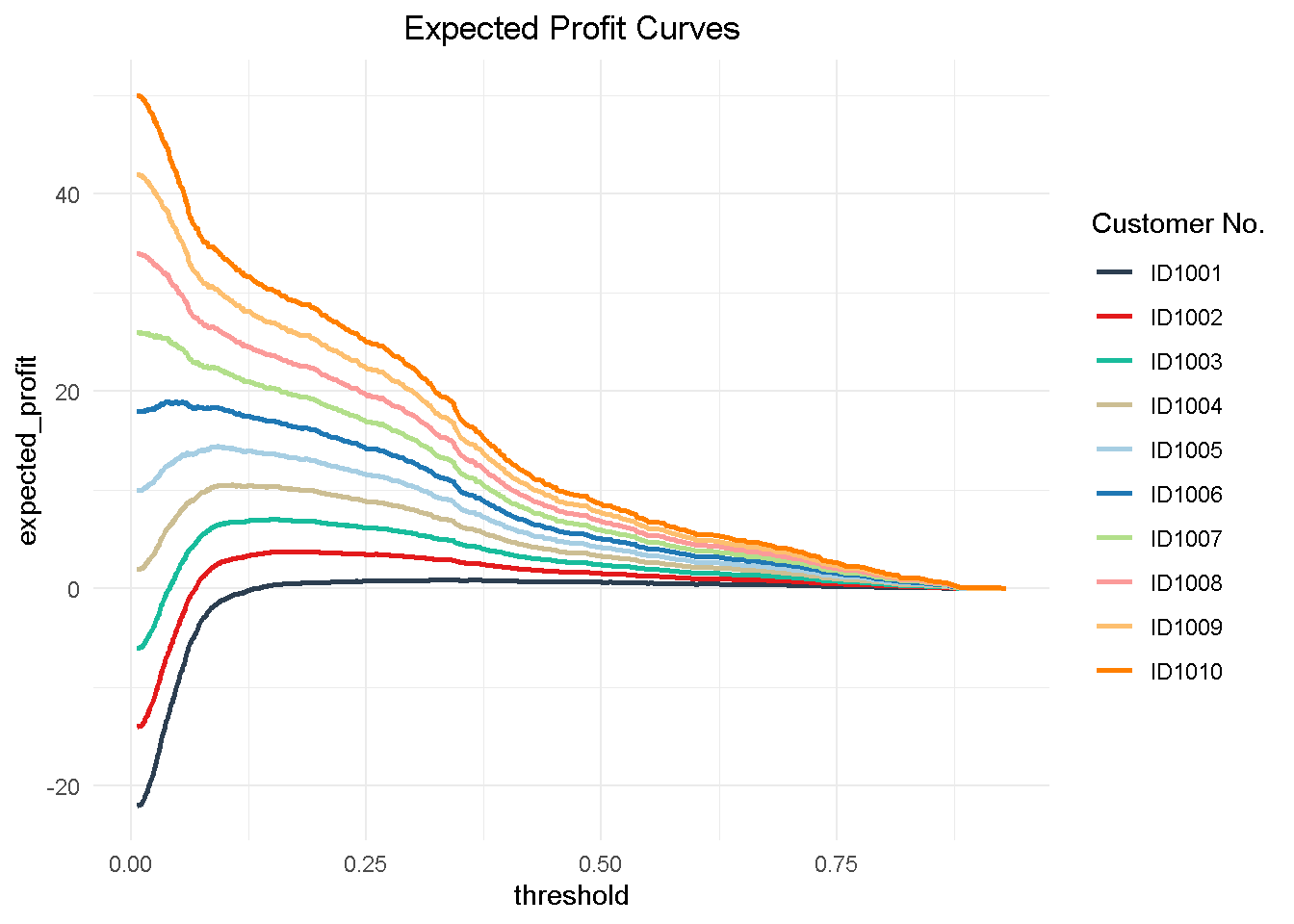
Now to understand how a multi customer dynamic would work, I’m creating a hypothetical 10 customer group to test my function on. This is a simplified view in that I’m applying the same cost and revenue structure to all customers but the cost/benefit framework can be tailored to the individual customer to reflect their separate product and service level set up and the process can be easily adapted to optimise towards different KPIs (like net profit, CLV, number of subscriptions, etc.)
# Ten Hypothetical Customers
ten_cust <- tribble(
~"cust", ~"p1", ~"cb_tp", ~"cb_fp",
'ID1001', 0.1, 80 - 30, -30,
'ID1002', 0.2, 80 - 30, -30,
'ID1003', 0.3, 80 - 30, -30,
'ID1004', 0.4, 80 - 30, -30,
'ID1005', 0.5, 80 - 30, -30,
'ID1006', 0.6, 80 - 30, -30,
'ID1007', 0.7, 80 - 30, -30,
'ID1008', 0.8, 80 - 30, -30,
'ID1009', 0.9, 80 - 30, -30,
'ID1010', 1.0, 80 - 30, -30
)
I use purrr to map the expected_profit_func() to each customer, returning a data frame of expected profit per customer by threshold value. This operation creates a nester tibble, which I have to unnest() to expand the data frame to one level.
# calculate expected profit for each at each threshold
expected_profit_ten_cust <- ten_cust %>%
# pmap to map expected_profit_func() to each item
mutate(expected_profit = pmap(.l = list(p1, cb_tp, cb_fp),
.f = expected_profit_func)) %>%
unnest() %>%
select(cust, p1, threshold, expected_profit)
Then, I can visualize the expected profit curves for each customer.
# Visualising Expected Cost
expected_profit_ten_cust %>%
ggplot(aes(threshold, expected_profit,
colour = factor(cust)),
group = cust) +
geom_line(size = 1) +
theme_minimal() +
tidyquant::scale_color_tq() +
labs(title = "Expected Profit Curves",
colour = "Customer No." ) +
theme(plot.title = element_text(hjust = 0.5))
Finally, I can aggregate the expected profit, visualise the final curve and highlight the optimal threshold.
# Aggregate expected profit by threshold
total_expected_profit_ten_cust <- expected_profit_ten_cust %>%
group_by(threshold) %>%
summarise(expected_profit_total = sum(expected_profit))
# Get maximum optimal threshold
max_expected_profit <- total_expected_profit_ten_cust %>%
filter(expected_profit_total == max(expected_profit_total))
# Visualize the total expected profit curve
total_expected_profit_ten_cust %>%
ggplot(aes(threshold, expected_profit_total)) +
geom_line(size = 1) +
geom_vline(xintercept = max_expected_profit$threshold) +
theme_minimal() +
labs(title = "Expected Profit Curve - Total Expected Profit",
caption = paste0('threshold @ max = ',
max_expected_profit$threshold %>% round(3))) +
theme(plot.title = element_text(hjust = 0.5))
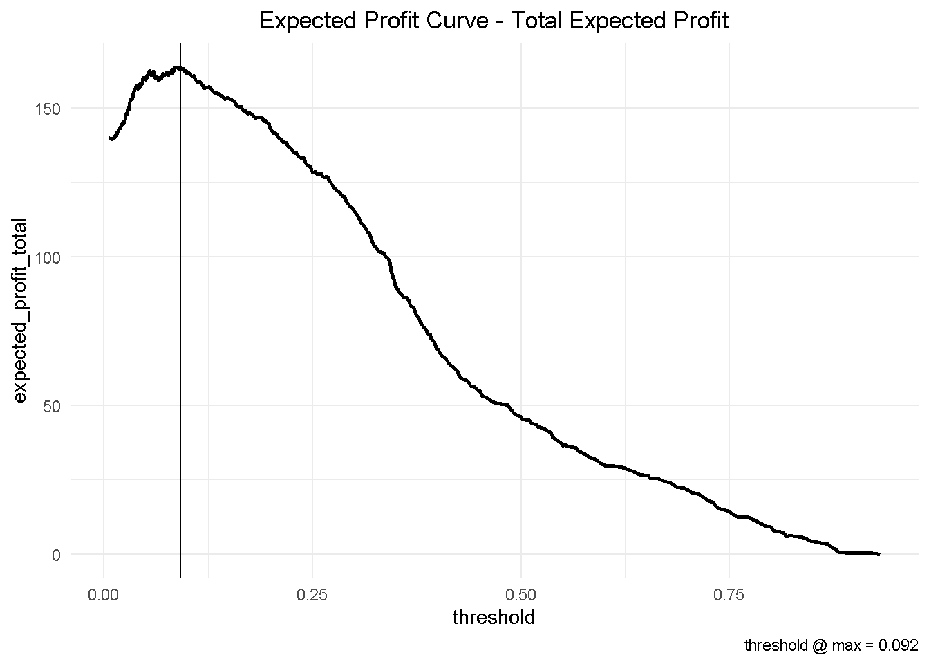
This has some important business implications. Based on our hypothetical 10-customer group, choosing the optimised threshold of 0.092 would yield a total profit of nearly £164 compared to the nearly £147 associated with the automatically selected cut-off of 0.190.
This would result in an additional expected profit of nearly £1.7 per customer. Assuming that we have a customer base of approximately 500,000, switching to the optimised model could generate an additional expected profit of £850k!
total_expected_profit_ten_cust %>%
slice(184, 121) %>%
round(3) %>%
mutate(diff = expected_profit_total - lag(expected_profit_total))
## # A tibble: 2 x 3
## threshold expected_profit_total diff
## <dbl> <dbl> <dbl>
## 1 0.19 147. NA
## 2 0.092 164. 16.9
It is easy to see that, depending on the size of your business, the magnitude of potential profit increase could be a significant.
Closing thoughts
In this project, I use a publicly available dataset to estimate the likelihood of a bank’s existing customers to purchase a financial product following a direct marketing campaign.
Following a thorough exploration and cleansing of the data, I estimate several models and compare their performance and fit to the data using the DALEX library, which focuses on Model-Agnostic Interpretability. One of its key advantages is the ability to compare contributions of traditional “glass-box” models as well as black-box models on the same scale. However, being permutation-based, one of its main drawbacks is that it does not scale well to large number of predictors and larger datasets.
Lastly, I take my final model and implemented a multi-customer profit optimization that reveals a potential additional expected profit of nearly £1.7 per customer (or £850k if you had a 500,000 customer base). Furthermore, I discuss key concepts like the threshold and F1 score and the precision-recall tradeoff and explain why it’s highly important to decide which cutoff to adopt.
After exploring and cleansing the data, fitting and comparing multiple models and choosing the best one, sticking with the default threshold @ Max F1 would be stopping short of the ultimate “so what?” that puts all that hard work into prospective.
One final thing: don’t forget to shut-down the h2o instance when you’re done!
h2o.shutdown(prompt = FALSE)
Code Repository
The full R code and all relevant files can be found on my GitHub profile @ Propensity Modelling
References
For the original paper that used the data set see: A Data-Driven Approach to Predict the Success of Bank Telemarketing. Decision Support Systems, S. Moro, P. Cortez and P. Rita.
To Speed Up Exploratory Data Analysis see: correlationfunnel Package Vignette
For a technically rigorous but applied take on Machine Learning Interpretability see Bradley Boehmke’s Model Interpretability with DALEX
For a in-depth look at tools and techniques to examine fully-trained machine-learning models and compare their performance in a model-agnostic framework see: Explanatory Model Analysis, P. Biecek, T. Burzykowski
For an advanced tutorial on sales forecasting and product backorders optimisation see Matt Dancho’s Predictive Sales Analytics: Use Machine Learning to Predict and Optimize Product Backorders
For the Expected Value Framework see: Data Science for Business