Segmenting with Mixed Type Data - A Case Study Using K-Medoids on Subscription Data
With the new year, I started to look for new employment opportunities and even managed to land a handful of final stage interviews before it all grounded to a halt following the corona-virus pandemic. Invariably, as part of the selection process I was asked to analyse a set of data and compile a number of data driven-recommendations to present in my final meeting.
In this post I retrace the steps I took for one of the take home analysis I was tasked with and revisit clustering, one of my favourite analytic methods. Only this time the set up is a lot closer to a real-world situation in that the data I had to analyse came with a mix of categorical and numerical feature. Simply put, this could not be tackled with a bog-standard K-means algorithm as it’s based on pairwise Euclidean distances and has no direct application to categorical data.
The data
library(tidyverse)
library(readxl)
library(skimr)
library(knitr)
library(janitor)
library(cluster)
library(Rtsne)
The data represents all online acquisitions in February 2018 and their subscription status 3 months later (9th June 2018) for a Fictional News Aggregator Subscription business. It contains a number of parameters describing each account, like account creation date, campaign attributed to acquisition, payment method and length of product trial. A full description of the variables can be found in the Appendix
I got hold of this dataset in the course of a recruitment selection process as I was asked to carry out an analysis and present results and recommendations that could helps improve their products sign up in my final meeting. Although fictitious in nature, I thought it best to further anonimise the dataset by changing names and values of most of the variables as well as removing several features that were of no use to the analysis
The data was raw and required some cleansing and manipulation before it could be used for analysis. You can find the anonimised dataset on my GitHub profile, along with the scripts I used to cleanse the data and perform the analysis
Data Exploration
This is a vital part of any data analysis study, often overlooked in favour of the fancier and “sexier” modelling/playing with the algos. In fact, I find it one of the most creative phases of any project, where you “join the dots” among the different variables and start formulating interesting hypothesis for you to test later on
data_clean <- readRDS("../00_data/data_clean.rds")
Here I’m loading the cleaned data before I explore a selection of the features, run through a number of considerations to set up the analysis as well as show you some of the interesting insight I gathered. You can find the post covering data cleansing and formatting on my webpage @ Segmenting with Mixed Type Data - Initial data inspection and manupulation
In this project I’m also testing quite a few of the adorn_ and the tabyl functions from the janitor library, a family of functions created to help expedite the initial data exploration and cleaning but also very useful to create and format summary tables.
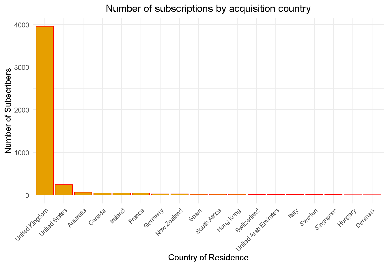
Country of Residence
Let’s start with the geographic distribution of subscribers, the overwhelming majority of whom are UK based
Cancellations
The dynamics of cancellations are definitely something that warrants further investigation (outside the scope of this study). In fact, Failed payments represent roughly 10% of total subscriptions and a staggering 38% when looking at cancellations alone
data_clean %>%
tabyl(canc_reason, status) %>%
adorn_totals(c("row", "col")) %>%
adorn_percentages("col") %>%
adorn_pct_formatting(rounding = "half up", digits = 1) %>%
adorn_ns() %>%
adorn_title("combined") %>%
kable(align = 'c')
| canc_reason/status | Active | Cancelled | Total |
|---|---|---|---|
| - | 100.0% (3510) | 18.1% (224) | 78.6% (3734) |
| Competitor | 0.0% (0) | 1.5% (18) | 0.4% (18) |
| Editorial | 0.0% (0) | 3.6% (44) | 0.9% (44) |
| Failed Payment | 0.0% (0) | 37.9% (469) | 9.9% (469) |
| Lack of time | 0.0% (0) | 19.5% (242) | 5.1% (242) |
| Other | 0.0% (0) | 6.5% (81) | 1.7% (81) |
| Price | 0.0% (0) | 8.2% (101) | 2.1% (101) |
| UX Related | 0.0% (0) | 4.8% (60) | 1.3% (60) |
| Total | 100.0% (3510) | 100.0% (1239) | 100.0% (4749) |
RECOMMENDATION 1: Review causes of high failed payment rate as it could result in a 10% boost in overall subscriptions
Payment Methods
Credit Card is the preferred payment method for over two fifths (61%) of subscribers
data_clean %>%
tabyl(payment_method) %>%
adorn_pct_formatting(rounding = "half up", digits = 1) %>%
arrange(desc(n)) %>%
kable(align = 'c')
| payment_method | n | percent |
|---|---|---|
| Credit Card | 2905 | 61.2% |
| PayPal | 1230 | 25.9% |
| Direct Debit | 614 | 12.9% |
Campaigns
Three acquisition campaigns drove the largest majority of subscriptions in February 2018
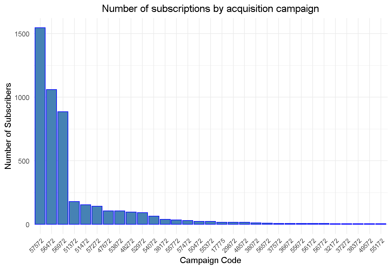
The analysis is going to focus on these top 3 campaigns, which account for over 73% of total acquisitions. Adding additional campaigns to the analysis would likely see them all lumped into one “hybrid” cluster and result in less focused insight.
data_clean %>%
tabyl(campaign_code) %>%
adorn_pct_formatting(rounding = "half up", digits = 1) %>%
arrange(desc(n)) %>%
top_n(10, wt = n) %>%
kable(align = 'c')
| campaign_code | n | percent |
|---|---|---|
| 57572 | 1546 | 32.6% |
| 56472 | 1061 | 22.3% |
| 56972 | 885 | 18.6% |
| 51372 | 178 | 3.7% |
| 51472 | 154 | 3.2% |
| 57272 | 141 | 3.0% |
| 47672 | 104 | 2.2% |
| 53872 | 104 | 2.2% |
| 48272 | 95 | 2.0% |
| 52972 | 92 | 1.9% |
Trial Length
Potential subscribes have a number of options available but the analysis is going to take into account only customers that took the 1-month trial before sign-up.
Given that all acquisitions refer to a particular month and their current status 3 MONTHS LATER, this will ensure a clear cut window for the analysis AND cover the vast majority of subscriptions (nearly 90%)
data_clean %>%
tabyl(trial_length) %>%
adorn_pct_formatting(rounding = "half up", digits = 1) %>%
select(-valid_percent) %>%
kable(align = 'c')
| trial_length | n | percent |
|---|---|---|
| 1M | 4233 | 89.1% |
| 2M | 1 | 0.0% |
| 3M | 95 | 2.0% |
| 6M | 7 | 0.1% |
| NA | 413 | 8.7% |
Product Pricing
Zooming in on the top 3 campaigns for clarity, we can see the two price points of £6.99 for the Standard product and £15 for the Premium one.
Surprisingly, campaign 56472 is attributed to the acquisition of both products. It is good practice to keep acquisition campaigns more closely aligned to a single product as it would ensure better accountability and understanding of acquisition dynamics.
data_clean %>%
filter(campaign_code %in% c('57572', '56472', '56972')) %>%
filter(trial_length == '1M') %>%
group_by(product_group, campaign_code,
contract_monthly_price) %>%
count() %>%
ungroup() %>%
arrange(campaign_code) %>%
kable(align = 'c')
| product_group | campaign_code | contract_monthly_price | n |
|---|---|---|---|
| Standard | 56472 | 6.99 | 1061 |
| Premium | 56972 | 15.00 | 264 |
| Standard | 56972 | 6.99 | 587 |
| Standard | 57572 | 6.99 | 1521 |
Subscription Rate
For the majority of the top 10 campaigns, sign up after trial hovers in the 74-76% range. This offers a good benchmark for the general subscription levels we can expect after trial.
data_clean %>%
# selecting top n campaigns by number of
filter(campaign_code %in% c(
'57572', '56472', '56972', '51372', '57272',
'51472', '47672', '53872', '52972', '54072'
)) %>%
filter(trial_length == '1M') %>%
group_by(campaign_code, status) %>%
count() %>%
ungroup() %>%
# lag to allign past (lagging) obs to present obs
mutate(lag_1 = lag(n, n = 1)) %>%
# sort out NAs
tidyr::fill(lag_1, .direction = "up") %>%
# calculate cancelled to total rate perc difference
mutate(act_to_tot =
(lag_1 / (n + lag_1))) %>%
filter(status == 'Cancelled') %>%
select(campaign_code, act_to_tot) %>%
arrange(desc(campaign_code)) %>%
adorn_pct_formatting(rounding = "half up", digits = 1) %>%
kable(align = 'c')
| campaign_code | act_to_tot |
|---|---|
| 57572 | 75.5% |
| 57272 | 75.6% |
| 56972 | 72.5% |
| 56472 | 75.8% |
| 54072 | 86.4% |
| 53872 | 71.3% |
| 52972 | 73.9% |
| 51472 | 48.1% |
| 51372 | 68.8% |
| 47672 | 74.8% |
The low subscription rate for campaign 51472 may be due to the higher contract price after trial (contract_monthly_price) of £9.65 compared to £6.99 seen for other Standard product contracts.
data_clean %>%
filter(campaign_code == '51472') %>%
filter(trial_length == '1M') %>%
group_by(contract_monthly_price, product_group, campaign_code) %>%
count() %>%
ungroup() %>%
kable(align = 'c')
| contract_monthly_price | product_group | campaign_code | n |
|---|---|---|---|
| 9.65 | Standard | 51472 | 128 |
RECOMMENDATION 2: Investigate different price points for standard product as lower price point could boost take up
Analysis Structure
In this analysis I want to understand what factors make a customer subscribe after a trial and to do so, I need to identify what approach is best suited for the type and cut of data I have at my disposal, and to define a measure of success.
APPROACH: The data is a snapshot in time and as such does not lend itself to any time-based type of analysis. In such cases, one of the best suited approaches to extract insight is
clustering, which is especially good when you have no prior domain knowledge to guide you. However, the fact that data is a mix of categorical and numerical features requires a slightly different approach, which I discuss in the next section.MEASURE: The perfect candidate to measure success is Subscription Rate defined as Active / Total Subscribers. The an focus on 1-month trial subscribers also ensures a clear cut window for analysis as their
statusreflects whether they signed up 3 MONTHS AFTERWARDS.
Methodology
When I started to research cluster analysis with mix categorical and numerical data, I came across an excellent post on Towards Data Science entitled Clustering on mixed type data, from which I borrowed the core analysis coding and adjusted it to my needs. In his article, Thomas Filaire shows how to use the PAM clustering algorithm (Partitioning Around Medoids) to perform the clustering and the silhouette coefficient to select the optimal number of clusters.
The K-medoid, also know as PAM, is a clustering algorithm similar to the more popular K-means algorithm. K-means and K-medoids work in similar ways in that they create groups in your data and work on distances (often referred to as dissimilarities) as they ensure that elements in each group are very similar to one another by minimising the distance within each cluster. However, K-medoids has the advantage of working on distances other than numerical and lends itself well to analyse mixed-type data that include both numerical and categorical features.
I’m going to calculate the dissimilarities between observations with the help of the daisy function from the cluster library, which allows to choose between a number of methods (“euclidean”, “manhattan” and “gower”) to run the calculations. The Gower’s distance (1971) is of particular interest to us as it computes dissimilarities on a [0 1] range regardless of whether the input is numerical or categorical, hence making them comparable.
Clustering
I’m going to segment the subscription data by the following 5 dimensions:
- Status: Active / Cancelled
- Product Group: Standard / Premium
- Top 3 Campaigns by Subscription Numbers: 56472 / 56972 / 57572
- Payment Method: Credit Card / Direct Debit / PayPal
- Contract Monthly Price: £6.99 / £15
I’ll start with selecting the cut of the data I need for the clustering. I’m keeping account_id for my reference but will not pass it to the algorithm.
clust_data <-
data_clean %>%
# filtering by the top 3 campaigns
filter(campaign_code %in% c('57572', '56472', '56972')) %>%
# selecting 1M trial subscriptions
filter(trial_length == '1M') %>%
# select features to cluster by
select(account_id, status, product_group, campaign_code,
contract_monthly_price, payment_method
) %>%
# setting all features as factors
mutate(
account_id = account_id %>% as_factor(),
status = status %>% as_factor(),
product_group = product_group %>% as_factor(),
campaign_code = campaign_code %>% as_factor(),
contract_monthly_price = contract_monthly_price %>% as_factor(),
payment_method = payment_method %>% as_factor()
)
Then, I compute the Gower distance with the daisy function from the cluster package. The “Gower’s distance” would automatically be selected if some features in the data are not numeric but I prefer to spell it out anyway.
gower_dist <-
clust_data %>%
# de-select account_id
select(2:6) %>%
daisy(metric = "gower")
And that’s that! You’re set to go!
Assessing the Clusters
There are a number of methods to establish the optimal number of clusters to use but in this study I’m using the silhouette coefficient, which contrasts the average distance of elements in the same cluster with average distance of elements in other clusters. In other words, each additional cluster is adding “compactness” to the individual segment, bringing their elements closer together, whilst “moving” each cluster further apart from one another.
First, I’m calculating the Partition Around Medoids (a.k.a. PAM) using the pam function from the cluster library. The one number to keep an eye on is the average silhouette width (or avg.width), which I’m storing away in the sil_width parameter.
sil_width <- c(NA)
for (i in 2:8) {
pam_fit <- pam(gower_dist, diss = TRUE, k = i)
sil_width[i] <- pam_fit$silinfo$avg.width
}
In a business context, we want a number of clusters to be both meaningful and easy to handle, (i.e. 2 to 8) and 5-cluster configuration seems a good starting point to investigate.
sil_width %>%
as_tibble() %>%
rowid_to_column() %>%
filter(rowid %in% c(2:8)) %>%
ggplot(aes(rowid, value)) +
geom_line(colour = 'black', size = 0.7) +
geom_point(colour = 'black', size = 1.3) +
theme_minimal() +
labs(title = 'Silhouette Widths of k-medoid Clusters',
x = "Number of clusters",
y = 'Silhouette Width') +
theme(plot.title = element_text(hjust = 0.5))
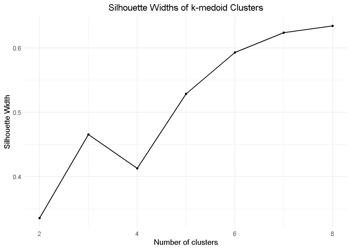
When deciding on the optimal number of clusters, DO NOT rely exclusively on the output of mathematical methods. Make sure you combine it with domain knowledge and your own judgement as often adding an extra segment (say, going from 5 to 6) may only add complexity for no extra insight.
Visualising the Segments with t-SNE
Now that I have a potential optimal number of clusters, I want to visualise them. To do so, I use the t-SNE ( t-distributed stochastic neighbour embedding), a dimensionality reduction technique that assists with cluster visualisation in a similar way to Principal Component Analysis and UMAP.
First, I pull the partitioning data for the 5-cluster configuration from gower_dist
pam_fit <-
gower_dist %>%
# diss = TRUE to treat argument as dissimilarity matrix
pam(k = 5, diss = TRUE)
Then I construct the 2D projection of my 5-dimensional space with Rtsne and plot it
tsne_obj <- Rtsne(gower_dist, is_distance = TRUE)
tsne_obj$Y %>%
data.frame() %>%
setNames(c("X", "Y")) %>%
mutate(cluster = factor(pam_fit$clustering)) %>%
# plot
ggplot(aes(x = X, y = Y, colour = cluster)) +
geom_point() +
theme_light() +
labs(title = 't-SNE 2D Projections of k-medoid Clusters') +
theme(plot.title = element_text(hjust = 0.5))
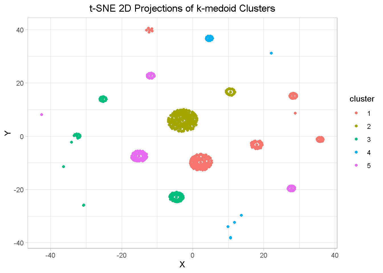
Aside from a few elements, there is a general good separation between clusters as well as closeness of elements within clusters, which confirms the segmentation relevance
Evaluating the Clusters
At this stage of a project you get to appreciate the main difference between Supervised and Unsupervised approaches. With the latter is the algorithm that does all the leg work but it’s still up to you to interpret the results and understand what the algorithm has found.
To properly evaluate the clusters, you want to first pull all information into one tibble that you can easily manipulate. I start by appending the cluster number from the pam_fit list to the clust_data.
pam_results <- clust_data %>%
# append the cluster information onto clust_data
mutate(cluster = pam_fit$clustering) %>%
# sort out variable order
select(account_id, cluster, everything()) %>%
# attach some extra data features from the data_clean file
left_join(select(data_clean,
c(account_id, canc_reason)), by = 'account_id') %>%
mutate_if(is.character, funs(factor(.)))
NOTE THAT I’m also bringing in canc_reason from data_clean, a dimension that I did NOT use in the calculations. It does not always work but sometimes it may reveal patterns you have not explicitly considered.
From experience I found that a very good exercise is to print out the summaries (on screen or paper) of each single cluster - here’s an example for cluster 2.
Lay all the summaries before you and let your inner Sherlock Holmes comes out to play! The story usually unfolds before your very eyes when you start comparing the differences between clusters.
pam_results %>%
filter(cluster == 2) %>%
select(-c(account_id , cluster, contract_monthly_price)) %>%
summary()
| status | product_group | campaign_code | payment_method | canc_reason |
|---|---|---|---|---|
| Cancelled:202 | Standard:900 | 56472: 0 | Direct Debit: 0 | - :738 |
| Active :698 | Premium : 0 | 57572:900 | Credit Card :900 | Failed Payment: 81 |
| 56972: 0 | PayPal : 0 | Lack of time : 46 | ||
| Price : 16 | ||||
| Editorial : 8 | ||||
| Other : 5 | ||||
| (Other) : 6 |
When you have your story, you may want to frame it in a nice table or graph. Here I’m showing the code I used to assemble my own overall summary and then discuss the results but feel free to tailor it to your own taste and needs!
First I calculate subscription rate (my measure of success) and failed payment rate for each cluster…
# subscription rate - my measure of success...
subscr <-
pam_results %>%
group_by(cluster, status) %>%
count() %>%
ungroup() %>%
# lag to allign past (lagging) obs to present obs
mutate(lag_1 = lag(n, n = 1)) %>%
# sort out NAs
tidyr::fill(lag_1, .direction = "up") %>%
# calculate active to total rate perc difference
mutate(sub_rate = (n / (n + lag_1))) %>%
filter(status == 'Active') %>%
select(Cluster = cluster, Subsc.Rate = sub_rate) %>%
adorn_pct_formatting(rounding = "half up", digits = 1)
# ... and failed payment rate
fail_pymt <-
pam_results %>%
group_by(cluster , canc_reason) %>%
count() %>%
ungroup() %>%
group_by(cluster) %>%
mutate(tot = sum(n)) %>%
# calculate failed payment rate to total
mutate(fail_pymt_rate = (n / tot)) %>%
ungroup() %>%
filter(canc_reason == 'Failed Payment') %>%
select(Cluster = cluster, Failed.Pymt.Rate = fail_pymt_rate) %>%
adorn_pct_formatting(rounding = "half up", digits = 1)
Then, I bring all together in a handy table so that we can have a closer look
pam_results %>%
group_by(Cluster = cluster,
Campaign = campaign_code,
Product = product_group,
Mth.Price = contract_monthly_price) %>%
summarise(Cluster.Size = n()) %>%
ungroup() %>%
arrange(Campaign) %>%
# attach subscription rate from subscr
left_join(select(subscr, c(Cluster, Subsc.Rate)), by = 'Cluster') %>%
# attach failed payment rate from fail_pymt
left_join(select(fail_pymt, c(Cluster, Failed.Pymt.Rate)), by = 'Cluster') %>%
kable(align = 'c')
| Cluster | Campaign | Product | Mth.Price | Cluster.Size | Subsc.Rate | Failed.Pymt.Rate |
|---|---|---|---|---|---|---|
| 1 | 56472 | Standard | 6.99 | 1061 | 75.8% | 11.0% |
| 2 | 57572 | Standard | 6.99 | 900 | 77.6% | 9.0% |
| 5 | 57572 | Standard | 6.99 | 621 | 72.5% | 15.0% |
| 3 | 56972 | Standard | 6.99 | 587 | 76.0% | 9.9% |
| 4 | 56972 | Premium | 15 | 264 | 64.8% | 9.5% |
Having focused on the top 3 campaigns was a good tactic and resulted in clear separation of the groups, which meant that the K-medoid discovered sub-groups within 2 campaigns.
Let’s take a look at campaign 57572 first:
cluster 5 has a lower Subscription Rate than most campaigns (74-76%, remember?) AND higher Failed Payment Rate
Further inspection reveals that the lower subscription rate is associated with Direct Debit and PayPal payments
.
pam_results %>%
group_by(Cluster = cluster,
Pymt.Method = payment_method) %>%
summarise(Cluster.Size = n()) %>%
ungroup() %>%
filter(Cluster %in% c(2,5)) %>%
# attach subscription rate from subscr
left_join(select(subscr, c(Cluster, Subsc.Rate)), by = 'Cluster') %>%
kable(align = 'c')
| Cluster | Pymt.Method | Cluster.Size | Subsc.Rate |
|---|---|---|---|
| 2 | Credit Card | 900 | 77.6% |
| 5 | Direct Debit | 165 | 72.5% |
| 5 | PayPal | 456 | 72.5% |
RECOMMENDATION 3: there may be potential to incentivise Credit Card payments as they seem to associate with higher Subscription Rate
Let’s move on to campaign 56972:
We already found this campaign is attributed to acquisition of both products, and has a lower overall subscription rate of 72.5% if compared to our benchmark of 74-76%
K-medoid split this out into two groups, revealing that premium product has a lower subscription rate than its standard counterpart
| Cluster | Campaign | Product | Mth.Price | Cluster.Size | Subsc.Rate | Failed.Pymt.Rate |
|---|---|---|---|---|---|---|
| 1 | 56472 | Standard | 6.99 | 1061 | 75.8% | 11.0% |
| 2 | 57572 | Standard | 6.99 | 900 | 77.6% | 9.0% |
| 5 | 57572 | Standard | 6.99 | 621 | 72.5% | 15.0% |
| 3 | 56972 | Standard | 6.99 | 587 | 76.0% | 9.9% |
| 4 | 56972 | Premium | 15 | 264 | 64.8% | 9.5% |
RECOMMENDATION 4: there may be potential to investigate different price points for Premium product that could help boost take up
RECOMMENDATION 5: acquisition campaigns should be more closely aligned to a single product to ensure accountability and better understanding of acquisition dynamics
Summary of recommendations
Review and solve high failed payment rate - This could result in a 10% potential boost in overall subscriptions
Incentivise credit card payments - Subscriptions associated with this means of payment have a higher sign up rate that other payments methods
Investigate different price points for both standard & premium products - Lower price point could boost take up
Keep campaigns more closely aligned to product - This would ensure better accountability and understanding of acquisition dynamics
Closing thoughts
In this project I revisited clustering, one of my favourite analytic methods, to explore and analyse a real-world dataset that included a mix of categorical and numerical feature. This required a different approach from the classical K-means algorithm that cannot be no directly applied to categorical data.
Instead, I used the K-medoids algorithm, also known as PAM (Partitioning Around Medoids), that has the advantage of working on distances other than numerical and lends itself well to analyse mixed-type data.
The silhouette coefficient helped to establish the optimal number of clusters, whilst t-SNE ( t-distributed stochastic neighbour embedding), a dimensionality reduction technique akin Principal Component Analysis and UMAP, unveiled good separation between clusters as well as closeness of elements within clusters, confirming the segmentation relevance.
Finally, I condensed the insight generated from the analysis into a number of actionable and data-driven recommendations that, applied correctly, could help improve product sign up.
Code Repository
The full R code and all relevant files can be found on my GitHub profile @ K Medoid Clustering
References
For the article that inspired my foray into K-medois clustering see this excellent TDS post by Thomas Filaire: Clustering on mixed type data
For a tidy and fully-featured approach to counting things, see the tabyls Function Vignette
Appendix
Table 1 – Variable Definitions
| Attribute | Description |
|---|---|
| Account ID | Unique account ID |
| Created Date | Date of original account creation |
| Country | Country of account holder |
| Status | Current status - active/inactive |
| Product Group | Product type |
| Payment Frequency | Most subscriptions are a 1 year contract term - payable annually or monthly |
| Campaign Code | Unique identifier for campaign attributed to acquisition |
| Start Date | Start date of the trial |
| End Date | Scheduled end of term |
| Cancellation Date | Date of instruction to cancel |
| Cancellation Reason | Reason given for cancellation |
| Monthly Price | Current monthly price of subscription |
| Contract Monthly Price | Price after promo period |
| Trial Length | Length of trial |
| Trial Monthly Price | Price during trial |
| Payment Method | Payment method |