Time Series Machine Learning Analysis and Demand Forecasting with H2O & TSstudio
Traditional approaches to time series analysis and forecasting, like Linear Regression, Holt-Winters Exponential Smoothing, ARMA/ARIMA/SARIMA and ARCH/GARCH, have been well-established for decades and find applications in fields as varied as business and finance (e.g. predict stock prices and analyse trends in financial markets), the energy sector (e.g. forecast electricity consumption) and academia (e.g. measure socio-political phenomena).
In more recent times, the popularisation and wider availability of open source frameworks like Keras, TensorFlow and scikit-learn helped machine learning approaches like Random Forest, Extreme Gradient Boosting, Time Delay Neural Network and Recurrent Neural Network to gain momentum in time series applications. These techniques allow for historical information to be introduced as input to the model through a set of time delays.
The advantage of using machine learning models over more traditional methods is that they can have higher predictive power, especially when predictors have a clear causal link to the response. Moreover, they can handle complex calculations over larger numbers of inputs much faster.
However, they tend to have a wider array of tuning parameters, are generally more complex than “classic” models, and can be expensive to fit, both in terms of computing power and time. To top it off, their black box nature makes their output harder to interpret and has given birth to the ever growing field of Machine Learning interpretability (I am not going to touch on this as it’s outside the scope of the project)
Project structure
In this project I am going to explain in detail the various steps needed to model time series data with machine learning models.
These include:
exploratory time series analysis
feature engineering
models training and validation
comparison of models performance and forecasting
In particular, I use TSstudio to carry out a “traditional” time series exploratory analysis to describe the time series and its components and show how to use the insight I gather to create features for a machine learning pipeline to ultimately generate a weekly revenue forecast.
For modelling and forecasting I’ve chosen the high performance, open source machine learning library H2O. I am fitting an assorted selection of machine learning models such as Generalised Linear Model, Gradient Boosting Machine and Random Forest and also using AutoML for automatic machine learning, one of the most exciting features of the H2O library.
The data
library(tidyverse)
library(lubridate)
library(readr)
library(TSstudio)
library(scales)
library(plotly)
library(h2o)
library(vip)
library(gridExtra)
library(knitr)
The dataset I’m using here accompanies a Redbooks publication and is available as a free download in the Additional Material section. The data covers 3 & 1⁄2 years worth of sales orders for the Sample Outdoors Company, a fictitious B2B outdoor equipment retailer enterprise and comes with details about the products they sell as well as their customers (which in their case are retailers). Due to its artificial nature, the series presents a few oddities and quirks, which I am going to point out throughout this project.
Here I’m simply loading up the compiled dataset but if you want to follow along I’ve also written a number of posts where I show how I’ve assembled the various data feeds and sorted out variable names, new features creation and some general housekeeping tasks. There is a version for those that prefer to handle data in excel using R and one where I fetch the data by linking R to a PosgreSQL database.
# Import orders
orders_tmp <-
read_rds("orders_tbl.rds")
You can find the full code on my Github repository.
Initial exploration
Time series data have a set of unique features, like timestamp, frequency and cycle/period, that have applications for both descriptive and predictive analysis. R provides several classes to represent time series objects (xts and zoo to name but the main ones), but to cover the descriptive analysis for this project I’ve chosen to use the ts class, which is supported by the TSstudio library.
TSstudio comes with some very useful functions for interactive visualization of time series objects. And I really like the fact that this library uses plotly as its visualisation engine!
First of all, I select the data I need for my analysis (order_date and revenue in this case) and aggregate it to a weekly frequency. I mark this dataset with a _tmp suffix to denote that is a temporary version and a few steps are still needed before it can be used.
revenue_tmp <-
orders_tmp %>%
# filter out final month of the series, which is incomplete
filter(order_date <= "2007-06-25") %>%
select(order_date, revenue) %>%
mutate(order_date =
floor_date(order_date,
unit = 'week',
# setting up week commencing Monday
week_start = getOption("lubridate.week.start", 1))) %>%
group_by(order_date) %>%
summarise(revenue = sum(revenue)) %>%
ungroup()
revenue_tmp %>% str()
## Classes 'tbl_df', 'tbl' and 'data.frame': 89 obs. of 2 variables:
## $ order_date: Date, format: "2004-01-12" "2004-01-19" ...
## $ revenue : num 58814754 13926869 55440318 17802526 52553592 ...
The series spans across 3 & 1⁄2 years worth of sales orders so I should expect to have at least 182 data point but there are only 89 observations!
Let’s take a closer look to see what’s happening:
revenue_tmp %>% head(10)
## # A tibble: 10 x 2
## order_date revenue
## <date> <dbl>
## 1 2004-01-12 58814754.
## 2 2004-01-19 13926869.
## 3 2004-02-09 55440318.
## 4 2004-02-16 17802526.
## 5 2004-03-08 52553592.
## 6 2004-03-15 23166647.
## 7 2004-04-12 39550528.
## 8 2004-04-19 25727831.
## 9 2004-05-10 41272154.
## 10 2004-05-17 33423065.
A couple of things to notice here: this series presents an unusual weekly pattern, with sales logged twice a month on average. Also, the first week of 2004 has no sales logged against it.
To carry out time series analysis with ts objects I need to make sure that I have a full 52 weeks in each year, which should also include weeks with no sales.
So before converting my data to a ts object I need to:
Add 1 observation at the beginning of the series to insure that the first year includes 52 weekly observations
All is arranged in chronological order. This is especially important because the output may not be correctly mapped to the actual index of the series, leading to inaccurate results.
Fill the gaps in incomplete datetime variables. The
padfunction from thepadrlibrary inserts a record for each of the missing time points (the default fill value is NA)Replace missing values with a zero as there are no sales recorded against the empty weeks. The
fill_by_valuefunction from thepadrlibrary helps with that.
.
revenue_tbl <-
revenue_tmp %>%
rbind(list('2004-01-05', NA, NA)) %>%
arrange(order_date) %>%
padr::pad() %>%
padr::fill_by_value(value = 0)
revenue_tbl %>% summary()
## order_date revenue
## Min. :2004-01-05 Min. : 0
## 1st Qu.:2004-11-15 1st Qu.: 0
## Median :2005-09-26 Median : 0
## Mean :2005-09-26 Mean :24974220
## 3rd Qu.:2006-08-07 3rd Qu.:52521082
## Max. :2007-06-18 Max. :93727081
Now I can take a look at weekly revenue, my response variable
revenue_tbl %>%
ggplot(aes(x = order_date, y = revenue)) +
geom_line(colour = 'darkblue') +
theme_light() +
scale_y_continuous(labels = scales::dollar_format(scale = 1e-6,
suffix = "m")) +
labs(title = 'Weekly Revenue - 2004 to June 2007',
x = "",
y = 'Revenue ($m)')
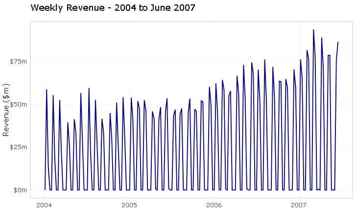
As already mentioned, the series is artificially generated and does not necessarily reflect what would happen in a real-life situation. If this was an actual analytics consulting project, I would most definitely question the odd weekly sales frequency with my client.
But assuming that this is the real deal, the challenge here is to construct a thought-through selection of meaningful features and test them on a few machine learning models to find one that can to produce a good forecast.
CHALLENGE EXCEPTED!
Exploratory analysis
In this segment I am exploring the time series, examining its components and seasonality structure, and carry out a correlation analysis to identify the main characteristics of the series.
Before I can change my series into a ts object, I need to define the start (or end) argument of the series. I want the count of weeks to start with the first week of the year, which ensures that all aligns with the ts framework.
start_point_wk <- c(1,1)
start_point_wk
## [1] 1 1
I create the ts object by selecting the response variable (revenue) as the data argument and specifying a frequency of 52 weeks.
ts_weekly <-
revenue_tbl %>%
select(revenue) %>%
ts(start = start_point_wk,
frequency = 52)
ts_info(ts_weekly)
## The ts_weekly series is a ts object with 1 variable and 181 observations
## Frequency: 52
## Start time: 1 1
## End time: 4 25
Checking the series attributes with the ts_info() function shows that the series is a weekly ts object with 1 variable and 181 observations.
Time series components
Let’s now plot our time series with the help of TSstudio’s graphic functions.
ts_decompose breaks down the series into its elements: Trend, Seasonality, and Random components.
ts_decompose(ts_weekly, type = 'additive')
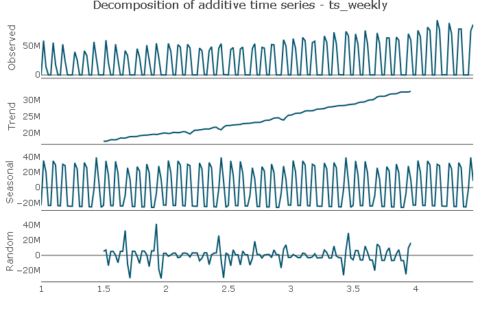
Trend: The series does not appear to have a cyclical component but shows a distinct upward trend. The trend is potentially not linear, which I will try to capture by including a squared trend element in the features.
Seasonal: the plot shows a distinct seasonal pattern, which I will explore next.
Random: The random component appears to be randomly distributed.
Seasonal component
Let’s now zoom in on the seasonal component of the series
ts_seasonal(ts_weekly, type = 'normal')
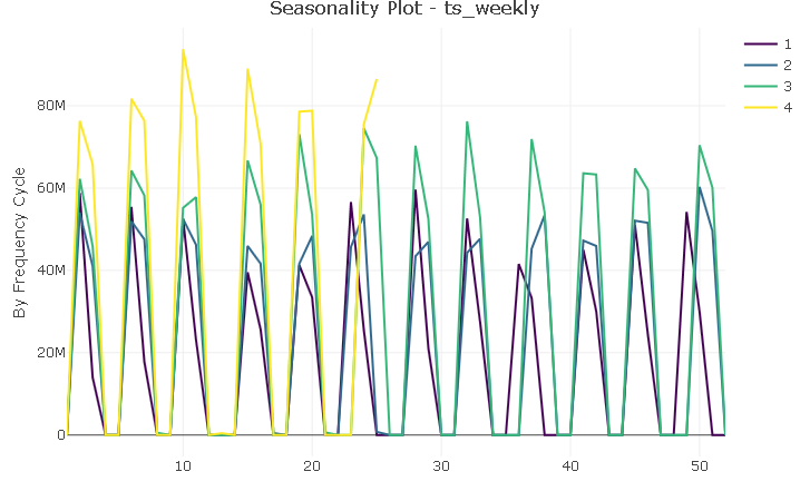
Although there are 12 distinct “spikes” (one for each month of the year), the plot does not suggest the presence of a canonical seasonality. However, with very few exceptions, sales are logged on the same weeks each year and I will try to capture that regularity with a feature variable.
Correlation analysis
The autocorrelation function (ACF) describes the level of correlation between the series and its lags.
Due to the odd nature of the series at hand, the AC plot is not very straightforward to read and interpret: it shows that there is a lag structure but due to the noise in the series it’s difficult to pick up a meaningful pattern.
ts_acf(ts_weekly, lag.max = 52)
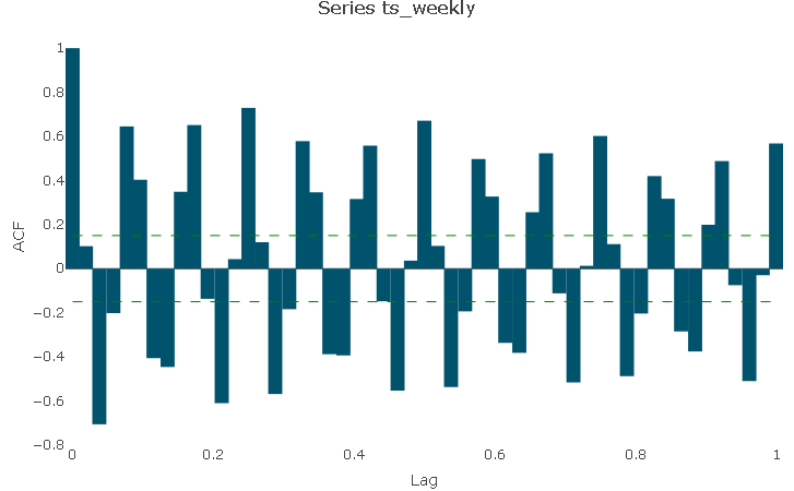
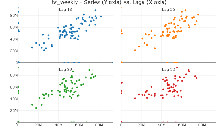
However, I can make use of Lag Visualizations and play with the lag number to identify potential correlation between the series and it lags.
In this case, aligning the number of weeks to a quarterly frequency shows a distinct linear relationship with quarterly lags. For simplicity, I will only include lag 13 in the models to control for the effect of level of sales during the last quarter.
ts_lags(ts_weekly, lags = c(13, 26, 39, 52))
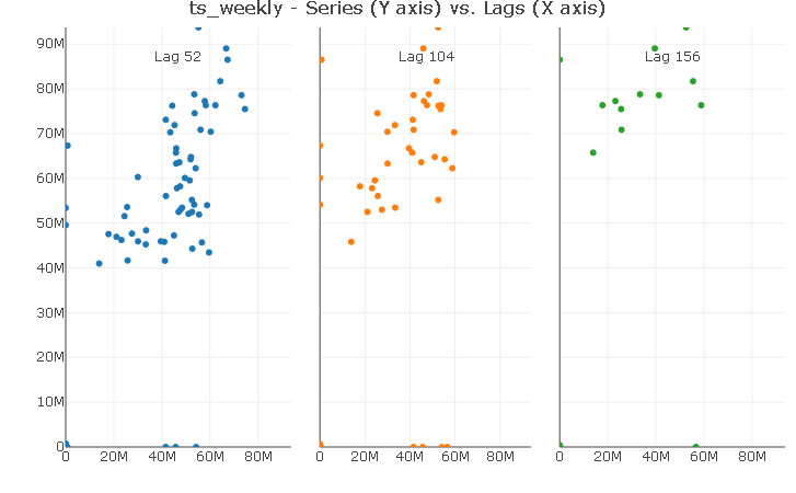
Using the same trick reveals a strong linear relationship with the first yearly lag. Again, I will include only a lag 52 in the models.
ts_lags(ts_weekly, lags = c(52, 104, 156))
Summary of exploratory analysis
The series has a 2-week-on, 2-week-off purchase frequency with no canonical seasonality. However, sales are logged roughly on the same weeks each year, with very few exceptions.
The series does not appear to have a cyclical component but shows a clear upward trend as well as potentially a not linear trend.
ACF was difficult to interpret due to the noisy data but the lag plots hint at a yearly and quarterly lag structure.
.
Modelling
The modelling and forecasting strategy is to:
train and cross-validate all models up to and including Q1 2007 and compare their in-sample predictive performance using Q1 2007.
pretend I do not have data for Q2 2007, generate a forecast for that period using all fitted models, and compare their forecasts performance against Q2 2007 actuals
Below you find a visual representation of the strategy. I find from experience that supporting explanations with a good visualisation is a great way to bring your points to life, especially when working with time series analysis.
All models accuracy will be compared with performance metrics and actual vs predicted plots.
The performance metrics I am going to be using are:
the R^2 is a goodness-of-fit metric that explains in percentage terms the amount of variation in the response variable that is due to variation in the feature variables.
the RMSE (or Root Mean Square Error) is the standard deviation of the residuals and measures the average magnitude of the prediction error. Basically, it tells you how spread out residuals are.
.
revenue_tbl %>%
filter(order_date >= "2005-01-03") %>%
ggplot(aes(order_date, revenue)) +
geom_line(colour = 'black', size = 0.7) +
geom_point(colour = 'black', size = 0.7) +
geom_smooth(se = FALSE, colour = 'red', size = 1, linetype = "dashed") +
theme_light() +
scale_y_continuous(limits = c(0, 11.5e7),
labels = scales::dollar_format(scale = 1e-6, suffix = "m")) +
labs(title = 'Weekly Revenue - 2005 to June 2007',
subtitle = 'Train, Test and Forecast Data Portions',
x = "",
y = 'Revenue ($m)') +
# Train Portion
annotate(x = ymd('2005-12-01'), y = (10.5e7), fill = 'black',
'text', label = 'Train\nPortion', size = 2.8) +
# Test Portion
annotate(x = ymd('2007-02-05'), y = (10.5e7),
'text', label = 'Test\nPortion', size = 2.8) +
geom_rect(xmin = as.numeric(ymd('2006-12-18')),
xmax = as.numeric(ymd('2007-03-25')),
ymin = -Inf, ymax = Inf, alpha = 0.005,
fill = 'darkturquoise') +
# Forecast Portion
annotate(x = ymd('2007-05-13'), y = (10.5e7),
'text', label = 'Forecast\nPortion', size = 2.8) +
geom_rect(xmin = as.numeric(ymd('2007-03-26')),
xmax = as.numeric(ymd('2007-07-01')),
ymin = -Inf, ymax = Inf, alpha = 0.01,
fill = 'cornflowerblue')
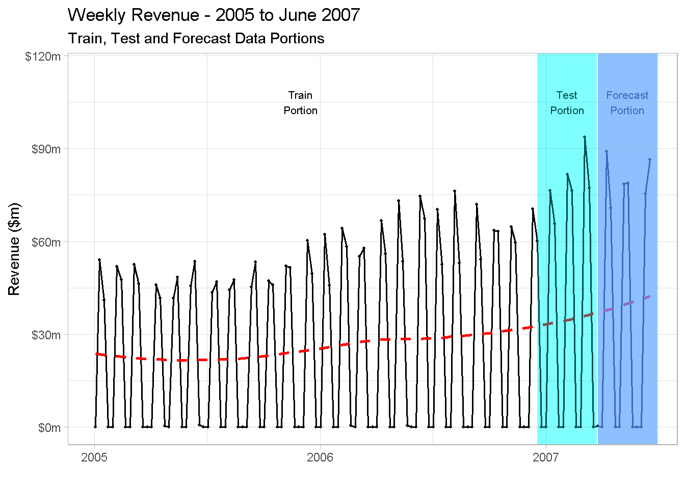
A very important remark: as you can see, I’m not showing 2004 data in the plot. This is because, whenever you include a lag variable in your model, the first period used to calculate the lag “drop off” the dataset and won’t be available for modelling. In the case of a yearly lag, all observations “shift” one year ahead, and as there are no sales recorder for 2003, this results in the first 52 weeks being dropped from the analysis.
Feature creation
Now I can start to incorporate the findings from the Time Series exploration in my feature variables. I do that by creating:
Trend features: (a trend and trend squared ). this is done with a simple numeric index to control for the upward trend and the potential non-linear trend.
Lag features: (a _lag13 and _lag52) to capture the observed correlation of revenue with its quarterly and yearly seasonal lags.
Seasonal feature to deal with the 2-week-on, 2-week-off purchase frequency
model_data_tbl <-
revenue_tbl %>%
mutate(trend = 1:nrow(revenue_tbl),
trend_sqr = trend^2,
rev_lag_13 = lag(revenue, n = 13),
rev_lag_52 = lag(revenue, n = 52),
season = case_when(revenue == 0 ~ 0,
TRUE ~ 1)
) %>%
filter(!is.na(rev_lag_52))
The next step is to create the train, test and forecast data frames.
As a matter of fact, the test data set is not strictly required because H2O allows for multi-fold cross validation to be automatically implemented.
However, as hinted at in the previous paragraph, I’m “carving off” a test set from the train data for the sake of evaluating and comparing the in-sample performance of the fitted models.
train_tbl <-
model_data_tbl %>%
filter(order_date <= "2007-03-19")
test_tbl <-
model_data_tbl %>%
filter(order_date >= "2006-10-02" &
order_date <= "2007-03-19")
train_tbl %>% head()
## # A tibble: 6 x 7
## order_date revenue trend trend_sqr rev_lag_13 rev_lag_52 season
## <date> <dbl> <int> <dbl> <dbl> <dbl> <dbl>
## 1 2005-01-03 0 53 2809 0 0 0
## 2 2005-01-10 54013487. 54 2916 45011429. 58814754. 1
## 3 2005-01-17 40984715. 55 3025 30075259. 13926869. 1
## 4 2005-01-24 0 56 3136 0 0 0
## 5 2005-01-31 0 57 3249 0 0 0
## 6 2005-02-07 51927116. 58 3364 51049952. 55440318. 1
The main consideration when creating a forecast data set revolves around making calculated assumptions on the likely values and level for the predictor variables
When it comes to the
trendfeatures, I simply select them from the _model_datatbl dataset. They are based on the numeric index and are fine as they areGiven that weeks with orders are almost all aligned year in, year out (remember the exploratory analysis?) I am setting
seasonandrev_lag_52equal to their values a year earlier (52 weeks earlier)The value of
rev_lag_13is set equal to its value during the previous quarter (i.e. Q1 2007)
.
forecast_tbl <-
model_data_tbl %>%
filter(order_date > "2007-03-19") %>%
select(order_date:trend_sqr) %>%
cbind(season = model_data_tbl %>%
filter(between(order_date,
as.Date("2006-03-27"),
as.Date("2006-06-19"))) %>%
select(season),
rev_lag_52 = model_data_tbl %>%
filter(between(order_date,
as.Date("2006-03-27"),
as.Date("2006-06-19"))) %>%
select(rev_lag_52),
rev_lag_13 = model_data_tbl %>%
filter(between(order_date,
as.Date("2006-12-25"),
as.Date("2007-03-19"))) %>%
select(rev_lag_13)
)
forecast_tbl %>% head()
## order_date revenue trend trend_sqr season rev_lag_52 rev_lag_13
## 1 2007-03-26 449709 169 28561 0 0.0 0
## 2 2007-04-02 0 170 28900 0 0.0 0
## 3 2007-04-09 89020602 171 29241 1 45948859.7 63603122
## 4 2007-04-16 70869888 172 29584 1 41664162.8 63305793
## 5 2007-04-23 0 173 29929 0 480138.8 0
## 6 2007-04-30 0 174 30276 0 0.0 0
Modelling with H2O
Finally, I am ready to start modelling!
H2O is a high performance, open source library for machine learning applications and works on distributed processing, which makes it suitable for smaller in-memory project and can quikly scale up with external processing power for larger undertaking.
It’s Java-based, has dedicated interfaces with both R and Python and incorporates many supervised and unsupervised machine learning models. In this project I am focusing in particular on 4 algorithms:
Generalised Linear Model (GLM)
Random Forest (RF)
Gradient Boosting Machine (GBM)
I’m also using the AutoML facility and use the leader model to compare performance
First things first: start a H2O instance!
When R starts H2O through the h2o.init command, I can specify the size of the memory allocation pool cluster. To speed things up a bit, I set it to “16G”.
h2o.init(max_mem_size = "16G")
## H2O is not running yet, starting it now...
##
## Note: In case of errors look at the following log files:
## C:\Users\LENOVO\AppData\Local\Temp\RtmpSWW88g/h2o_LENOVO_started_from_r.out
## C:\Users\LENOVO\AppData\Local\Temp\RtmpSWW88g/h2o_LENOVO_started_from_r.err
##
##
## Starting H2O JVM and connecting: . Connection successful!
##
## R is connected to the H2O cluster:
## H2O cluster uptime: 4 seconds 712 milliseconds
## H2O cluster timezone: Europe/Berlin
## H2O data parsing timezone: UTC
## H2O cluster version: 3.26.0.10
## H2O cluster version age: 2 months and 4 days
## H2O cluster name: H2O_started_from_R_LENOVO_xwx278
## H2O cluster total nodes: 1
## H2O cluster total memory: 14.22 GB
## H2O cluster total cores: 4
## H2O cluster allowed cores: 4
## H2O cluster healthy: TRUE
## H2O Connection ip: localhost
## H2O Connection port: 54321
## H2O Connection proxy: NA
## H2O Internal Security: FALSE
## H2O API Extensions: Amazon S3, Algos, AutoML, Core V3, TargetEncoder, Core V4
## R Version: R version 3.6.1 (2019-07-05)
I also prefer to switch off the progress bar as in some cases the output message can be quite verbose and lengthy.
h2o.no_progress()
The next step is to arrange response and predictor variables sets. For regression to be performed, you need to ensure that the response variable is NOT a factor (otherwise H2O will carry out a classification).
# response variable
y <- "revenue"
# predictors set: remove response variable and order_date from the set
x <- setdiff(names(train_tbl %>% as.h2o()), c(y, "order_date"))
A random forest
I am going to start by fitting a random forest.
Note that I’m including the nfolds parameter. Whenever specified, this parameter enables cross-validation to be carried out without the need for a validation_frame - if set to 5 for instance, it will perform a 5-fold cross-validation.
If you want to use a specific validation frame, simply set nfolds == 0, in which case a validation_frame argument can be specified (in my case it would be the test_tbl) and used for early stopping of individual models and of the grid searches.
I’m also using some of the control parameters to handle the model’s running time:
I’m setting
stopping_metrictoRMSEas the error metric for early stopping (the model will stop building new trees when the metric ceases to improve)With
stopping_roundsI’m specifying the number of training rounds before early stopping is consideredI’m using
stopping_toleranceto set minimal improvement needed for the training process to continue
.
# random forest model
rft_model <-
h2o.randomForest(
x = x,
y = y,
training_frame = train_tbl %>% as.h2o(),
nfolds = 10,
ntrees = 500,
stopping_metric = "RMSE",
stopping_rounds = 10,
stopping_tolerance = 0.005,
seed = 1975
)
I now visualise the variable importance with h2o.varimp_plot, which returns a plot with the ranked contribution of each variable, normalised to a scale between 0 and 1.
rft_model %>% h2o.varimp_plot()
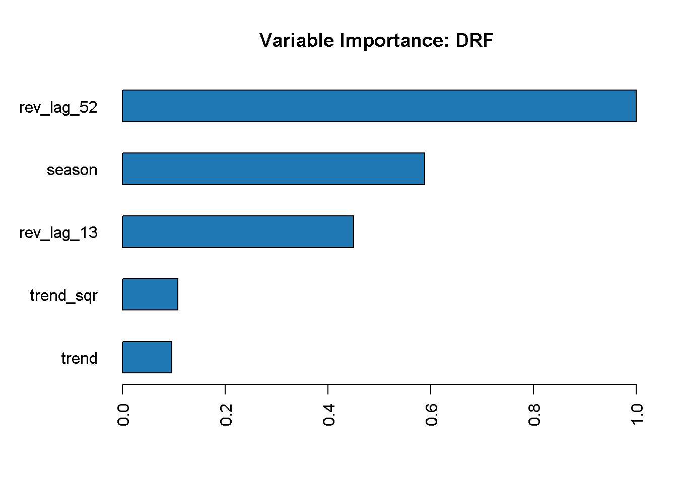
The lag_52 variable is the most important in the model, followed by season and the other lag variable, lag_13. On the other hand, neither of the trend variables seem to contribute strongly to our random forest model.
The model_summary function grants access to information about the models parameters.
rft_model@model$model_summary
## Model Summary:
## number_of_trees number_of_internal_trees model_size_in_bytes min_depth
## 1 27 27 12560 7
## max_depth mean_depth min_leaves max_leaves mean_leaves
## 1 14 10.29630 12 45 32.37037
Here we can see that the random forest only uses 26 out of a maximum of 500 trees that it was allowed to estimate (I set this with the ntrees parameter). We can also gauge that the tree depth ranges from 7 to 14 (not a particularly deep forest) and that the number of leaves per tree ranges from 12 to 45.
Last but not least, I can review the model’s performance with h2o.performance
h2o.performance(rft_model, newdata = test_tbl %>% as.h2o())
## H2ORegressionMetrics: drf
##
## MSE: 3.434687e+13
## RMSE: 5860620
## MAE: 3635468
## RMSLE: 9.903415
## Mean Residual Deviance : 3.434687e+13
## R^2 : 0.9737282
The model achieves a high R^2 of 97.4%, which means that the variation in the feature variables explains almost all the variability of the response variable.
On the other hand, RMSE appears to be quite large! High values of RMSE can be due to the presence of small number of high error predictions (like in the case of outliers), and this should not surprise given the choppy nature of the response variable.
When it comes to error based metric like RMSE, MAE, MSE, etc., there is no absolute value of good or bad as they are expressed in the unit of Response Variable. Usually, you want to achieve a smaller RMSE as this translates into a higher predictive power but for this project I will simply use this metric to compare the relative performance of the different model.
Extend to many models
Let’s generalise the performance assessment in a programmatic way to compute, assess and compare multiple models in one go.
First, I fit a few more models and make sure I’m enabling cross-validation for all of them. Note that for the GBM I’m specify the same parameters I used for the random forest but there is an extensive array of parameters that you can use to control several aspects of the model’s estimation (I will not touch on these as it’s outside the scope of this project)
# gradient boosting machine model
gbm_model <-
h2o.gbm(
x = x,
y = y,
training_frame = as.h2o(train_tbl),
nfolds = 10,
ntrees = 500,
stopping_metric = "RMSE",
stopping_rounds = 10,
stopping_tolerance = 0.005,
seed = 1975
)
# generalised linear model (a.k.a. elastic net model)
glm_model <-
h2o.glm(
x = x,
y = y,
training_frame = as.h2o(train_tbl),
nfolds = 10,
family = "gaussian",
seed = 1975
)
I’m also running the very handy automl function that enables for multiple models to be fitted and grid-search optimised. Like I did for the other models, I can specify a series of parameters to guide the function, like several stopping metrics, and max_runtime_secs to save on computing time.
automl_model <-
h2o.automl(
x = x,
y = y,
training_frame = as.h2o(train_tbl),
nfolds = 5,
stopping_metric = "RMSE",
stopping_rounds = 10,
stopping_tolerance = 0.005,
max_runtime_secs = 60,
seed = 1975
)
Checking the leader board will show the fitted models
automl_model@leaderboard
## model_id mean_residual_deviance
## 1 GBM_2_AutoML_20200112_111324 1.047135e+14
## 2 GBM_4_AutoML_20200112_111324 1.070608e+14
## 3 StackedEnsemble_BestOfFamily_AutoML_20200112_111324 1.080933e+14
## 4 GBM_1_AutoML_20200112_111324 1.102083e+14
## 5 DeepLearning_grid_1_AutoML_20200112_111324_model_1 1.104058e+14
## 6 DeepLearning_grid_1_AutoML_20200112_111324_model_5 1.146914e+14
## rmse mse mae rmsle
## 1 10232963 1.047135e+14 5895463 NaN
## 2 10347021 1.070608e+14 5965855 NaN
## 3 10396794 1.080933e+14 5827000 NaN
## 4 10498016 1.102083e+14 5113982 NaN
## 5 10507419 1.104058e+14 6201525 NaN
## 6 10709407 1.146914e+14 6580217 NaN
##
## [22 rows x 6 columns]
As you can see the top model is a Gradient Boosting Machine model. There are also a couple of Deep Learning models and a stacked ensemble, H2O take on the Super Learner.
Performance assessment
First, I save all models in one folder so that I can access them and process performance metrics programmatically through a series of functions
# set path to get around model path being different from project path
path = "/02_models/final/"
# Save GLM model
h2o.saveModel(glm_model, path)
# Save RF model
h2o.saveModel(rft_model, path)
# Save GBM model
h2o.saveModel(gbm_model, path)
# Extracs and save the leader autoML model
aml_model <- automl_model@leader
h2o.saveModel(aml_model, path)
Variable importance plots
Let’s start with the variable importance plots. Earlier on I used plotting functionality with the random forest model but now I want to plot them all in one go so that I can compare and contrast the results.
There are many libraries (like IML, PDP, VIP, and DALEX to name the more popular ones) that help with Machine Learning model interpretability, feature explanation and general performance assessment. In this project I am using the vip package.
One of the main advantages of these libraries is their compatibility with other R packages such as gridExtra.
p_glm <- vip(glm_model) + ggtitle("GLM")
p_rft <- vip(rft_model) + ggtitle("RF")
p_gbm <- vip(gbm_model) + ggtitle("GBM")
p_aml <- vip(aml_model) + ggtitle("AML")
grid.arrange(p_glm, p_rft, p_gbm, p_aml, nrow = 2)
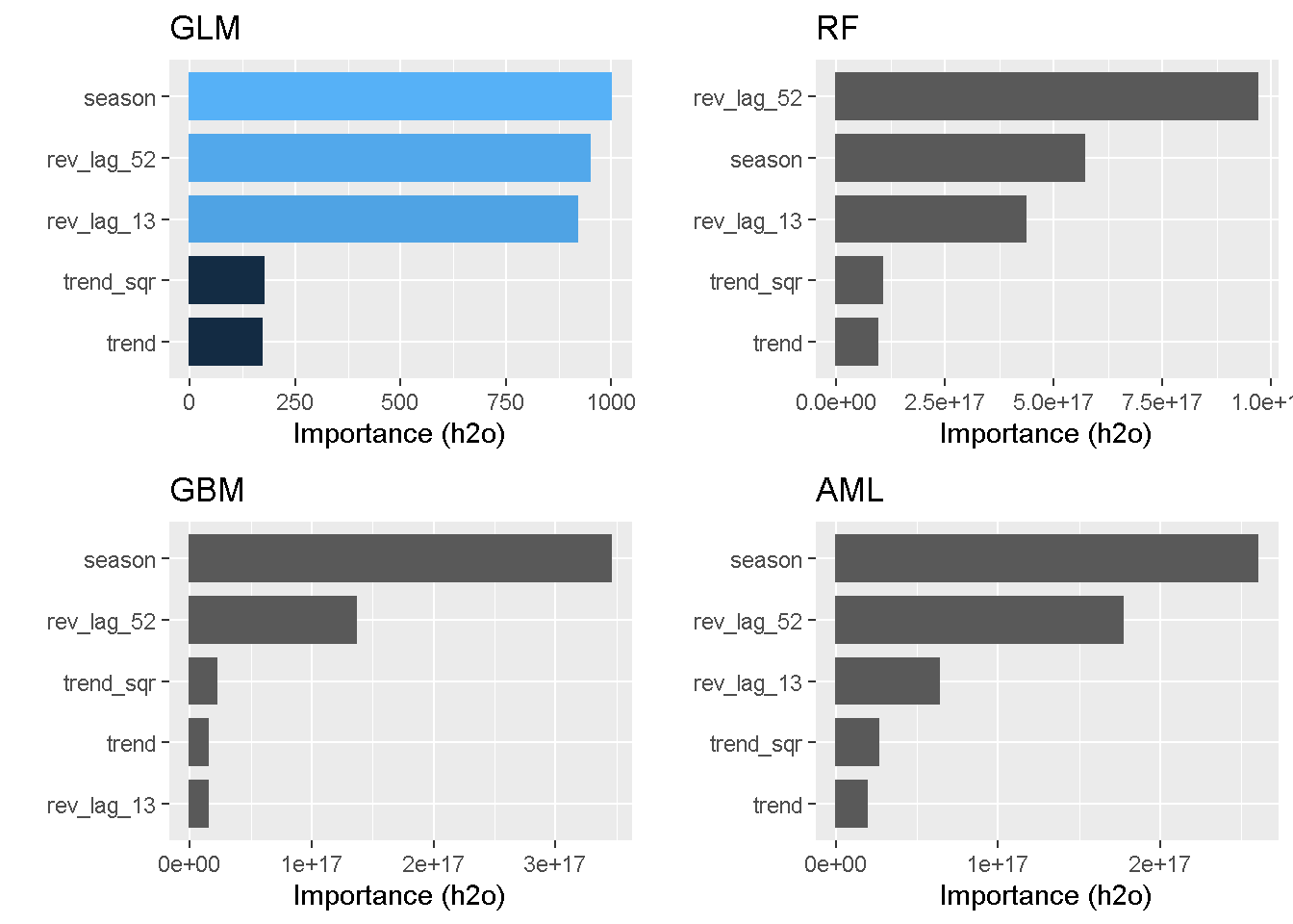
Seasonality and previous revenue levels (lags) come through at the top 3 stronger drives in almost all models (the only exception being GBM). Conversely, none of the models find trend and its squared counterpart to be a strong explainer of variation in the response variable.
Performance metrics
As I’ve shown earlier with the random forest model, the h2o.performance function shows a single model’s performance at a glance (here for example I check the performance of the GBM model)
perf_gbm_model <-
h2o.performance(gbm_model, newdata = as.h2o(test_tbl))
perf_gbm_model
## H2ORegressionMetrics: gbm
##
## MSE: 1.629507e+13
## RMSE: 4036716
## MAE: 2150460
## RMSLE: 9.469847
## Mean Residual Deviance : 1.629507e+13
## R^2 : 0.9875359
However, to assess and compare the models performance I am going to focus on RMSE and R^2^.
All performance metrics can be pulled at once using the h20.metric function, which for some reason does not seem to work with H2ORegressionMetrics objects.
perf_gbm_model %>%
h2o.metric()
## Error in paste0("No ", metric, " for ",
## class(object)) : argument "metric" is missing, with
## no default
Also the error message is not particularly helpful in this case as the “metric” argument is optional and should return all metrics by default. The issue seems to have to do with performing a regression as it actually works fine with H2OClassificationMetrics objects.
Luckily, provides some useful helper functions to extract the single metrics individually, which work all right!
perf_gbm_model %>% h2o.r2()
## [1] 0.9875359
perf_gbm_model %>% h2o.rmse()
## [1] 4036716
So I will be using these individual helpers to write a little function that runs predictions for all models on the test data and returns a handy tibble to house all the performance metrics.
performance_metrics_fct <- function(path, data_tbl) {
model_h2o <- h2o.loadModel(path)
perf_h2o <- h2o.performance(model_h2o, newdata = as.h2o(data_tbl))
R2 <- perf_h2o %>% h2o.r2()
RMSE <- perf_h2o %>% h2o.rmse()
tibble(R2, RMSE)
}
Now I can pass this formula to a map function from the purrr package to iterate calculations and compile RMSE and R^2^ across all models. To correctly identify each model, I also make sure to extract the model’s name from the path.
perf_metrics_test_tbl <- fs::dir_info(path = "/02_models/final_models/") %>%
select(path) %>%
mutate(metrics = map(path, performance_metrics_fct, data_tbl = test_tbl),
path = str_split(path, pattern = "/", simplify = T)[,2]
%>% substr(1,3)) %>%
rename(model = path) %>%
unnest(cols = c(metrics))
perf_metrics_test_tbl %>%
arrange(desc(R2))
model R2 RMSE
AML 0.9933358 2951704
GBM 0.9881890 3929538
DRF 0.9751434 5700579
GLM -0.0391253 36858064
All tree-based models achieve very high R^2, with the autoML model (which is a GBM, remember?) reaching a staggering 99.3% and achieves the lowest RMSE. The GLM on the other hand scores a negative R^2.
A negarive R^2 is not unheard of: the R^2 compares the fit of a model with that of a horizontal straight line and calculates the proportion of the variance explained by the model compared to that of a straight line (the null hypothesis). If the fit is actually worse than just fitting a horizontal line then R-square can be negative.
Actual vs Predicted plots
Last by not least, to provides an additional and more visual display of the models performance, I’m going to plot the actual versus predicted for all models.
I’m using a function similar to the one I’ve used to calculate the performance metrics as the basic principle is the same.
predict_fct <- function(path, data_tbl) {
model_h2o <- h2o.loadModel(path)
pred_h2o <- h2o.predict(model_h2o, newdata = as.h2o(data_tbl))
pred_h2o %>%
as_tibble() %>%
cbind(data_tbl %>% select(order_date))
}
As I did before, I pass the formula to a map function to iterate calculations and compile prediction using the test data subset across all models.
validation_tmp <- fs::dir_info(path = "/02_models/final_models/") %>%
select(path) %>%
mutate(pred = map(path, predict_fct, data_tbl = test_tbl),
path = str_split(path, pattern = "/", simplify = T)[,2] %>%
substr(1,3)) %>%
rename(model = path)
However, the resulting validation_tmp is a nested tibble, with the predictions stored as lists in each cell.
validation_tmp
## # A tibble: 4 x 2
## model pred
## <chr> <list>
## 1 AML <df[,2] [25 × 2]>
## 2 DRF <df[,2] [25 × 2]>
## 3 GBM <df[,2] [25 × 2]>
## 4 GLM <df[,2] [25 × 2]>
This requires a couple of additional manipulations to get in in a shape that can be used for plotting: unnesting the list, “pivot” the predictions around the order_date and add the revenue as actual.
validation_tbl <-
validation_tmp %>%
unnest(cols = c(pred)) %>%
pivot_wider(names_from = model,
values_from = predict) %>%
cbind(test_tbl %>%
select(actual = revenue)) %>%
rename(date = order_date)
Now, I’m going to write this plotting function directly in plotly
validation_tbl %>%
plot_ly() %>%
add_lines(x = ~ date, y = ~ actual, name = 'Actual') %>%
add_lines(x = ~ date, y = ~ DRF, name = 'Random Forest',
line = list(dash = 'dot')) %>%
add_lines(x = ~ date, y = ~ GBM, name = 'Gradient Boosting Machine',
line = list(dash = 'dash')) %>%
add_lines(x = ~ date, y = ~ AML, name = 'Auto ML',
line = list(dash = 'dot')) %>%
add_lines(x = ~ date, y = ~ GLM, name = 'Generalised Linear Model',
line = list(dash = 'dash')) %>%
layout(title = 'Total Weekly Sales - Actual versus Predicted (various models)',
yaxis = list(title = 'Millions of Dollars'),
xaxis = list(title = ''),
legend = list(orientation = 'h')
)
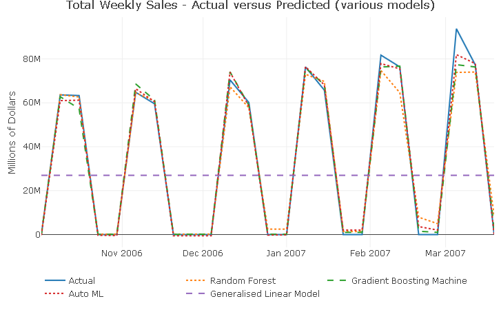
With the exception of the GLM model, which is producing a seemingly flat line prediction (remember the negative R^2?), all models are capturing well the peaks and troughs in the series. The prediction only start to miss the full extent of the response variation around the last 2 spikes.
Forecasting
No need to write any new functions as the performance_metrics_fct and predict_fctcan also be used for the forecasting.
First, I take a look at the performance metrics
perf_metrics_cast_tbl <- fs::dir_info(path = "/02_models/final_models/") %>%
select(path) %>%
mutate(metrics = map(path, performance_metrics_fct, data_tbl = forecast_tbl),
path = str_split(path, pattern = "/", simplify = T)[,2]
%>% substr(1,3)) %>%
rename(model = path) %>%
unnest(cols = c(metrics))
perf_metrics_cast_tbl %>%
arrange(desc(R2))
model R2 RMSE
GBM 0.8678649 14544327
AML 0.8363565 16185792
DRF 0.8042526 17702414
GLM -0.0617160 41227664
Interestingly, a little swap in the top position, with the “manual” GBM performing better in the forecast that the autoML model. The performance metrics worsened for all models when compared to the validation metrics.
Then, I calculate the forecast…
cast_tbl <- fs::dir_info(path = "/02_models/final_models/") %>%
select(path) %>%
mutate(pred = map(path, predict_fct, data_tbl = forecast_tbl),
path = str_split(path, pattern = "/", simplify = T)[,2] %>%
substr(1,3)) %>%
rename(model = path) %>%
unnest(cols = c(pred)) %>%
pivot_wider(names_from = model, values_from = predict) %>%
cbind(forecast_tbl %>% select(actual = revenue)) %>%
rename(date = order_date)
…and visualise it
cast_tbl %>%
plot_ly() %>%
add_lines(x = ~ date, y = ~ actual, name = 'Actual') %>%
add_lines(x = ~ date, y = ~ DRF, name = 'Random Forest',
line = list(dash = 'dot')) %>%
add_lines(x = ~ date, y = ~ GBM, name = 'Gradient Boosting Machine',
line = list(dash = 'dash')) %>%
add_lines(x = ~ date, y = ~ AML, name = 'Auto ML',
line = list(dash = 'dot')) %>%
add_lines(x = ~ date, y = ~ GLM, name = 'Generalised Linear Model',
line = list(dash = 'dash')) %>%
layout(title = 'Total Weekly Sales - Actual versus Forecast (various models)',
yaxis = list(title = 'Millions of Dollars'),
xaxis = list(title = ''),
legend = list(orientation = 'h')
)
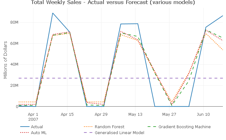
Aside from the GLM which unsurprisingly produces a flat line forecast, all models continue to capture well the 2-week-on, 2-week-off purchase pattern. Additionally, all models forecasts fail to capture the full extent of the response variable movements for all 3 spikes, suggesting that there could be another dynamic at play in 2007 that the current predictors are not controlling for.
Taking a closer look at the forecast_tbl reveals that, for observations 9 throught to 11, both season and lag_52 predictors are not perfectly alligned with the actual revenue, which explains why all models predict positive revenue for weeks with actual zero sales.
forecast_tbl %>%
select(-trend, -trend_sqr) %>%
tail(10)
order_date revenue season rev_lag_52 rev_lag_13
4 2007-04-16 70869888 1 41664162.8 63305793
5 2007-04-23 0 0 480138.8 0
6 2007-04-30 0 0 0.0 0
7 2007-05-07 78585882 1 41617508.0 64787291
8 2007-05-14 78797822 1 48403283.4 59552955
9 2007-05-21 0 1 0.0 0
10 2007-05-28 0 0 0.0 0
11 2007-06-04 0 0 45696327.2 0
12 2007-06-11 75486199 1 53596289.9 70430702
13 2007-06-18 86509530 1 774190.1 60094495
One final thing: don’t forget to shut-down the H2O instance when you’re done!
h2o.shutdown(prompt = FALSE)
Closing thoughts
In this project I have gone through the various steps needed to build a time series machine learning pipeline and generate a weekly revenue forecast.
In particular, I have carried out a more “traditional” exploratory time series analysis with TSstudio and created a number of predictors using the insight I gathered. I’ve then trained and validated an array of machine learning models with the open source library H2O, and compared the models’ accuracy using performance metrics and actual vs predicted plots.
Conclusions
This is just an first stab at producing a weekly revenue forecast and there clearly is plenty of room for improvement. Still, once you have a modelling and forecasting pipeline like this in place, it becomes much easier and faster to create and test several models and different predictors sets.
The fact that the data series is artificially generated is not ideal as it does not necessarily incorporate dynamics that you would encounter in a real-life dataset. Nonetheless that challenged me to get inventive and made the whole exercise that more enjoyable.
Forecasting total revenue may not be the best strategy and perhaps breaking down the response variable by product line or by country for instance may lead to improved and more accurate forecasts. This is behond the scope of this project but could well be the subject for a future project!
One thing I take away from this exercise is that H2O is absolutely brilliant! It’s fast, intuitive to set up and has a broad array of customisation options. AutoML is superb, has support with R, Python and Java and the fact that anyone can use it free of charge gives the likes of Google AutoML and AWS SageMaker AutoML platform a run for their money!
Code Repository
The full R code can be found on my GitHub profile
References
- For H2O website H2O Website
- For H2O documentation H2O Documentation
- For a thorough discussion on performing time series analysis and forecasting in R Hands-On Time Series Analysis with R
- For an introduction to TSstudio Introduction for the TSstudio Package
- For an introduction to Machine Learning interpretability