Steps and considerations to run a successful segmentation with K-means, Principal Components Analysis and Bootstrap Evaluation
Clustering is one of my favourite analytic methods: it resonates well with clients as I’ve found from my consulting experience, and is a relatively straightforward concept to explain non technical audiences.
Earlier this year I’ve used the popular K-Means clustering algorithm to segment customers based on their response to a series of marketing campaigns. For that post I’ve deliberately used a basic dataset to show that it is not only a relatively easy analysis to carry out but can also help unearthing interesting patterns of behaviour in your customer base even when using few customer attributes.
In this post I revisit customer segmentation using a complex and feature-rich dataset to show the practical steps you need to take and typical decisions you may face when running this type of analysis in a more realistic context.
Business Objective
Choosing the approach to use hinges on the nature of the question/s you want to answer and the type of industry your business operates in. For this post I assume that I’m working with a client that wants to get a better understanding of their customer base, with particular emphasis to the monetary value each customer contributes to the business’ bottom line.
One approach that lends itself well to this kind of analysis is the popular RFM segmentation, which takes into consideration 3 main attributes:
Recency– How recently did the customer purchase?Frequency– How often do they purchase?Monetary Value– How much do they spend?
This is a popular approach for good reasons: it’s easy to implement (you just need a transactional database with client’s orders over time), and explicitly creates sub-groups based on how much each customer is contributing.
Loading the libraries
library(tidyverse)
library(lubridate)
library(readr)
library(skimr)
library(broom)
library(fpc)
library(scales)
library(ggrepel)
library(gridExtra)
The data
The dataset I’m using here accompanies a Redbooks publication and is available as a free download in the Additional Material section. The data covers 3 & 1⁄2 years worth of sales orders for the Sample Outdoors Company, a fictitious B2B outdoor equipment retailer enterprise and comes with details about the products they sell as well as their customers (which in their case are retailers ).
Here I’m simply loading up the compiled dataset but if you want to follow along I’ve also written a number of posts where I show how I’ve assembled the various data feeds and sorted out variable names, new features creation and some general housekeeping tasks. There is a version for those that prefer to handle data in excel using R and one where I fetch the data by linking R to a PosgreSQL database.
orders_tbl <-
read_rds("orders_tbl.rds")
You can find the full code on my Github repository.
Data Exploration
This is a crucial phase of any data science project because it helps with making sense of your dataset. Here is where you get to understand the relations among the variables, discover interesting patterns within the data, and detect anomalous events and outliers. This is also the stage where you formulate hypothesis on what customer groups the segmentation may find.
First, I need to create an analysis dataset, which I’m calling customers_tbl (tbl stands for tibble, R modern take on data frames). I’m including average order value and number of orders as I want to take a look at a couple more variables beyond the RFM standard Recency, Frequency and Monetary Value.
customers_tbl <-
orders_tbl %>%
# assume a cut-off date of 30-June-2007 and create a recency variable
mutate(days_since = as.double(
ceiling(
difftime(
time1 = "2007-06-30",
time2 = orders_tbl$order_date,
units = "days")))
) %>%
# select last 2 full years
filter(order_date <= "2007-06-30") %>%
# create analysis variables
group_by(retailer_code) %>%
summarise(
recency = min(days_since),
frequency = n(),
# average sales
avg_amount = mean(revenue),
# total sales
tot_amount = sum(revenue),
# number of orders
order_count = length(unique(order_date))
) %>%
# average order value
mutate(avg_order_val = tot_amount / order_count) %>%
ungroup()
As a rule of thumb, you want to ideally include a good 2 to 3 year of transaction history in your segmentation (here I’m using the the full 3 & 1⁄2 years). This ensures that you have enough variation in your data to capture a wide variety of customer types and behaviours, different purchase patterns, and outliers.
Outliers may represent rare occurrences of customers that have made, for instance, only a few sporadic purchases over time or placed only one or two very large orders and disappeared. Some data science practitioners prefer to exclude outliers from segmentation analysis as k-means clustering tends to put them in little groups of their own, which may have little descriptive power. Instead, I think it’s important to include outliers so that they can be studied to understand why they occurred and, should those customers reappear, target them with the right incentive (like recommend a product they’re likely to purchase, a multi-buy discount, or on-boarding them on a loyalty scheme for instance).
Single Variable Exploration
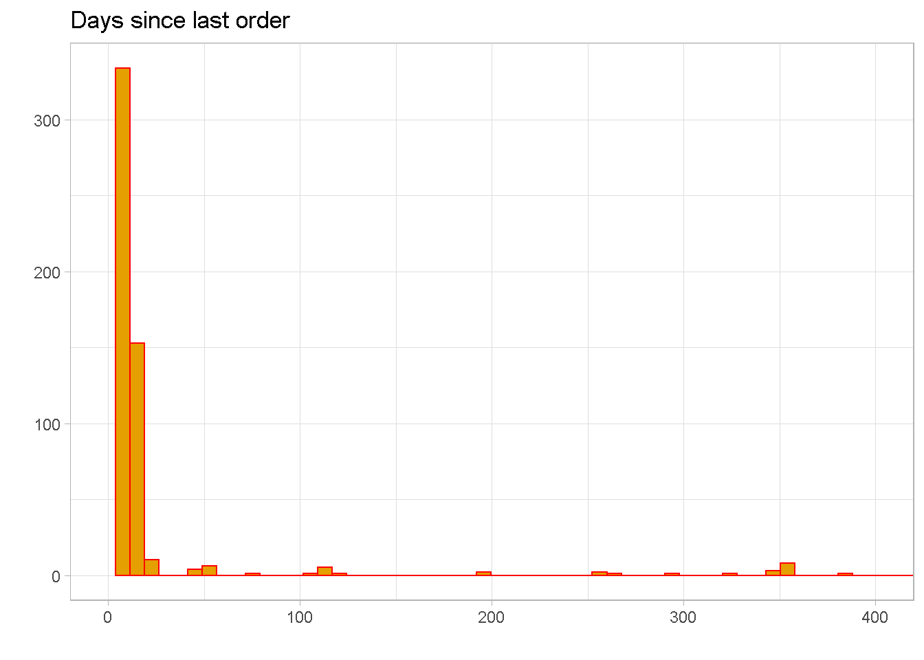
Recency
recency distribution is severely right skewed, with a mean of around 29 and 50% of observations between the values of 9 and 15. This means that the bulk of customers have made their most recent purchase within the past 15 days.
summary(customers_tbl$recency)
## Min. 1st Qu. Median Mean 3rd Qu. Max.
## 8.00 9.00 10.00 29.22 15.00 754.00
Normally, I would expect orders to be a bit more evenly spread out over time with not so many gaps along the first part of the tail. The large amount of sales concentrated within the last 2 weeks of activity tells me that orders were “manually” added to the dataset to simulate a surge in orders.
NOTE that there are a few extreme outliers beyond 400, which are not shown in the chart.
customers_tbl %>%
ggplot(aes(x = recency)) +
geom_histogram(bins = 100, fill = "#E69F00", colour = "red") +
labs(x = "",
y = "",
title = "Days since last order") +
coord_cartesian(xlim = c(0, 400)) +
scale_x_continuous(breaks = seq(0, 400, 100)) +
theme_light()
Frequency
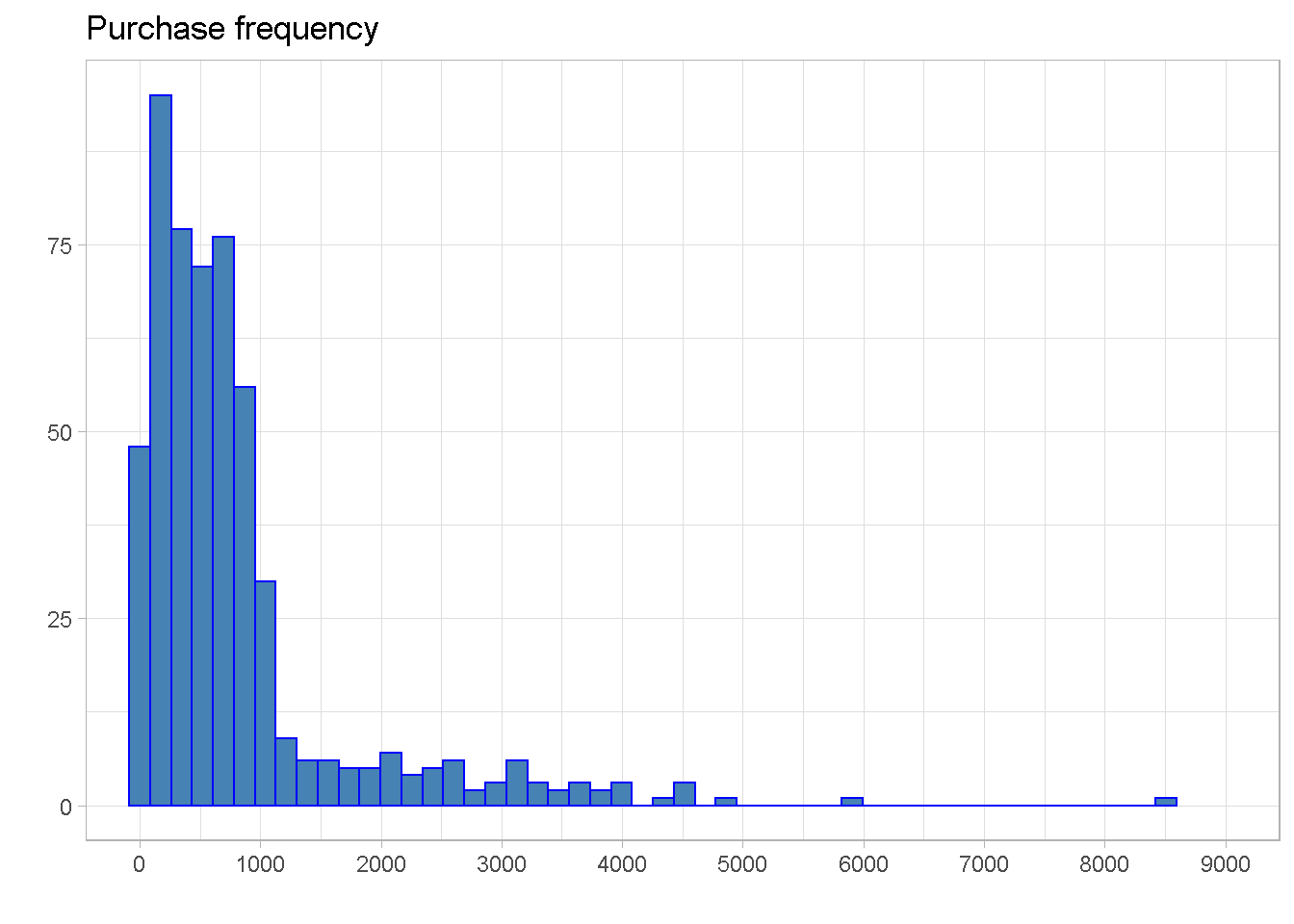
The distribution is right skewed and most customers have made between 250 and just under 900 purchases, with the mean pulled above the median by the right skew.
summary(customers_tbl$frequency)
## Min. 1st Qu. Median Mean 3rd Qu. Max.
## 2.0 245.0 565.5 803.1 886.2 8513.0
A small number of outliers can be found beyond 4,000 purchases per customer, with an extreme point beyond the 8,500 mark.
customers_tbl %>%
ggplot(aes(x = frequency)) +
geom_histogram(bins = 50, fill = "steelblue", colour = "blue") +
labs(x = "",
y = "",
title = "Purchase frequency") +
coord_cartesian(xlim = c(0, 9000)) +
scale_x_continuous(breaks = seq(0, 9000, 1000)) +
theme_light()
Total and Average Sales
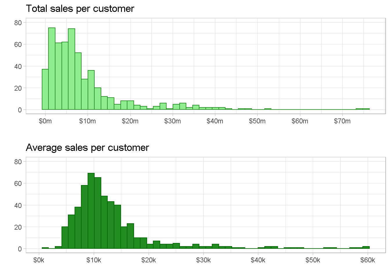
total sales and average sales are both right skewed with Total sales showing some extreme outliers at the $50m and $75m marks, whether average sales has a more continuous tail. They would both work well to capture the monetary value dimension for the segmentation but I personally prefer average sales as it softens the impact of the extreme values.
p1 <- customers_tbl %>%
ggplot(aes(x = tot_amount)) +
geom_histogram(bins = 50, fill = "light green", colour = "forest green") +
labs(x = "",
y = "",
title = "Total sales per customer") +
scale_x_continuous(
labels = scales::dollar_format(scale = 1e-6,suffix = "m"),
breaks = seq(0, 7e+7, 1e+7)) +
scale_y_continuous(limits = c(0,80)) +
theme_light()
p2 <- customers_tbl %>%
ggplot(aes(x = avg_amount)) +
geom_histogram(bins = 50, fill = "forest green", colour = "dark green") +
labs(x = "",
y = "",
title = "Average sales per customer") +
scale_x_continuous(
labels = scales::dollar_format(scale = 1e-3, suffix = "k"),
breaks = seq(0, 70000, 10000)) +
scale_y_continuous(limits = c(0, 80)) +
theme_light()
grid.arrange(p1, p2, nrow = 2)
Number of Orders
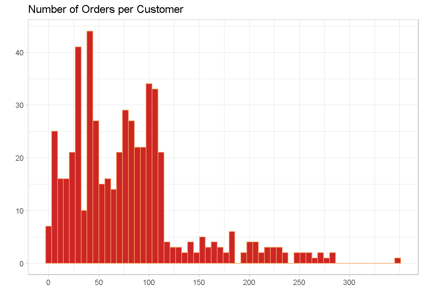
The distribution also has a right skew and the majority of retailers made between 37 and just over 100 orders in the 3 years to 30-June-2007. There are a small number of outliers with an extreme case of one retailer placing 349 orders in 3 years.
summary(customers_tbl$order_count)
## Min. 1st Qu. Median Mean 3rd Qu. Max.
## 1.00 37.00 72.00 78.64 103.00 349.00
Number of orders per customer show a hint of bi-modality on the right hand side, with a peak at around 30 and another one at about 90. This suggests the potential for distinct subgroups in the data.
customers_tbl %>%
ggplot(aes(x = order_count)) +
geom_histogram(bins = 60, fill = "firebrick3", colour = "sandybrown") +
labs(x = "",
y = "",
title = "Number of Orders per Customer") +
scale_x_continuous(breaks = seq(0, 300, 50)) +
theme_light()
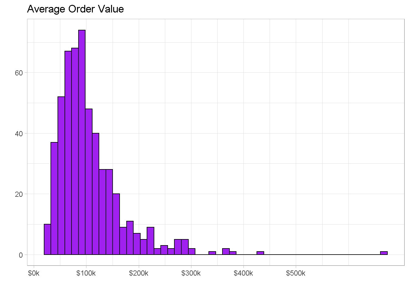
Average Order Value
The average order value is of just over $105k with 50% of orders having a value between $65k and $130k and a few outliers beyond the $300k mark.
summary(customers_tbl$avg_order_val)
## Min. 1st Qu. Median Mean 3rd Qu. Max.
## 20238 65758 90367 105978 129401 661734
We also find a small amount of outliers beyond the value of $300k per order.
customers_tbl %>%
ggplot(aes(x = avg_order_val)) +
geom_histogram(
bins = 50,
fill = "purple", colour = "black") +
labs(x = "",
y = "",
title = "Average Order Value") +
scale_x_continuous(
labels = scales::dollar_format(scale = 1e-3, suffix = "k"),
breaks = seq(0, 5e+5, 1e+5)) +
theme_light()
Multiple Variables Exploration
Plotting 2 or 3 variable together is a great way to understand the relationship that exists amongst them and get a sense of how many clusters you may find. It’s always good to plot as many combinations as possible but here I’m only showing the most salient ones.
Let’s plot the RFM trio (recency, frequency and average sales per customer) and use frequency to colour-code the points.
customers_tbl %>%
ggplot(aes(x = (recency), y = (avg_amount))) +
geom_point(aes(colour = frequency)) +
scale_colour_gradient(name = "Frequency",
high = "#132B43",
low = "#56B1F7") +
scale_y_continuous(labels = scales::dollar_format(scale = 1e-3,
suffix = "k")) +
labs(x = "Recency",
y = "Average Sales",
title = "") +
theme_light()
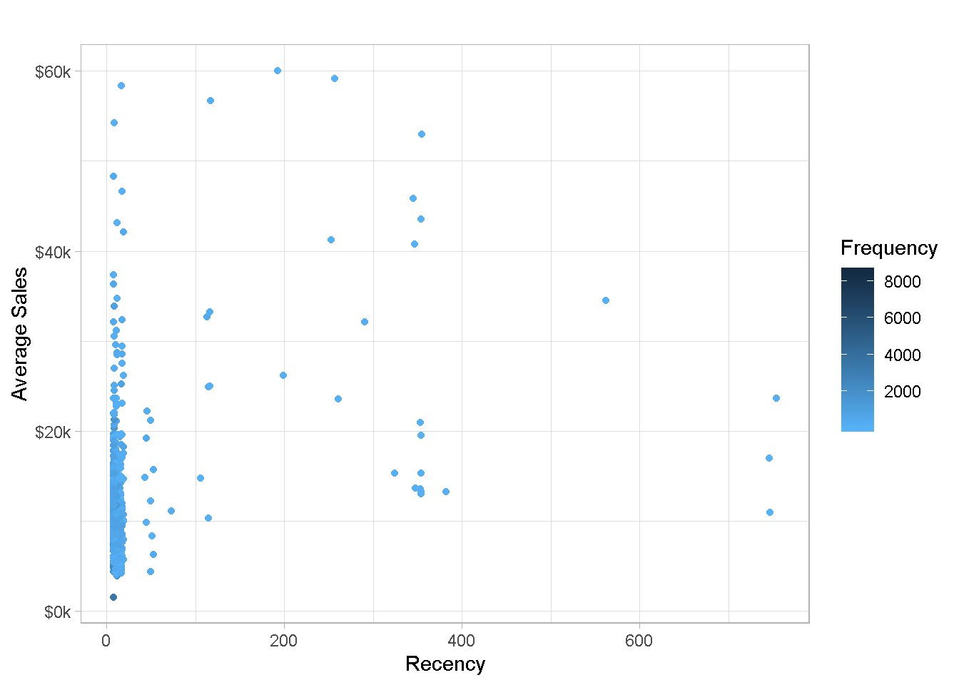
The chart is not too easy to read with most data points being clumped on the left-hand side, which is no surprise given the severe right skew found for recency in the previous section. You can also notice that the large majority of points are of a paler hue of blue, denoting less frequent purchases.
To make the chart more readable, it is often convenient to log-transform variables with a positive skew to spread the observations across the plot area.
customers_tbl %>%
ggplot(aes(x = log(recency), y = log(avg_amount))) +
geom_point(aes(colour = log(frequency))) +
scale_colour_gradient(name = "Log Freq.",
high = "#132B43",
low = "#56B1F7") +
labs(x = "Log Recency",
y = "Log Average Sales",
title = "") +
theme_light()
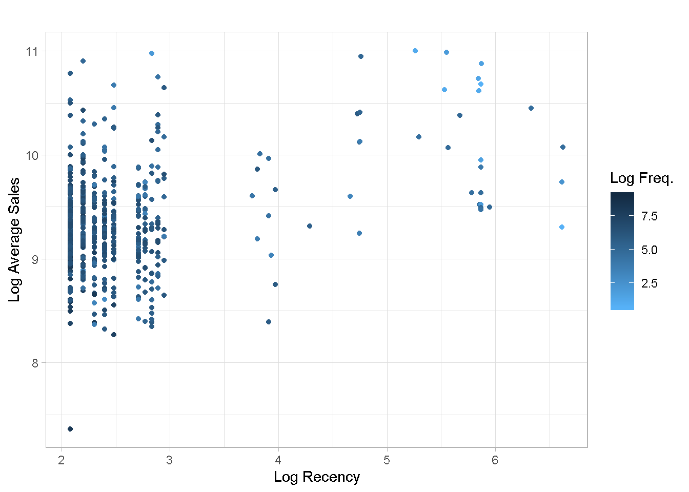
Even the log scale does not help much with chart readability. Given the extreme right skew found in recency, I expect that the clustering algorithm may find it difficult to identify well defined groups.
The Analysis
To profile the customers I am using the K-means clustering technique: it handles large dataset very well and iterates rapidly to stable solutions.
First, I need to scale the variables so that the relative difference in their magnitudes does not affect the calculations.
clust_data <-
customers_tbl %>%
select(-retailer_code) %>%
scale() %>%
as_tibble()
Then, I build a function to calculate kmeans for any number of centres and create a nested tibble to house all the model output.
kmeans_map <- function(centers = centers) {
set.seed(1975) # for reproducibility
clust_data[,1:3] %>%
kmeans(centers = centers,
nstart = 100,
iter.max = 50)
}
# Create a nested tibble
kmeans_map_tbl <-
tibble(centers = 1:10) %>% # create column with centres
mutate(k_means = centers %>%
map(kmeans_map)) %>% # iterate `kmeans_map` row-wise to gather
# kmeans models for each centre in column 2
mutate(glance = k_means %>% # apply `glance()` row-wise to gather each
map(glance)) # model’s summary metrics in column 3
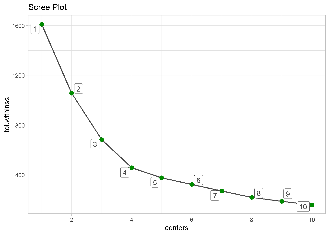
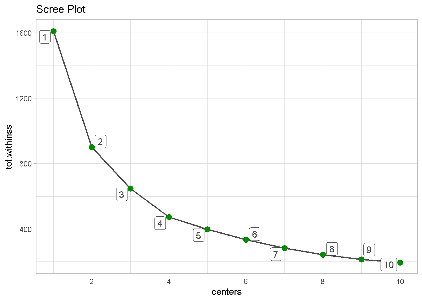
Last, I can build a scree plot and look for the “elbow”, the point where the gain of adding an extra clusters in explained tot.withinss starts to level off. It seems that the optimal number of clusters is 4.
kmeans_map_tbl %>%
unnest(glance) %>% # unnest the glance column
select(centers, tot.withinss) %>% # select centers and tot.withinss
ggplot(aes(x = centers, y = tot.withinss)) +
geom_line(colour = 'grey30', size = .8) +
geom_point(colour = 'green4', size = 3) +
geom_label_repel(aes(label = centers),
colour = 'grey30') +
labs(title = 'Scree Plot') +
scale_x_continuous(breaks = seq(0, 10, 2)) +
theme_light()
Evaluating the Clusters
Although the algorithm has captured some distinct groups in the data, there also are some significant overlaps between clusters 1 and 2, and clusters 3 and 4.
kmeans_4_tbl <-
kmeans_map_tbl %>%
pull(k_means) %>%
pluck(4) %>% # pluck element 4
augment(customers_tbl) # attach .cluster to the tibble
kmeans_4_tbl %>%
ggplot(aes(x = log(recency), y = log(avg_amount))) +
geom_point(aes(colour = .cluster)) +
labs(x = "Log Recency",
y = "Log Average Sales",
title = "") +
theme_light()
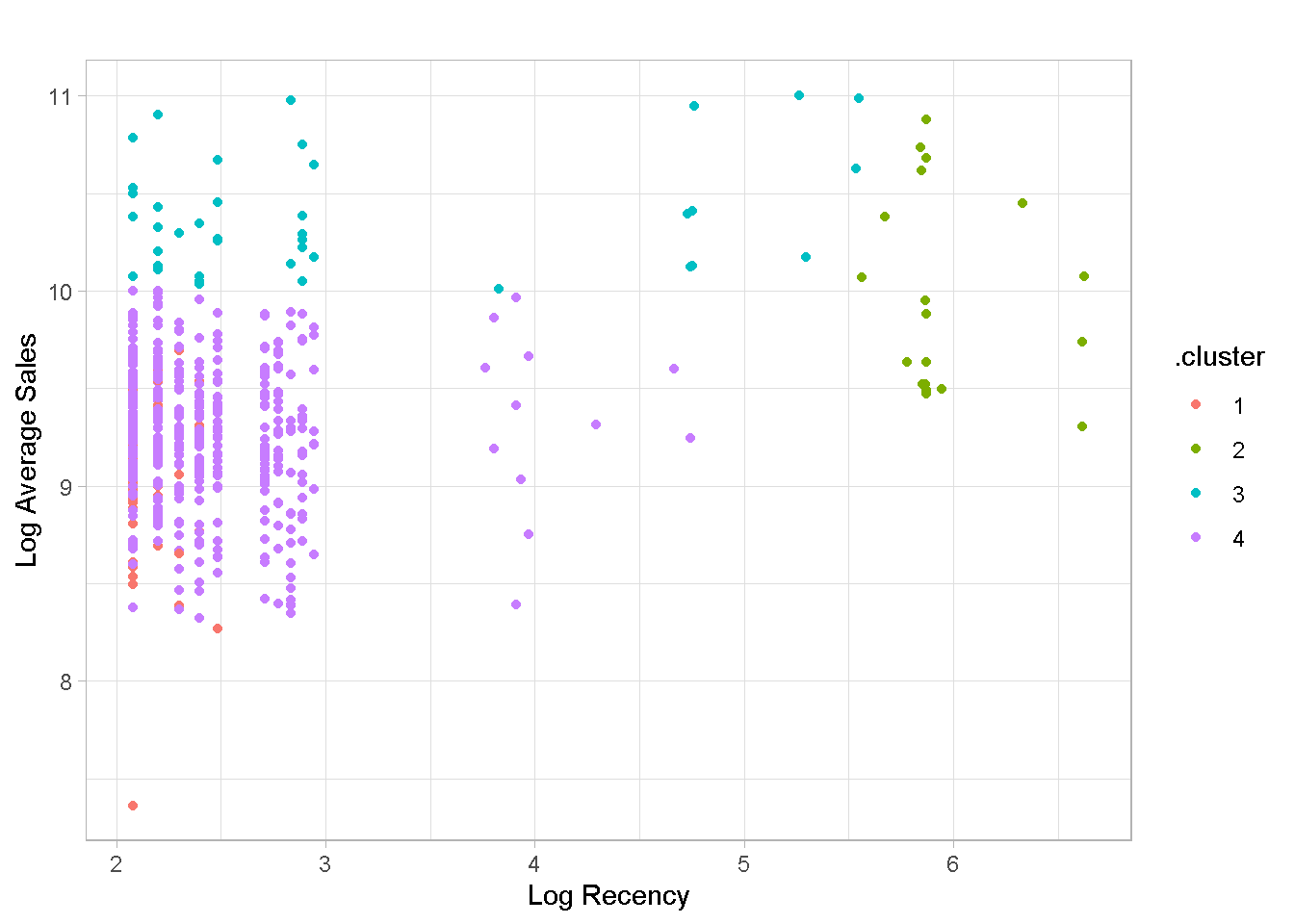
In addition, the clusters are not particularly well balanced, with the 4th group containing nearly %80 of all retailers, which is of limited use for profiling your customers. Groups 1, 3 and 4 have a very similar recency values, with the 2nd one capturing some (but not all) of the “less recent” buyers.
options(digits = 2)
kmeans_4_tbl %>%
group_by(.cluster) %>%
summarise(
Retailers = n(),
Recency = median(recency),
Frequency = median(frequency),
Avg.Sales = median(avg_amount)
) %>%
ungroup() %>%
mutate(`Retailers(%)` = 100*Retailers / sum(Retailers)) %>%
arrange((.cluster)) %>%
select(c(1,2,6,3:5)) %>%
kable()
| .cluster | Retailers | Retailers(%) | Recency | Frequency | Avg.Sales |
|---|---|---|---|---|---|
| 1 | 58 | 10.8 | 8 | 2862 | 9537 |
| 2 | 19 | 3.5 | 354 | 75 | 19518 |
| 3 | 41 | 7.6 | 12 | 167 | 29588 |
| 4 | 420 | 78.1 | 10 | 565 | 10747 |
Alternative Analysis
As anticipated, the algorithm is struggling to find well defined groups based on recency. I’m not particularly satisfied with the RFM-based profiling and believe it wise to consider a different combination of features.
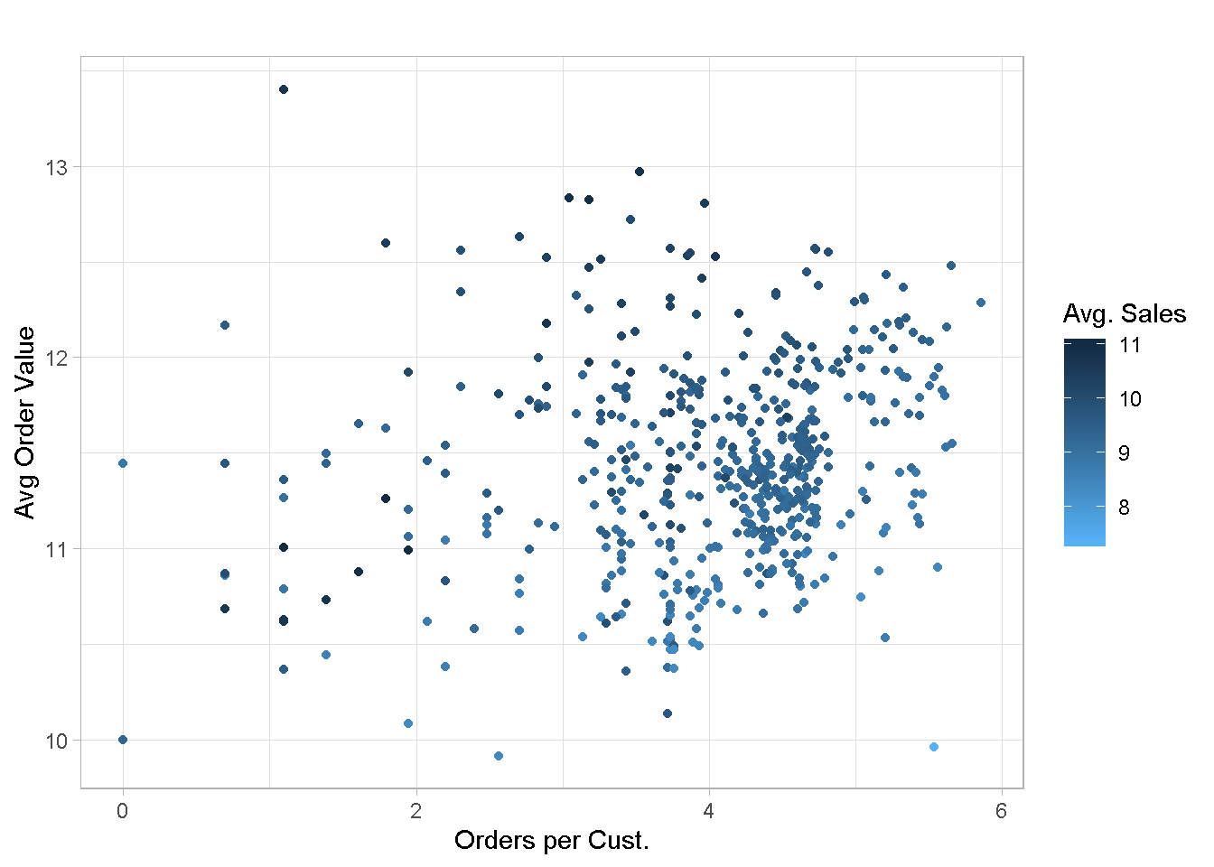
I’ve explored several alternatives (not included here for conciseness) and found that average order value, orders per customerand average sales per customer are promising candidates. Plotting them unveils a good enough feature separation, which is encouraging.
customers_tbl %>%
ggplot(aes(x = log(order_count), y = log(avg_order_val))) +
geom_point(aes(colour = log(avg_amount))) +
scale_colour_gradient(name = "Avg. Sales",
high = "#132B43",
low = "#56B1F7") +
labs(x = "Orders per Cust.",
y = "Avg Order Value",
title = "") +
theme_light()
Let’s run the customer segmentation one more time with the new variables.
# function for a set number of centers
kmeans_map_alt <- function(centers = centers) {
set.seed(1975) # for reproducibility
clust_data[,4:6] %>% # select relevant features
kmeans(centers = centers,
nstart = 100,
iter.max = 50)
}
# create nested tibble
kmeans_map_tbl_alt <-
tibble(centers = 1:10) %>% # create column with centres
mutate(k_means = centers %>%
map(kmeans_map_alt)) %>% # iterate `kmeans_map_alt` row-wise to gather
# kmeans models for each centre in column 2
mutate(glance = k_means %>% # apply `glance()` row-wise to gather each
map(glance)) # model’s summary metrics in column 3
Once again the optimal number of clusters should be 4 but the change in slope going to 5 is less pronounced than we have seen before, which may imply that the number of meaningful groups could be higher.
kmeans_map_tbl_alt %>%
unnest(glance) %>% # unnest the glance column
select(centers, tot.withinss) %>% # select centers and tot.withinss
ggplot(aes(x = centers, y = tot.withinss)) +
geom_line(colour = 'grey30', size = .8) +
geom_point(colour = 'green4', size = 3) +
geom_label_repel(aes(label = centers),
colour = 'grey30') +
labs(title = 'Scree Plot') +
scale_x_continuous(breaks = seq(0, 10, 2)) +
theme_light()
Evaluating the Alternative Clusters
Although still present, cluster overlapping is less pronounced and the groups separation is much sharper.
kmeans_4_tbl_alt <-
kmeans_map_tbl_alt %>%
pull(k_means) %>%
pluck(4) %>% # pluck element 4
augment(customers_tbl) # attach .cluster to the tibble
kmeans_4_tbl_alt %>%
ggplot(aes(x = log(order_count), y = log(avg_order_val))) +
geom_point(aes(colour = .cluster)) +
labs(x = "Number of Orders",
y = "Average Order Value",
title = "Segmentation on 4 clusters") +
theme_light()
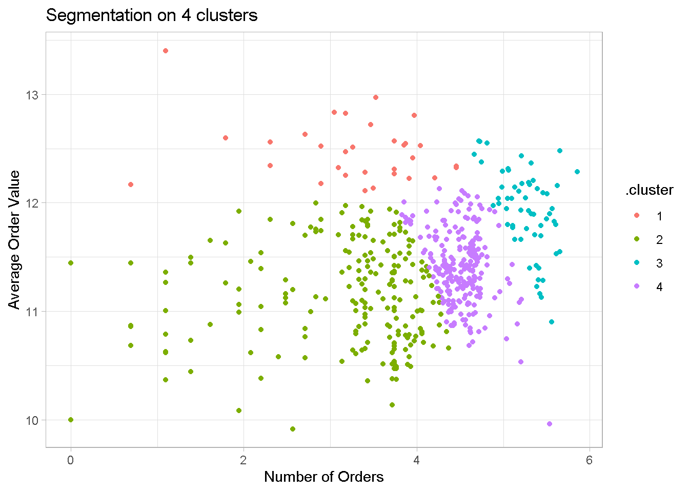
Clusters are much better defined with no one group dominating like before. Although not used in the model, I’ve added recency to show that even the former problem child is now more evenly balanced across groups.
options(digits = 2)
kmeans_4_tbl_alt %>%
group_by(.cluster) %>%
summarise(
Retailer = n(),
Avg.Sales = median(avg_amount),
Orders = median(order_count),
Avg.Order.Val = median(avg_order_val),
Recency = median(recency),
Frequency = median(frequency)
) %>%
ungroup() %>%
mutate(`Retailers(%)` = 100 * Retailer / sum(Retailer)) %>%
arrange((.cluster)) %>%
select(c(1,2,8, 3:7)) %>%
kable()
| .cluster | Retailer | Retailers(%) | Avg.Sales | Orders | Avg.Order.Val | Recency | Frequency |
|---|---|---|---|---|---|---|---|
| 1 | 31 | 5.8 | 28646 | 30 | 260276 | 12 | 285 |
| 2 | 207 | 38.5 | 11001 | 31 | 68398 | 15 | 223 |
| 3 | 60 | 11.2 | 10822 | 201 | 154102 | 8 | 2703 |
| 4 | 240 | 44.6 | 10756 | 94 | 89711 | 9 | 751 |
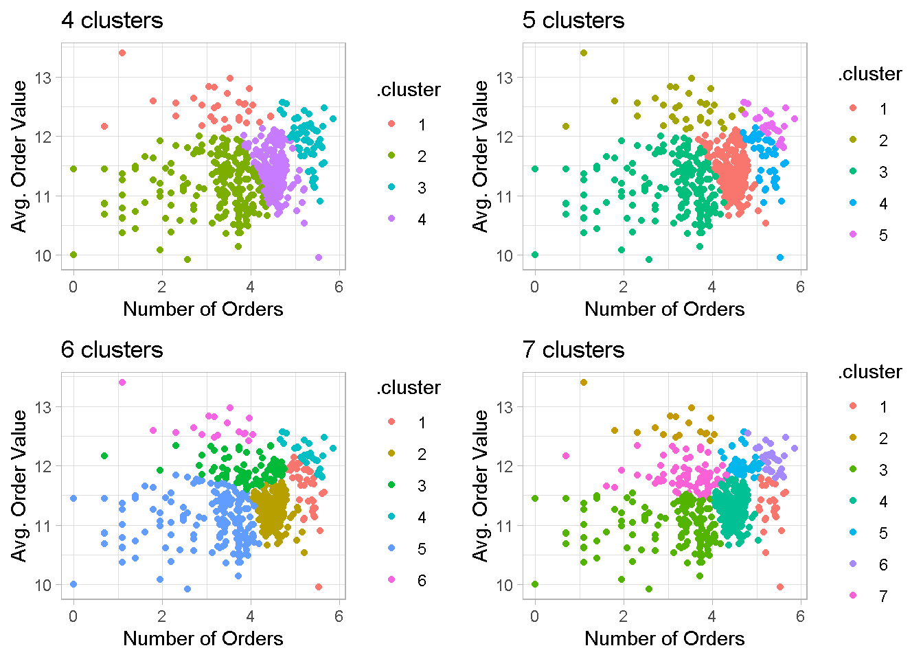
When I increase the number of clusters, the group separation remains quite neat and some noticeable overlapping reappears only with the 7-cluster configuration.
cl4 <- kmeans_map_tbl_alt %>%
pull(k_means) %>%
pluck(4) %>%
augment(customers_tbl) %>%
ggplot(aes(x = log(order_count), y = log(avg_order_val))) +
geom_point(aes(colour = .cluster)) +
theme(legend.position = "none") +
labs(x = "Number of Orders",
y = "Avg. Order Value",
title = "4 clusters") +
theme_light()
cl5 <- kmeans_map_tbl_alt %>%
pull(k_means) %>%
pluck(5) %>%
augment(customers_tbl) %>%
ggplot(aes(x = log(order_count), y = log(avg_order_val))) +
geom_point(aes(colour = .cluster)) +
theme(legend.position = "none") +
labs(x = "Number of Orders",
y = "Avg. Order Value",
title = "5 clusters") +
theme_light()
cl6 <- kmeans_map_tbl_alt %>%
pull(k_means) %>%
pluck(6) %>%
augment(customers_tbl) %>%
ggplot(aes(x = log(order_count), y = log(avg_order_val))) +
geom_point(aes(colour = .cluster)) +
theme(legend.position = "none") +
labs(x = "Number of Orders",
y = "Avg. Order Value",
title = "6 clusters") +
theme_light()
cl7 <- kmeans_map_tbl_alt %>%
pull(k_means) %>%
pluck(7) %>%
augment(customers_tbl) %>%
ggplot(aes(x = log(order_count), y = log(avg_order_val))) +
geom_point(aes(colour = .cluster)) +
theme(legend.position = "none") +
labs(x = "Number of Orders",
y = "Avg. Order Value",
title = "7 clusters") +
theme_light()
grid.arrange(cl4, cl5, cl6, cl7, nrow = 2)
Principal Components Analysis
Plotting combinations of variables is a good exploratory exercise but is arbitrary in nature and may lead to mistakes and omissions, especially when you have more than just a handful of variables to consider.
Thankfully we can use dimensionality reduction algorithms like Principal Components Analysis, or PCA for short, to visualise customer groups.
One key advantage of PCA is that each PCs is orthogonal to the direction that maximises the linear variance in the data. This means that the first few PCs can capture the majority of variance in the data and is a more faithful 2 dimensional visualisation of the clusters than the variable comparisons of the plots above.
To perform a principal components analysis I use the prcomp function from base R. VERY IMPORTANT: do NOT forget to scale and centre your data! For some reason, this is not the default!
pca_obj <-
customers_tbl[,5:7] %>%
prcomp(center = TRUE,
scale. = TRUE)
summary(pca_obj)
It’s a good idea to take a look at the variance explained by each PC. The information I need is the Proportion of Variance and is contained in the importance element of the pca_obj.
data.frame(summary(pca_obj)$importance) %>% # extract importance as a dataframe
rownames_to_column() %>% # get metrics names in a column
pivot_longer(c(2:4),
names_to = "PC",
values_to = "value") %>% # using tidyr::pivot_longer, the new gather
filter(rowname == 'Proportion of Variance') %>%
ggplot(aes(x = PC, y = value)) +
geom_col(aes(fill = value)) +
scale_fill_gradient(high = "grey5", low = "grey50") +
scale_y_continuous(labels = scales::percent) +
labs(x = "Principal Component",
y = "Percentage of Variance Explained",
title = "Variance Explained by Principal Component")
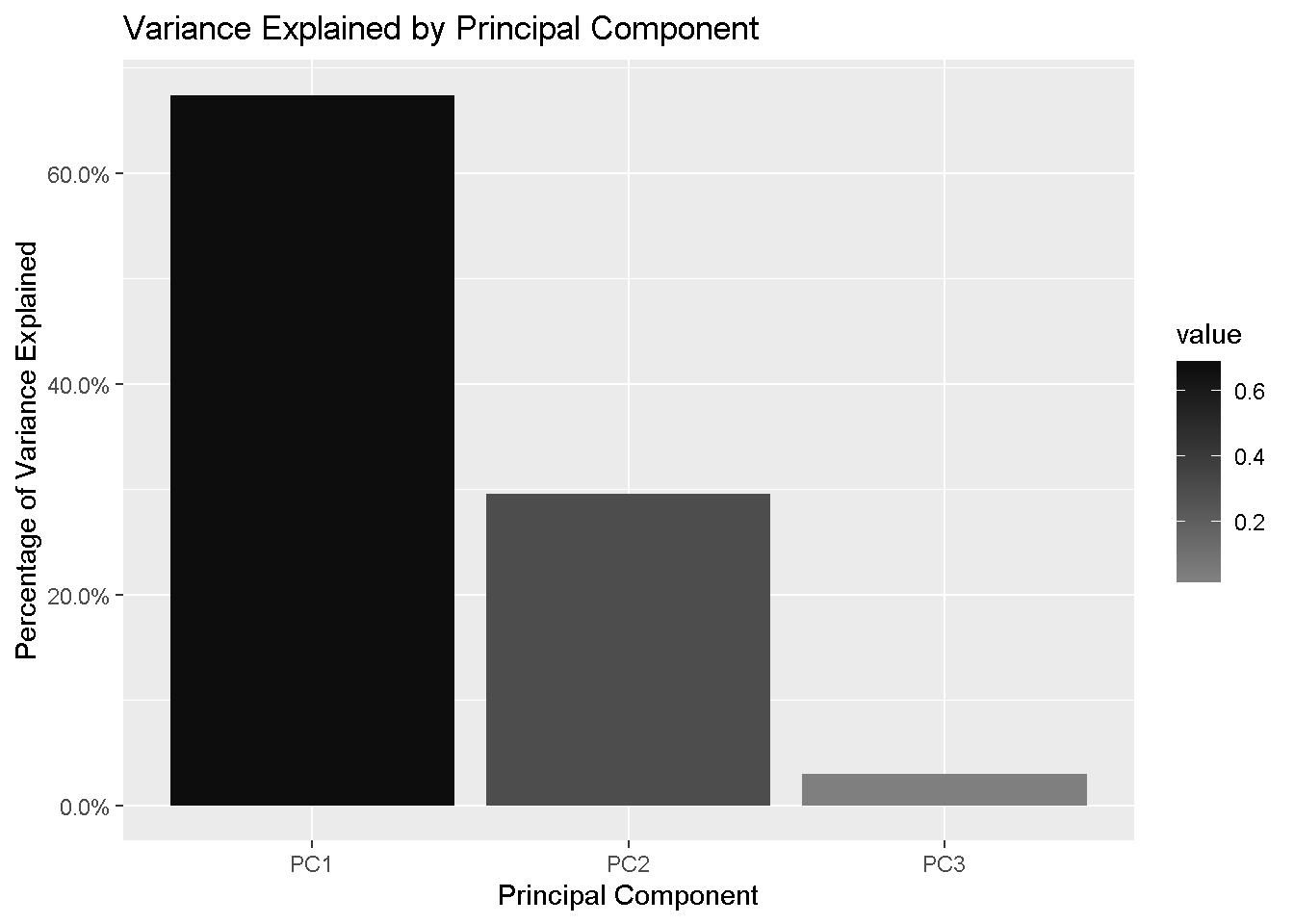
The first 2 components are explaining 97% of the variation in the data, which means that using the first 2 PCs will give us a very good understanding of the data and every subsequent PC will add very little information. This is obviously more relevant when you have a larger number of variables in your dataset.
PCA visualisation - 4 clusters
First, I extract the PCA from pca_obj and join the PCs co-ordinate contained in the element x with the retailer information from the original customer_tbl set.
pca_tbl <-
pca_obj$x %>% # extract "x", which contains the PCs co-ordinates
as_tibble() %>% # change to a tibble
bind_cols(customers_tbl %>% # append retailer_code, my primary key
select(retailer_code))
Then, I pluck the 4th element from kmeans_map_tbl_alt, attach the cluster info to it, and left_join by retailer_code so that I have all information I need in one tibble, ready for plotting.
km_pca_4_tbl <-
kmeans_map_tbl_alt %>%
pull(k_means) %>%
pluck(4) %>% # pluck element 4
augment(customers_tbl) %>% # attach .cluster to the tibble
left_join(pca_tbl, # left_join by my primary key, retailer_code
by = 'retailer_code')
km_pca_4_tbl %>%
ggplot(aes(x = PC1, y = PC2, colour = .cluster)) +
geom_point(aes(shape = .cluster)) +
labs(title = 'K-Means 4 Clusters Against First Two Principal Components',
caption = "") +
theme(legend.position = 'none') +
theme_light()
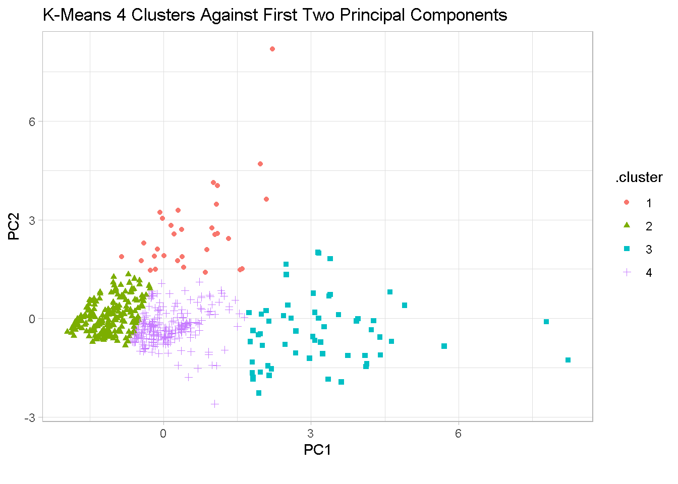
The chart confirms that the segments are well separated in the 4-cluster configuration. Segments 1 and 3 show significant variability in different directions and there is a degree of overlapping between segments 2 and 4.
options(digits = 2)
kmeans_map_tbl_alt %>%
pull(k_means) %>%
pluck(4) %>%
augment(customers_tbl) %>%
group_by(.cluster) %>%
summarise(
Retailers = n(),
Avg.Sales = median(avg_amount),
Orders = median(order_count),
Avg.Order.Val = median(avg_order_val),
`Tot.Sales(m)` = sum(tot_amount/1e+6)
) %>%
ungroup() %>%
mutate(`Tot.Sales(%)` = 100 * `Tot.Sales(m)` / sum(`Tot.Sales(m)`),
`Retailers(%)` = 100*Retailers / sum(Retailers)) %>%
select(c(1, 2, 8, 3:7)) %>%
kable()
| .cluster | Retailers | Retailers(%) | Avg.Sales | Orders | Avg.Order.Val | Tot.Sales(m) | Tot.Sales(%) |
|---|---|---|---|---|---|---|---|
| 1 | 31 | 5.8 | 28646 | 30 | 260276 | 273 | 5.8 |
| 2 | 207 | 38.5 | 11001 | 31 | 68398 | 504 | 10.6 |
| 3 | 60 | 11.2 | 10822 | 201 | 154102 | 1863 | 39.2 |
| 4 | 240 | 44.6 | 10756 | 94 | 89711 | 2105 | 44.4 |
GROUP 1 - includes customers who placed a small number of very high-value orders. Although they represent only 6% of overall total sales, encouraging them to place even a slightly higher number of orders could result in a big increase in your bottom line.
GROUP 2 - is the “low order value” / “low number of orders” segment. However, as it accounts for almost 40% of the customer base, I’d incentivise them to increase either their order value or number of orders.
GROUP 3 - is a relatively small segment (11% of total retailers) but have placed a very high number of mid-to-high value orders. These are some of your most valuable customers and account for nearly 40% of total sales. I would want to keep them very happy and engaged.
GROUP 4 - is where good opportunities may lay! This is the largest group in terms of both number of retailers (45%) and contribution to total sales (44%). I would try to motivate them to move to Group 1 or Group 3.
PCA visualisation - 6 clusters
IMPORTANT NOTE: the cluster numbering is randomly generated so group names do not match with those in the previous section.
Let’s now see if adding extra clusters reveals some hidden dynamics and help us fine tune this profiling exercise. Here I’m only showing the 6-cluster configuration, which is the most promising.
options(digits = 2)
kmeans_6_tbl <-
kmeans_map_tbl_alt %>%
pull(k_means) %>%
pluck(6) %>% # pluck element 6
augment(customers_tbl) %>% # attach .cluster to the tibble
left_join(pca_tbl, # left_join by retailer_code
by = 'retailer_code')
kmeans_6_tbl %>%
ggplot(aes(x = PC1, y = PC2, colour = .cluster)) +
geom_point(aes(shape = .cluster)) +
labs(title = 'K-Means 6 Clusters Against First Two Principal Components',
caption = "") +
theme(legend.position = 'none') +
theme_light()

The 6-segment set up broadly confirms the groups structure and separation found in the 4-split solution, showing good clusters stability. Former segments 1 and 3 further split out to create 2 “mid-of-the-range” groups, each ‘borrowing’ from former segments 2 and 4.
options(digits = 2)
kmeans_map_tbl_alt %>%
pull(k_means) %>%
pluck(6) %>%
augment(customers_tbl) %>%
group_by(.cluster) %>%
summarise(
Retailers = n(),
Avg.Sales = median(avg_amount),
Orders = median(order_count),
Avg.Order.Val = median(avg_order_val),
`Tot.Sales(m)` = sum(tot_amount/1e+6)
) %>%
ungroup() %>%
mutate(`Tot.Sales(%)` = 100 * `Tot.Sales(m)` / sum(`Tot.Sales(m)`),
`Retailers(%)` = 100*Retailers / sum(Retailers)) %>%
select(c(1, 2, 8, 3:7)) %>%
kable()
| .cluster | Retailers | Retailers(%) | Avg.Sales | Orders | Avg.Order.Val | Tot.Sales(m) | Tot.Sales(%) |
|---|---|---|---|---|---|---|---|
| 1 | 39 | 7.2 | 9256 | 194 | 128026 | 850 | 17.9 |
| 2 | 199 | 37.0 | 10068 | 94 | 82056 | 1525 | 32.1 |
| 3 | 85 | 15.8 | 15708 | 51 | 142416 | 765 | 16.1 |
| 4 | 28 | 5.2 | 12960 | 200 | 195423 | 1115 | 23.5 |
| 5 | 170 | 31.6 | 10376 | 30 | 63924 | 333 | 7.0 |
| 6 | 17 | 3.2 | 33227 | 26 | 287822 | 158 | 3.3 |
The new “mid-of-the-range” groups have specific characteristics:
Customers in New Group 1 are placing a high number of orders of mid-to-high value and contribute some 18% to Total Sales.
- STRATEGY TO TEST: as they’re already placing frequent orders, we may offer them incentives to increase their order value.
On the other hand, New Group 3 customers are purchasing less frequently and have a similar mid-to-high order value and account for some 16% to total customers.
- STRATEGY TO TEST: in this case the incentive could be focused on boosting the number of orders.
Better defined clusters represent greater potential opportunities: it makes it easier to testing different strategies, learn what really resonates with each group and connect with them using the right incentive.
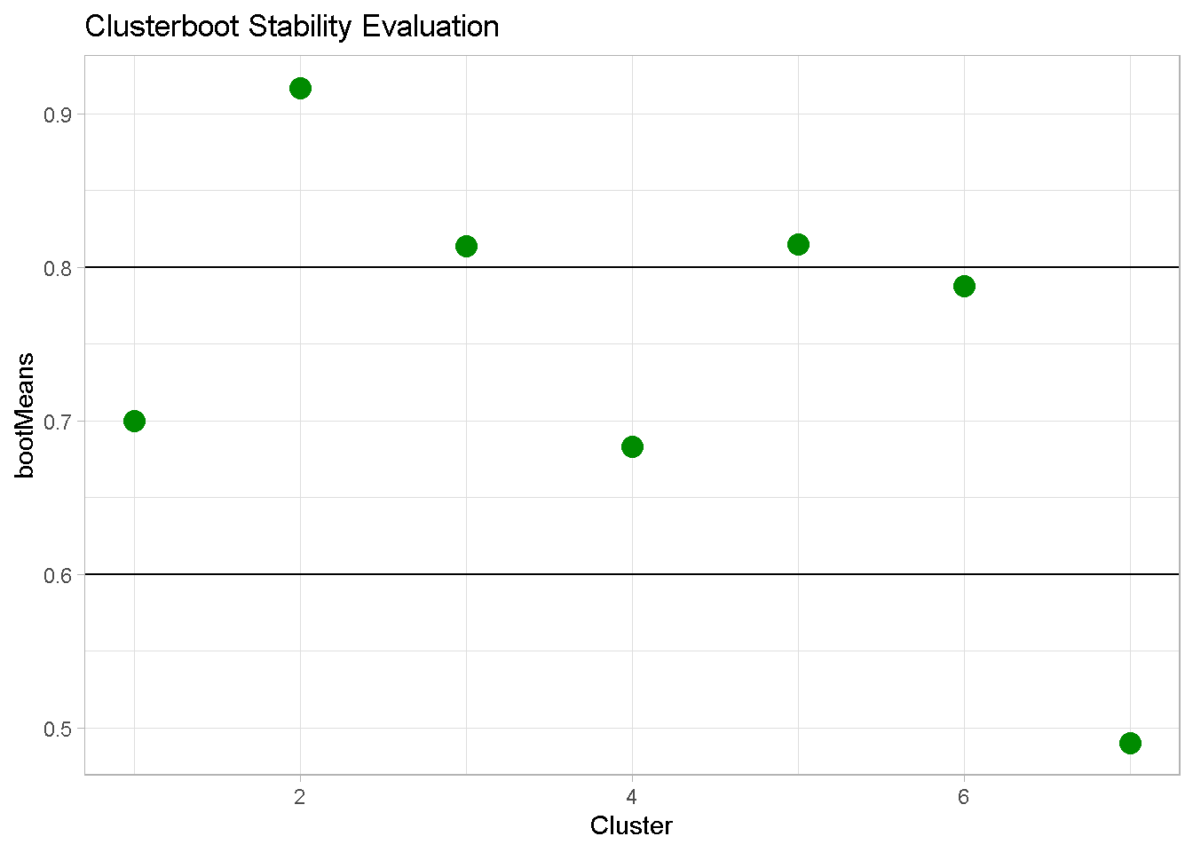
Clusterboot Evaluation
One last step worth taking is verifying how ‘genuine’ your clusters are by validating whether they capture non-random structure in the data. This is particularly important with k-means clustering because the analyst has to specify the number of clusters in advance.
The clusterboot algorithm uses bootstrap resampling to evaluate how stable a given cluster is to perturbations in the data. The cluster’s stability is assessed by measuring the similarity between sets of a given number of number of resampling runs.
kmeans_boot100 <-
clusterboot(
clust_data[,4:6],
B = 50, # number of resampling runs
bootmethod = "boot", # resampling method: nonparametric bootstrap
clustermethod = kmeansCBI, # clustering method: k-means
k = 7, # number of clusters
seed = 1975) # for reproducibility
bootMean_df <-
data.frame(cluster = 1:7,
bootMeans = kmeans_boot100$bootmean)
To interpret the results, I visualise the tests output with a simple chart.
Remember that values:
- above 0.8 (segment 2, 3 and 5) indicates highly stable clusters
- between 0.6 and 0.75 (segments 1, 4 and 6) signal a acceptable degree of stability
- below 0.6 (segment 7) should be considered unstable
Hence, the 6-cluster configuration is overall considerably stable.
bootMean_df %>%
ggplot(aes(x = cluster, y = bootMeans)) +
geom_point(colour = 'green4', size = 4) +
geom_hline(yintercept = c(0.6, 0.8)) +
theme_light() +
labs(x = "Cluster",
title = "Clusterboot Stability Evaluation") +
theme(legend.position = "none")
Closing thoughts
In this post I’ve used a feature-rich dataset to run through the practical steps you need to take and considerations you may face when running a customer profiling analysis. I’ve used the K-means clustering technique on a range of different customer attributes to look for potential sub-groups in the customer base, visually examined the clusters with Principal Components Analysis, and validated the cluster’s stability with clusterboot from the fpc package.
This analysis should provide a solid base for discussion with relevant business stakeholders. Normally I would present my client with a variety of customer profiles based on different combinations of customer features and formulate my own data-driven recommendations. However, it is ultimately down to them to decide how many groups they want settle for and what characteristics each segment should have.
Conclusions
Statistical clustering is very easy to implement and can identify natural occurring patterns of behaviour in your customer base. However, it has some limitations that should always be kept in mind in a commercial setting. First and foremost, it is a snapshot in time and just like a picture it only represents the moment it was taken.
For that reason it should be periodically re-evaluated because:
it may capture seasonal effects that do not necessarily apply at different periods in time
new customers can enter your customer base, changing the make up of each group
customers purchase patterns evolve over time and so should your customer profiling
Nonetheless, statistical segmentation remains a powerful and useful exploratory exercise to finding groups within your consumer data. It also resonates well with clients as I’ve found from my consulting experience, and is a relatively straightforward concept to explain non technical audiences.
Code Repository
The full R code can be found on my GitHub profile
References
- For a broader discussion on the benefits of customer segmentation
- For a visual introduction to Principal Components Analysis
- For an application of clusterboot algorithm
- For a critique of some of k-means drawback