Propensity Modelling - Using h2o and DALEX to Estimate the Likelihood of Purchasing a Financial Product - Optimise Profit With the Expected Value Framework
In this day and age, a business that leverages data to understand the drivers of its customers’ behaviour has a true competitive advantage. Organisations can dramatically improve their performance in the market by analysing customer level data in an effective way and focus their efforts towards those that are more likely to engage.
One trialled and tested approach to tease out this type of insight is Propensity Modelling, which combines information such as a customers’ demographics (age, race, religion, gender, family size, ethnicity, income, education level), psycho-graphic (social class, lifestyle and personality characteristics), engagement (emails opened, emails clicked, searches on mobile app, webpage dwell time, etc.), user experience (customer service phone and email wait times, number of refunds, average shipping times), and user behaviour (purchase value on different time-scales, number of days since most recent purchase, time between offer and conversion, etc.) to estimate the likelihood of a certain customer profile to performing a certain type of behaviour (e.g. the purchase of a product).
Once you understand the probability of a certain customer to interact with your brand, buy a product or sign up for a service, you can use this information to create scenarios, be it minimising marketing expenditure, maximising acquisition targets, and optimise email send frequency or depth of discount.
Project Structure
In this project I’m analysing the results of a bank direct marketing campaign to sell term deposits in order to identify what type of customer is more likely to respond. The marketing campaigns were based on phone calls and more than one contact to the same client was required at times.
First, I am going to carry out an extensive data exploration and use the results and insights to prepare the data for analysis.
Then, I’m estimating a number of models and assess their performance and fit to the data using a model-agnostic methodology that enables to compare traditional “glass-box” models and “black-box” models.
Last, I’ll fit one final model that combines findings from the exploratory analysis and insight from models’ selection and use it to run a basic profit optimisation.
Optimising for expected profit
library(tidyverse)
library(skimr)
library(h2o)
library(knitr)
library(tictoc)
Now that I have my final model, the last piece of the puzzle is the final “So what?” question that puts all into perspective. The estimate for the probability of a customer to sign up for a term deposit can be used to create a number of optimised scenarios, ranging from minimising your marketing expenditure, maximising your overall acquisitions, to driving a certain number of cross-sell opportunities.
Before I can do that, there are a couple of housekeeping tasks needed to “set up the work scene” and a couple of important concepts to introduce:
the threshold and the F1 score
precision and recall
A few housekeeping tasks
I load the clensed data saved at the end of the exploratory analysis
# Loading clensed data
data_final <- readRDS(file = "../01_data/data_final.rds")
From that, I create a randomised training and validation set with rsample and save them as train_tbl and test_tbl.
set.seed(seed = 1975)
train_test_split <-
rsample::initial_split(
data = data_final,
prop = 0.80
)
train_tbl <- train_test_split %>% rsample::training()
test_tbl <- train_test_split %>% rsample::testing()
I also need to start a h2o cluster, turn off the progress bar and load the final random forest model
# initialize h2o session and switch off progress bar
h2o.no_progress()
h2o.init(max_mem_size = "16G")
##
## H2O is not running yet, starting it now...
##
## Note: In case of errors look at the following log files:
## C:\Users\LENOVO\AppData\Local\Temp\RtmpkRk5j9/h2o_LENOVO_started_from_r.out
## C:\Users\LENOVO\AppData\Local\Temp\RtmpkRk5j9/h2o_LENOVO_started_from_r.err
##
##
## Starting H2O JVM and connecting: Connection successful!
##
## R is connected to the H2O cluster:
## H2O cluster uptime: 3 seconds 172 milliseconds
## H2O cluster timezone: Europe/Berlin
## H2O data parsing timezone: UTC
## H2O cluster version: 3.28.0.4
## H2O cluster version age: 2 months and 4 days
## H2O cluster name: H2O_started_from_R_LENOVO_frm928
## H2O cluster total nodes: 1
## H2O cluster total memory: 14.21 GB
## H2O cluster total cores: 4
## H2O cluster allowed cores: 4
## H2O cluster healthy: TRUE
## H2O Connection ip: localhost
## H2O Connection port: 54321
## H2O Connection proxy: NA
## H2O Internal Security: FALSE
## H2O API Extensions: Amazon S3, Algos, AutoML, Core V3, TargetEncoder, Core V4
## R Version: R version 3.6.3 (2020-02-29)
drf_final <- h2o.loadModel(path = "../03_models/drf_grid_final_model_1")
The threshold and the F1 score
The question the model is trying to answer is “ Has this customer signed up for a term deposit following a direct marketing campaign? “ and the cut-off (a.k.a. the threshold) is the value that divides the model’s predictions into Yes and No.
To illustrate the point, I first calculate some predictions by passing the test_tbl data set to the h2o.performance function.
perf_drf_final <- h2o.performance(drf_final, newdata = test_tbl %>% as.h2o())
perf_drf_final@metrics$max_criteria_and_metric_scores
## Maximum Metrics: Maximum metrics at their respective thresholds
## metric threshold value idx
## 1 max f1 0.189521 0.508408 216
## 2 max f2 0.108236 0.560213 263
## 3 max f0point5 0.342855 0.507884 143
## 4 max accuracy 0.483760 0.903848 87
## 5 max precision 0.770798 0.854167 22
## 6 max recall 0.006315 1.000000 399
## 7 max specificity 0.930294 0.999864 0
## 8 max absolute_mcc 0.189521 0.444547 216
## 9 max min_per_class_accuracy 0.071639 0.721231 300
## 10 max mean_per_class_accuracy 0.108236 0.755047 263
## 11 max tns 0.930294 7342.000000 0
## 12 max fns 0.930294 894.000000 0
## 13 max fps 0.006315 7343.000000 399
## 14 max tps 0.006315 894.000000 399
## 15 max tnr 0.930294 0.999864 0
## 16 max fnr 0.930294 1.000000 0
## 17 max fpr 0.006315 1.000000 399
## 18 max tpr 0.006315 1.000000 399
Like many other machine learning modelling platforms, h2o uses the threshold value associated with the maximum F1 score, which is nothing but a weighted average between precision and recall. In this case the threshold @ Max F1 is 0.190.
Now, I use the h2o.predict function to make predictions using the test set. The prediction output comes with three columns: the actual model predictions (predict), and the probabilities associated with that prediction (p0, and p1, corresponding to No and Yes respectively). As you can see, the p1 probability associated with the current cut-off is around 0.0646.
drf_predict <- h2o.predict(drf_final, newdata = test_tbl %>% as.h2o())
# I converte to a tibble for ease of use
as_tibble(drf_predict) %>%
arrange(p0) %>%
slice(3088:3093) %>%
kable()
| predict | p0 | p1 |
|---|---|---|
| 1 | 0.9352865 | 0.0647135 |
| 1 | 0.9352865 | 0.0647135 |
| 1 | 0.9352865 | 0.0647135 |
| 0 | 0.9354453 | 0.0645547 |
| 0 | 0.9354453 | 0.0645547 |
| 0 | 0.9354453 | 0.0645547 |
However, the F1 score is only one way to identify the cut-off. Depending on our goal, we could also decide to use a threshold that, for instance, maximises precision or recall. In a commercial setting, the pre-selected threshold @ Max F1 may not necessarily be the optimal choice: enter Precision and Recall!
Precision and Recall
Precision shows how sensitive models are to False Positives (i.e. predicting a customer is subscribing when he-she is actually NOT) whereas Recall looks at how sensitive models are to False Negatives (i.e. forecasting that a customer is NOT subscribing whilst he-she is in fact going to do so).
These metrics are very relevant in a business context because organisations are particularly interested in accurately predicting which customers are truly likely to subscribe (high precision) so that they can target them with advertising strategies and other incentives. At the same time they want to minimise efforts towards customers incorrectly classified as subscribing (high recall) who are instead unlikely to sign up.
However, as you can see from the chart below, when precision gets higher, recall gets lower and vice versa. This is often referred to as the Precision-Recall tradeoff.
perf_drf_final %>%
h2o.metric() %>%
as_tibble() %>%
ggplot(aes(x = threshold)) +
geom_line(aes(y = precision), colour = "darkblue", size = 1) +
geom_line(aes(y = recall), colour = "red", size = 1) +
geom_vline(xintercept = h2o.find_threshold_by_max_metric(perf_drf_final, "f1")) +
theme_minimal() +
labs(title = 'Precision and Recall with Cut-off @ Max F1',
subtitle = 'Distributed Random Forest Model',
x = 'With threshold @ Max F1, probability above 0.0646 predicts subscribed = "Yes"',
y = 'Precision and Recall Values'
) +
theme(plot.title = element_text(hjust = 0.4),
plot.subtitle = element_text(hjust = 0.4)) +
# p < 0.0646
annotate("text", x = 0.065, y = 0.50, size = 3, colour = "darkgreen",
label = 'p1 < 0.0646 "No"\nNot Subscribed') +
# p=0.0646
geom_vline(xintercept = 0.190, size = 0.8, colour = "orange") +
annotate("text", x = 0.19, y = 0.80, size = 3, colour = "darkblue",
label = 'p1 = 0.0646 \nCurrent Cut-off \n@ Max F1') +
# p> 0.0646
annotate("text", x = 0.5, y = 0.50, size = 3, colour = "purple",
label = 'p1 > 0.0646 "Yes"\n Subscribed')
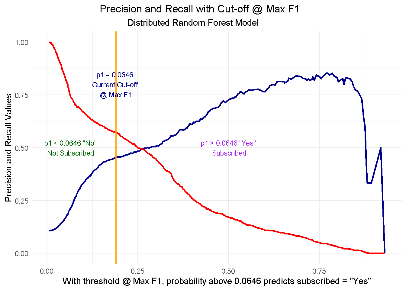
To fully comprehend this dynamic and its implications, let’s start with taking a look at the cut-off zero and cut-off one points and then see what happens when you start moving the threshold between the two positions:
At threshold zero ( lowest precision, highest recall) the model classifies every customer as
subscribed = Yes. In such scenario, you would contact every single customers with direct marketing activity but waste precious resourses by also including those less likely to subcsribe. Clearly this is not an optimal strategy as you’d incur in a higher overall acquisition cost.Conversely, at threshold one ( highest precision, lowest recall) the model tells you that nobody is likely to subscribe so you should contact no one. This would save you tons of money in marketing cost but you’d be missing out on the additional revenue from those customers who would’ve subscribed, had they been notified about the term deposit through direct marketing. Once again, not an optimal strategy.
When moving to a higher threshold the model becomes more “choosy” on who it classifies as subscribed = Yes. As a consequence, you become more conservative on who to contact ( higher precision) and reduce your acquisition cost, but at the same time you increase your chance of not reaching prospective subscribes ( lower recall), missing out on potential revenue.
The key question here is where do you stop? Is there a “sweet spot” and if so, how do you find it? Well, that will depend entirely on the goal you want to achieve. In the next section I’ll be running a mini-optimisation with the goal to maximise profit.
Finding the optimal threshold
For this mini-optimisation I’m implementing a simple profit maximisation based on generic costs connected to acquiring a new customer and benefits derived from said acquisition. This can be evolved to include more complex scenarios but it would be outside the scope of this exercise.
To understand which cut-off value is optimal to use we need to simulate the cost-benefit associated with each threshold point. This is a concept derived from the Expected Value Framework as seen on Data Science for Business
To do so I need 2 things:
Expected Rates for each threshold - These can be retrieved from the confusion matrix
Cost/Benefit for each customer - I will need to simulate these based on assumptions
Expected rates
Expected rates can be conveniently retrieved for all cut-off points using h2o.metric.
# Get expected rates by cutoff
expected_rates <- h2o.metric(perf_drf_final) %>%
as.tibble() %>%
select(threshold, tpr, fpr, fnr, tnr)
expected_rates
## # A tibble: 400 x 5
## threshold tpr fpr fnr tnr
## <dbl> <dbl> <dbl> <dbl> <dbl>
## 1 0.930 0 0.000136 1 1.00
## 2 0.919 0.00112 0.000136 0.999 1.00
## 3 0.893 0.00112 0.000272 0.999 1.00
## 4 0.882 0.00224 0.000545 0.998 0.999
## 5 0.879 0.00336 0.000545 0.997 0.999
## 6 0.876 0.00671 0.000545 0.993 0.999
## 7 0.873 0.00783 0.000545 0.992 0.999
## 8 0.867 0.0123 0.000545 0.988 0.999
## 9 0.857 0.0145 0.000545 0.985 0.999
## 10 0.849 0.0157 0.000545 0.984 0.999
## # ... with 390 more rows
Cost/Benefit Information
The cost-benefit matrix is a business assessment of the cost and benefit for each of four potential outcomes. To create such matrix I will have to make a few assumptions about the expenses and advantages that an organisation should consider when carrying out an advertising-led procurement drive.
Let’s assume that the cost of selling a term deposits is of £30 per customer. This would include the likes of performing the direct marketing activity (training the call centre reps, setting time aside for active calls, etc.) and incentives such as offering a discounts on another financial product or on boarding onto membership schemes offering benefits and perks. A banking organisation will incur in this type of cost in two cases: when they correctly predict that a customer will subscribe ( true positive, TP), and when they incorrectly predict that a customer will subscribe ( false positive, FP).
Let’s also assume that the revenue of selling a term deposits to an existing customer is of £80 per customer. The organisation will guarantee this revenue stream when the model predicts that a customer will subscribe and they actually do ( true positive, TP).
Finally, there’s the true negative (TN) scenario where we correctly predict that a customer won’t subscribe. In this case we won’t spend any money but won’t earn any revenue.
Here’s a quick recap of the scenarios:
True Positive (TP) - predict will subscribe, and they actually do: COST: -£30; REV £80
False Positive (FP) - predict will subscribe, when they actually wouldn’t: COST: -£30; REV £0
True Negative (TN) - predict won’t subscribe, and they actually don’t: COST: £0; REV £0
False Negative (FN) - predict won’t subscribe, but they actually do: COST: £0; REV £0
I create a function to calculate the expected profit using the probability of a positive case (p1) and the cost/benefit associated with a true positive (cb_tp) and a false positive (cb_fp). No need to include the true negative or false negative here as they’re both zero.
I’m also including the expected_rates data frame created previously with the expected rates for each threshold (400 thresholds, ranging from 0 to 1).
# Function to calculate expected profit
expected_profit_func <- function(p1, cb_tp, cb_fp) {
tibble(
p1 = p1,
cb_tp = cb_tp,
cb_fp = cb_fp
) %>%
# add expected rates
mutate(expected_rates = list(expected_rates)) %>%
unnest() %>%
# calculate the expected profit
mutate(
expected_profit = p1 * (tpr * cb_tp) +
(1 - p1) * (fpr * cb_fp)
) %>%
select(threshold, expected_profit)
}
Multi-Customer Optimization
Now to understand how a multi customer dynamic would work, I’m creating a hypothetical 10 customer group to test my function on. This is a simplified view in that I’m applying the same cost and revenue structure to all customers but the cost/benefit framework can be tailored to the individual customer to reflect their separate product and service level set up and the process can be easily adapted to optimise towards different KPIs (like net profit, CLV, number of subscriptions, etc.)
# Ten Hypothetical Customers
ten_cust <- tribble(
~"cust", ~"p1", ~"cb_tp", ~"cb_fp",
'ID1001', 0.1, 80 - 30, -30,
'ID1002', 0.2, 80 - 30, -30,
'ID1003', 0.3, 80 - 30, -30,
'ID1004', 0.4, 80 - 30, -30,
'ID1005', 0.5, 80 - 30, -30,
'ID1006', 0.6, 80 - 30, -30,
'ID1007', 0.7, 80 - 30, -30,
'ID1008', 0.8, 80 - 30, -30,
'ID1009', 0.9, 80 - 30, -30,
'ID1010', 1.0, 80 - 30, -30
)
I use purrr to map the expected_profit_func() to each customer, returning a data frame of expected profit per customer by threshold value. This operation creates a nester tibble, which I have to unnest() to expand the data frame to one level.
# calculate expected profit for each at each threshold
expected_profit_ten_cust <- ten_cust %>%
# pmap to map expected_profit_func() to each item
mutate(expected_profit = pmap(.l = list(p1, cb_tp, cb_fp),
.f = expected_profit_func)) %>%
unnest() %>%
select(cust, p1, threshold, expected_profit)
Then, I can visualize the expected profit curves for each customer.
# Visualising Expected Profit
expected_profit_ten_cust %>%
ggplot(aes(threshold, expected_profit,
colour = factor(cust)),
group = cust) +
geom_line(size = 1) +
theme_minimal() +
tidyquant::scale_color_tq() +
labs(title = "Expected Profit Curves",
colour = "Customer No." ) +
theme(plot.title = element_text(hjust = 0.5))
Finally, I can aggregate the expected profit, visualise the final curve and highlight the optimal threshold.
# Aggregate expected profit by threshold
total_expected_profit_ten_cust <- expected_profit_ten_cust %>%
group_by(threshold) %>%
summarise(expected_profit_total = sum(expected_profit))
# Get maximum optimal threshold
max_expected_profit <- total_expected_profit_ten_cust %>%
filter(expected_profit_total == max(expected_profit_total))
# Visualize the total expected profit curve
total_expected_profit_ten_cust %>%
ggplot(aes(threshold, expected_profit_total)) +
geom_line(size = 1) +
geom_vline(xintercept = max_expected_profit$threshold) +
theme_minimal() +
labs(title = "Expected Profit Curve - Total Expected Profit",
caption = paste0('threshold @ max = ',
max_expected_profit$threshold %>% round(3))) +
theme(plot.title = element_text(hjust = 0.5))
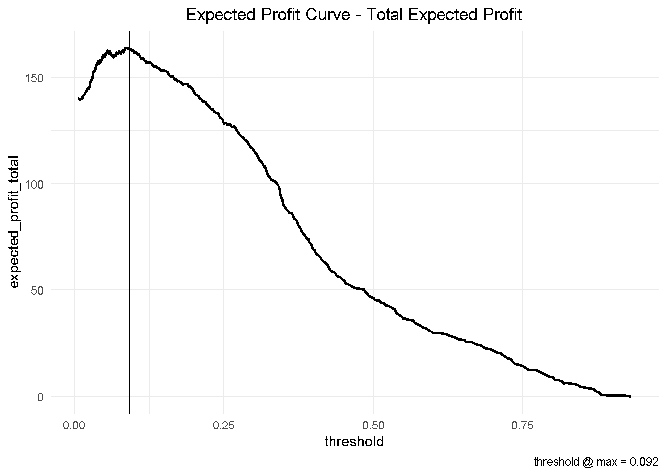
This has some important business implications. Based on our hypothetical 10-customer group, choosing the optimised threshold of 0.092 would yield a total profit of nearly £164 compared to the nearly £147 associated with the automatically selected cut-off of 0.190.
This would result in an additional expected profit of nearly £1.7 per customer. Assuming that we have a customer base of approximately 500,000, switching to the optimised model could generate an additional expected profit of £850k!
total_expected_profit_ten_cust %>%
slice(184, 121) %>%
round(3) %>%
mutate(diff = expected_profit_total - lag(expected_profit_total))
## # A tibble: 2 x 3
## threshold expected_profit_total diff
## <dbl> <dbl> <dbl>
## 1 0.19 147. NA
## 2 0.092 164. 16.9
It is easy to see that, depending on the size of your business, the magnitude of potential profit increase could be a significant.
Closing thoughts
In this final piece of the puzzle, I’ve taken my final random forest model and implemented a multi-customer profit optimization that revealed a potential additional expected profit of nearly £1.7 per customer (or £850k if you had a 500,000 customer base).
Furthermore, I’ve introduced key concepts like the threshold and F1 score and the precision-recall tradeoff and explained why it’s highly important to decide which cutoff to call YES.
After exploring, cleansing and formatting the data, fitting and comparing multiple models and choosing the best one, sticking with the default threshold @ Max F1 would be stopping short of the ultimate “so what?” that puts all that hard work into prospective.
One final thing: don’t forget to shut-down the h2o instance when you’re done!
h2o.shutdown(prompt = FALSE)
Code Repository
The full R code and all relevant files can be found on my GitHub profile @ Propensity Modelling
References
For the original paper that used the data set see: A Data-Driven Approach to Predict the Success of Bank Telemarketing. Decision Support Systems, S. Moro, P. Cortez and P. Rita.
For an advanced tutorial on sales forecasting and product backorders optimisation see Matt Dancho’s Predictive Sales Analytics: Use Machine Learning to Predict and Optimize Product Backorders
For the Expected Value Framework see: Data Science for Business