A gentle Introduction to Customer Segmentation - Using K-Means Clustering to Understand Marketing Response
Market segmentation refers to the process of dividing a consumer market of existing and/or potential customers into groups (or segments) based on shared attributes, interests, and behaviours.
For this mini-project I will use the popular K-Means clustering algorithm to segment customers based on their response to a series of marketing campaigns. The basic concept is that consumers who share common traits would respond to marketing communication in a similar way so that companies can reach out for each group in a relevant and effective way.
What is K-Means Clustering?
K-Means clustering is part of the Unsupervised Learning modelling family, a set of techniques used to find patterns in data that has not been labelled, classified or categorized. As this method does not require to have a target for clustering, it can be of great help in the exploratory phase of customer segmentation.
The fundamental idea is that customers assigned to a group are as similar as possible, whereas customers belonging to different groups are as dissimilar as possible. Each cluster is represented by its centre, corresponding to the mean of elements assigned to the cluster.
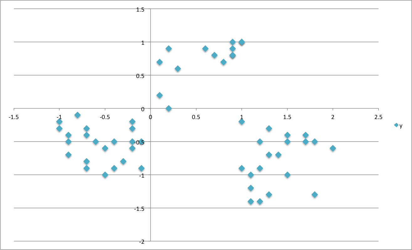
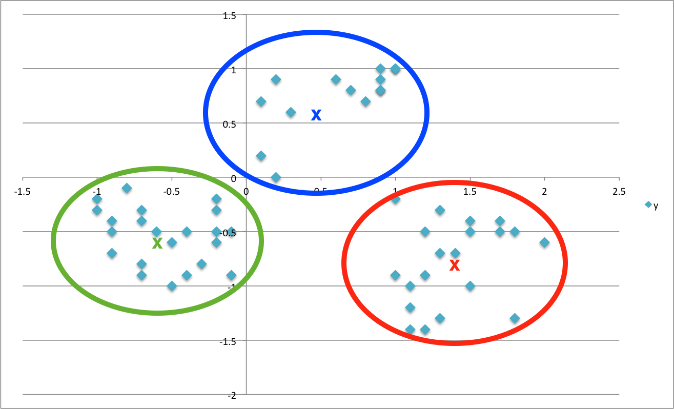
To illustrate the principle, suppose that you have a set of elements like those in the picture below and want to classify them into 3 clusters
What K-Means would do for you is to group them up around the middle or centre of each cluster, represented here by the “X”’s, in a way that minimises the distance of each element to its centre
So how does that help you to better understand your customers? Well, in this case you can use their behavior (specifically, which offer they did or did not go for) as a way to grouping them up with similar minded customers. You can now look into each of those groups to unearth trends and patterns and use them for shaping future offers.
On a slightly more technical note, it’s important to mention that there are many K-Means algorithms available ( Hartigan-Wong, Lloyd, MacQueen to name but a few) but they all share the same basic concept: each element is assigned to a cluster so that it minimises the sum of squares Euclidean Distance to the centre - a process also referred to as minimising the total within-cluster sum of squares (tot.withinss).
Loading the Packages
library(tidyverse)
library(lubridate)
library(knitr)
library(readxl)
library(broom)
library(umap)
library(ggrepel)
The Data
The dataset comes from John Foreman’s book, Data Smart. It contains sales promotion data for a fictional wine retailer and includes details of 32 promotions (including wine variety, minimum purchase quantity, percentage discount, and country of origin) and a list of 100 customers and the promotions they responded to.
offers_tbl <- read_excel('WineKMC.xlsx', sheet = 'OfferInformation')
offers_tbl <- offers_tbl %>%
set_names(c('offer', 'campaign', 'varietal', 'min_qty_kg',
'disc_pct','origin', 'past_peak'))
head(offers_tbl)
## # A tibble: 6 x 7
## offer campaign varietal min_qty_kg disc_pct origin past_peak
## <dbl> <chr> <chr> <dbl> <dbl> <chr> <chr>
## 1 1 January Malbec 72 56 France FALSE
## 2 2 January Pinot Noir 72 17 France FALSE
## 3 3 February Espumante 144 32 Oregon TRUE
## 4 4 February Champagne 72 48 France TRUE
## 5 5 February Cabernet Sauvign~ 144 44 New Zeala~ TRUE
## 6 6 March Prosecco 144 86 Chile FALSE
transac_tbl <- read_excel('WineKMC.xlsx', sheet = 'Transactions')
transac_tbl <- transac_tbl %>%
set_names(c('customer', 'offer'))
head(transac_tbl)
## # A tibble: 6 x 2
## customer offer
## <chr> <dbl>
## 1 Smith 2
## 2 Smith 24
## 3 Johnson 17
## 4 Johnson 24
## 5 Johnson 26
## 6 Williams 18
The data needs to be converted to a User-Item format(a.k.a. Customer-Product matrix), featuring customers across the top and offers down the side. The cells are populated with 0’s and 1’s, where 1’s indicate if a customer responded to a specific offer.
This type of matrix is also known as binary rating matrix and does NOT require normalisation.
wine_tbl <- transac_tbl %>%
left_join(offers_tbl) %>%
mutate(value = 1) %>%
spread(customer,value, fill = 0)
head(wine_tbl)
## # A tibble: 6 x 10⁷
## offer campaign varietal min_qty_kg disc_pct origin past_peak Adams Allen
## <dbl> <chr> <chr> <dbl> <dbl> <chr> <chr> <dbl> <dbl>
## 1 1 January Malbec 72 56 France FALSE 0 0
## 2 2 January Pinot N~ 72 17 France FALSE 0 0
## 3 3 February Espuman~ 144 32 Oregon TRUE 0 0
## 4 4 February Champag~ 72 48 France TRUE 0 0
## 5 5 February Caberne~ 144 44 New Z~ TRUE 0 0
## 6 6 March Prosecco 144 86 Chile FALSE 0 0
## # ... with 98 more variables: Anderson <dbl>, Bailey <dbl>, Baker <dbl>,
## # Barnes <dbl>, Bell <dbl>, Bennett <dbl>, Brooks <dbl>, Brown <dbl>,
## # Butler <dbl>, Campbell <dbl>, Carter <dbl>, Clark <dbl>,
## # Collins <dbl>, Cook <dbl>, Cooper <dbl>, Cox <dbl>, Cruz <dbl>,
## # Davis <dbl>, Diaz <dbl>, Edwards <dbl>, Evans <dbl>, Fisher <dbl>,
## # Flores <dbl>, Foster <dbl>, Garcia <dbl>, Gomez <dbl>, Gonzalez <dbl>,
## # Gray <dbl>, Green <dbl>, Gutierrez <dbl>, Hall <dbl>, Harris <dbl>,
## # Hernandez <dbl>, Hill <dbl>, Howard <dbl>, Hughes <dbl>,
## # Jackson <dbl>, James <dbl>, Jenkins <dbl>, Johnson <dbl>, Jones <dbl>,
## # Kelly <dbl>, King <dbl>, Lee <dbl>, Lewis <dbl>, Long <dbl>,
## # Lopez <dbl>, Martin <dbl>, Martinez <dbl>, Miller <dbl>,
## # Mitchell <dbl>, Moore <dbl>, Morales <dbl>, Morgan <dbl>,
## # Morris <dbl>, Murphy <dbl>, Myers <dbl>, Nelson <dbl>, Nguyen <dbl>,
## # Ortiz <dbl>, Parker <dbl>, Perez <dbl>, Perry <dbl>, Peterson <dbl>,
## # Phillips <dbl>, Powell <dbl>, Price <dbl>, Ramirez <dbl>, Reed <dbl>,
## # Reyes <dbl>, Richardson <dbl>, Rivera <dbl>, Roberts <dbl>,
## # Robinson <dbl>, Rodriguez <dbl>, Rogers <dbl>, Ross <dbl>,
## # Russell <dbl>, Sanchez <dbl>, Sanders <dbl>, Scott <dbl>, Smith <dbl>,
## # Stewart <dbl>, Sullivan <dbl>, Taylor <dbl>, Thomas <dbl>,
## # Thompson <dbl>, Torres <dbl>, Turner <dbl>, Walker <dbl>, Ward <dbl>,
## # Watson <dbl>, White <dbl>, Williams <dbl>, Wilson <dbl>, Wood <dbl>,
## # Wright <dbl>, Young <dbl>
Clustering the Customers
The K-Means algorithm comes with the stats package, one of the Core System Libraries in R, and is fairly straightforward to use. I just need to pass a few parameters to the kmeans() function.
user_item_tbl <- wine_tbl[,8:107]
set.seed(196) # for reproducibility of clusters visualisation with UMAP
kmeans_obj <- user_item_tbl %>%
kmeans(centers = 5, # number of clusters to divide customer list into
nstart = 100, # specify number of random sets to be chosen
iter.max = 50) # maximum number of iterations allowed -
I can quickly inspect the model withglance()from the broompackage, which provides an summary of model-level statistics
glance(kmeans_obj) %>% glimpse()
## Observations: 1
## Variables: 4
## $ totss <dbl> 283.1875
## $ tot.withinss <dbl> 189.7255
## $ betweenss <dbl> 93.46201
## $ iter <int> 3
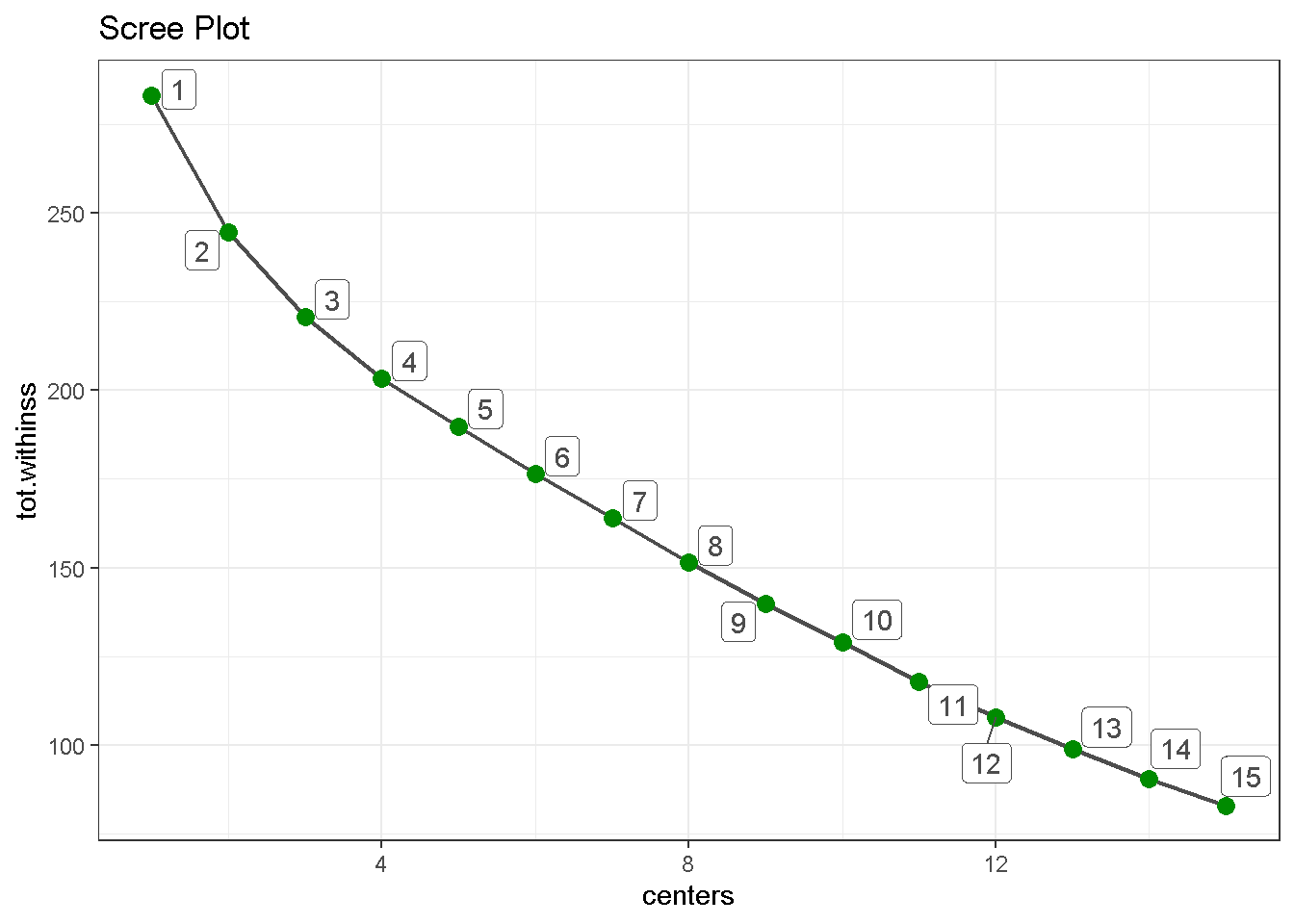
The one metric to really keep an eye on is the total within-cluster sum of squares (or tot.withinss) as the optimal number of clusters is that which minimises the tot.withinss. So I want to fit the k-means model for different number of clusters and see where tot.withinss reaches its minimum.
First, I build a function for a set number of centers (4 in this case) and check that is working on glance().
kmeans_map <- function(centers = 4) {
user_item_tbl %>%
kmeans(centers = centers, nstart = 100, iter.max = 50)
}
4 %>% kmeans_map() %>% glance()
## # A tibble: 1 x 4
## totss tot.withinss betweenss iter
## <dbl> <dbl> <dbl> <int>
## 1 283. 203. 80.0 2
Then, I create a nested tibble, which is a way of “nesting” columns inside a data frame. The great thing about nested data frames is that you can put essentially anything you want in them: lists, models, data frames, plots, etc!
kmeans_map_tbl <- tibble(centers = 1:15) %>% # create column with centres
mutate(k_means = centers %>%
map(kmeans_map)) %>% # iterate `kmeans_map` row-wise to gather
# kmeans models for each centre in column 2
mutate(glance = k_means %>%
map(glance)) # apply `glance()` row-wise to gather each
# model’s summary metrics in column 3
kmeans_map_tbl %>% glimpse()
## Observations: 15
## Variables: 3
## $ centers <int> 1, 2, 3, 4, 5, 6, 7, 8, 9, 10, 11, 12, 13, 14, 15
## $ k_means <list> [<1, 1, 1, 1, 1, 1, 1, 1, 1, 1, 1, 1, 1, 1, 1, 1, 1, ...
## $ glance <list> [<tbl_df[1 x 4]>, <tbl_df[1 x 4]>, <tbl_df[1 x 4]>, <...
Last, I can build a scree plot and look for the “elbow” on the graph, the point where the number of additional clusters seem to level off. In this case 5 appears to be an optimal number as the drop in tot.withinss for 6 is not as pronounced as the previous one.
kmeans_map_tbl %>%
unnest(glance) %>% # unnest the glance column
select(centers, tot.withinss) %>% # select centers and tot.withinss
ggplot(aes(x = centers, y = tot.withinss)) +
geom_line(colour = 'grey30', size = .8) +
geom_point(colour = 'green4', size = 3) +
geom_label_repel(aes(label = centers),
colour = 'grey30') +
theme_bw() +
labs(title = 'Scree Plot')
Visualising the Segments
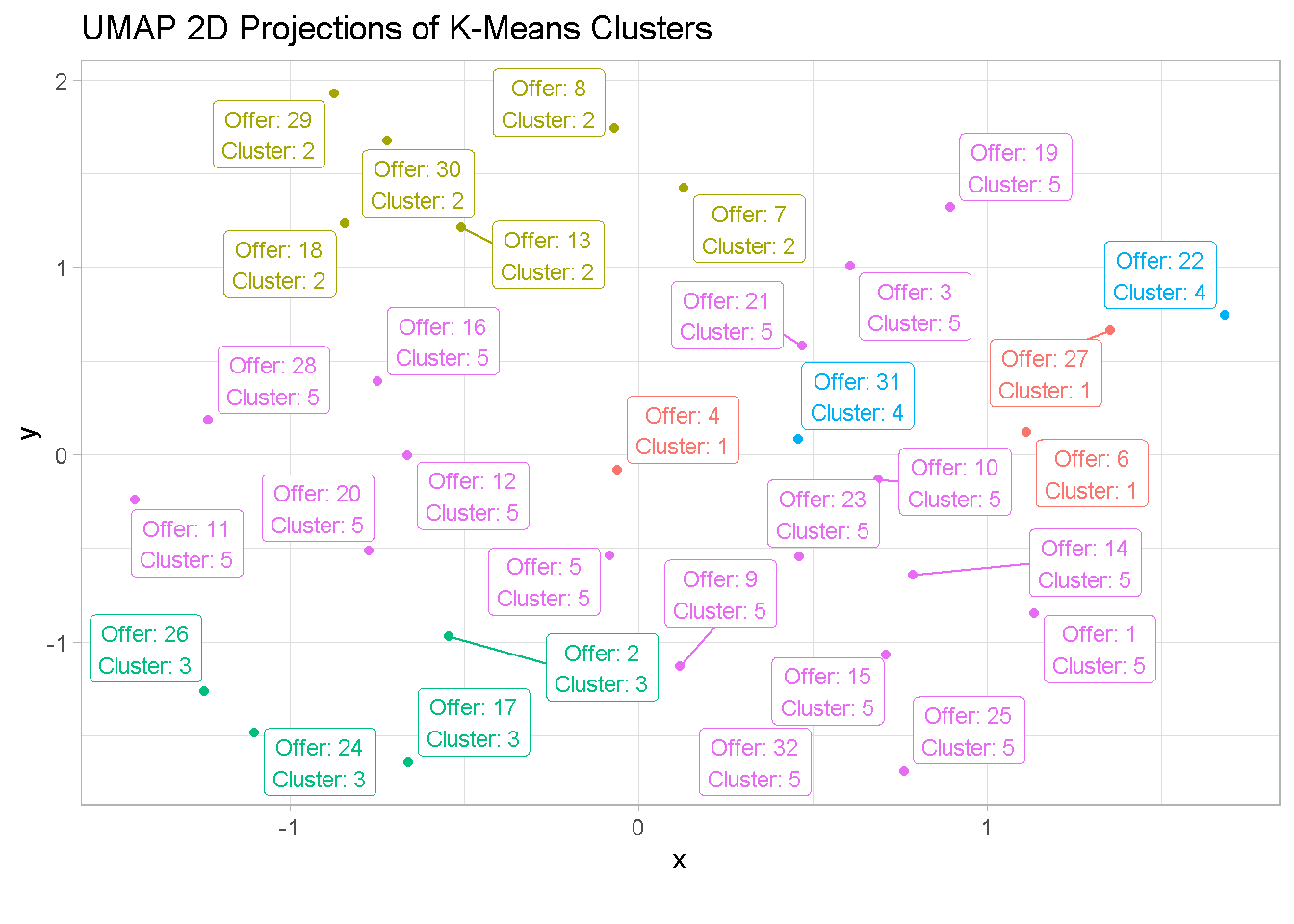
Now that I have identified the optimal number of clusters I want to visualise them. To do so, I use the UMAP ( Uniform Manifold Approximation and Projection ), a dimentionality reduction technique that can be used for cluster visualisation in a similar way to Principal Component Analysis and t-SNE.
First, I create a umap object and pull out the layout argument (containing coordinates that can be used to visualize the dataset), change its format to a tibble and attach the offer column from the wine_tbl.
umap_obj <- user_item_tbl %>% umap()
umap_tbl <- umap_obj$layout %>%
as_tibble() %>% # change to a tibble
set_names(c('x', 'y')) %>% # remane columns
bind_cols(wine_tbl %>% select(offer)) # attach offer reference
Then, I pluck the 5th kmeans model from the nested tibble, attach the cluster argument from the kmeans function to the output, and join offer and cluster to the umap_tbl.
umap_kmeans_5_tbl <- kmeans_map_tbl %>%
pull(k_means) %>%
pluck(5) %>% # pluck element 5
broom::augment(wine_tbl) %>% # attach .cluster to the tibble
select(offer, .cluster) %>%
left_join(umap_tbl, by = 'offer') # join umap_tbl to clusters by offer
At last, I can visualise the UMAP’ed projections of the clusters.
umap_kmeans_5_tbl %>%
mutate(label_text = str_glue('Offer: {offer}
Cluster: {.cluster}')) %>%
ggplot(aes(x,y, colour = .cluster)) +
geom_point() +
geom_label_repel(aes(label = label_text), size = 3) +
theme_light() +
labs(title = 'UMAP 2D Projections of K-Means Clusters',
caption = "") +
theme(legend.position = 'none')
Evaluating the Clusters
Now we can finally have a closer look at the single clusters to see what K-Means has identified.
But let’s first bring all information together in one data frame.
cluster_trends_tbl <- wine_tbl %>%
left_join(umap_kmeans_5_tbl) %>%
arrange(.cluster) %>%
select(.cluster, offer:past_peak)
Cluster 1 & 2
Customers in cluster 1 purchase high volumes of sparkling wines (Champagne and Prosecco) whilts those in the second segment favour low volume purchases of different varieties.
cluster_trends_tbl %>%
filter(.cluster == 1 | .cluster == 2) %>%
count(.cluster, varietal, origin, min_qty_kg, disc_pct) %>%
select(-n)
## # A tibble: 9 x 5
## .cluster varietal origin min_qty_kg disc_pct
## <fct> <chr> <chr> <dbl> <dbl>
## 1 1 Champagne France 72 48
## 2 1 Champagne New Zealand 72 88
## 3 1 Prosecco Chile 144 86
## 4 2 Espumante Oregon 6 50
## 5 2 Espumante South Africa 6 45
## 6 2 Malbec France 6 54
## 7 2 Merlot Chile 6 43
## 8 2 Pinot Grigio France 6 87
## 9 2 Prosecco Australia 6 40
Cluster 3 & 4
Customers in these groups have very specific taste when it comes to wine: those in the third segment have a penchant for Pinot Noir, whereas group 4 only buys French Champagne in high volumes.
cluster_trends_tbl %>%
filter(.cluster == 3 | .cluster == 4 ) %>%
group_by() %>%
count(.cluster, varietal, origin, min_qty_kg, disc_pct) %>%
select(-n)
## # A tibble: 6 x 5
## .cluster varietal origin min_qty_kg disc_pct
## <fct> <chr> <chr> <dbl> <dbl>
## 1 3 Pinot Noir Australia 144 83
## 2 3 Pinot Noir France 72 17
## 3 3 Pinot Noir Germany 12 47
## 4 3 Pinot Noir Italy 6 34
## 5 4 Champagne France 72 63
## 6 4 Champagne France 72 89
Cluster 5
The fifth segment is a little more difficult to categorise as it encompasses many different attributes. The only clear trend is that customers in this segment picked up all available Cabernet Sauvignon offers.
cluster_trends_tbl %>%
filter(.cluster == 5 ) %>%
count(.cluster, varietal, origin, min_qty_kg, disc_pct) %>%
select(-n)
## # A tibble: 17 x 5
## .cluster varietal origin min_qty_kg disc_pct
## <fct> <chr> <chr> <dbl> <dbl>
## 1 5 Cabernet Sauvignon France 12 56
## 2 5 Cabernet Sauvignon Germany 72 45
## 3 5 Cabernet Sauvignon Italy 72 82
## 4 5 Cabernet Sauvignon Italy 144 19
## 5 5 Cabernet Sauvignon New Zealand 144 44
## 6 5 Cabernet Sauvignon Oregon 72 59
## 7 5 Champagne California 12 50
## 8 5 Champagne France 72 85
## 9 5 Champagne Germany 12 66
## 10 5 Chardonnay Chile 144 57
## 11 5 Chardonnay South Africa 144 39
## 12 5 Espumante Oregon 144 32
## 13 5 Malbec France 72 56
## 14 5 Merlot California 72 88
## 15 5 Merlot Chile 72 64
## 16 5 Prosecco Australia 72 83
## 17 5 Prosecco California 72 52
Final thoughts
Although it’s not going to give you all the answers, clustering is a powerful exploratory exercise that can help you reveal patterns in your consumer base, especially when you have a brand new market to explore and do not have any prior knowledge of it.
It’s very easy to implement and even on a small dataset like the one I used here, you can unearth interesting patterns of behaviour in your customer base.
With little effort we have leaned that some of our customers favour certain varieties of wine whereas others prefer to buy high or low quantities. Such information can be used to tailor your pricing strategies and marketing campaings towards those customers that are more inclined to respond. Moreover, customer segmentation allows for a more efficient allocation of marketing resources and the maximization of cross- and up-selling opportunities.
Segmentation can also be enriched by overlaying information such as a customers’ demographics (age, race, religion, gender, family size, ethnicity, income, education level), geography (where they live and work), and psychographic (social class, lifestyle and personality characteristics) but these go beyond the scope of this mini-project.
Code Repository
The full R code can be found on my GitHub profile
References
- For a broader view on the potential of Customer Segmentation
- For a critique of some of k-means drawback
- Customer Segmentation at Bain & Company